Income change in New York City
Excel | QGIS |
Illustrator
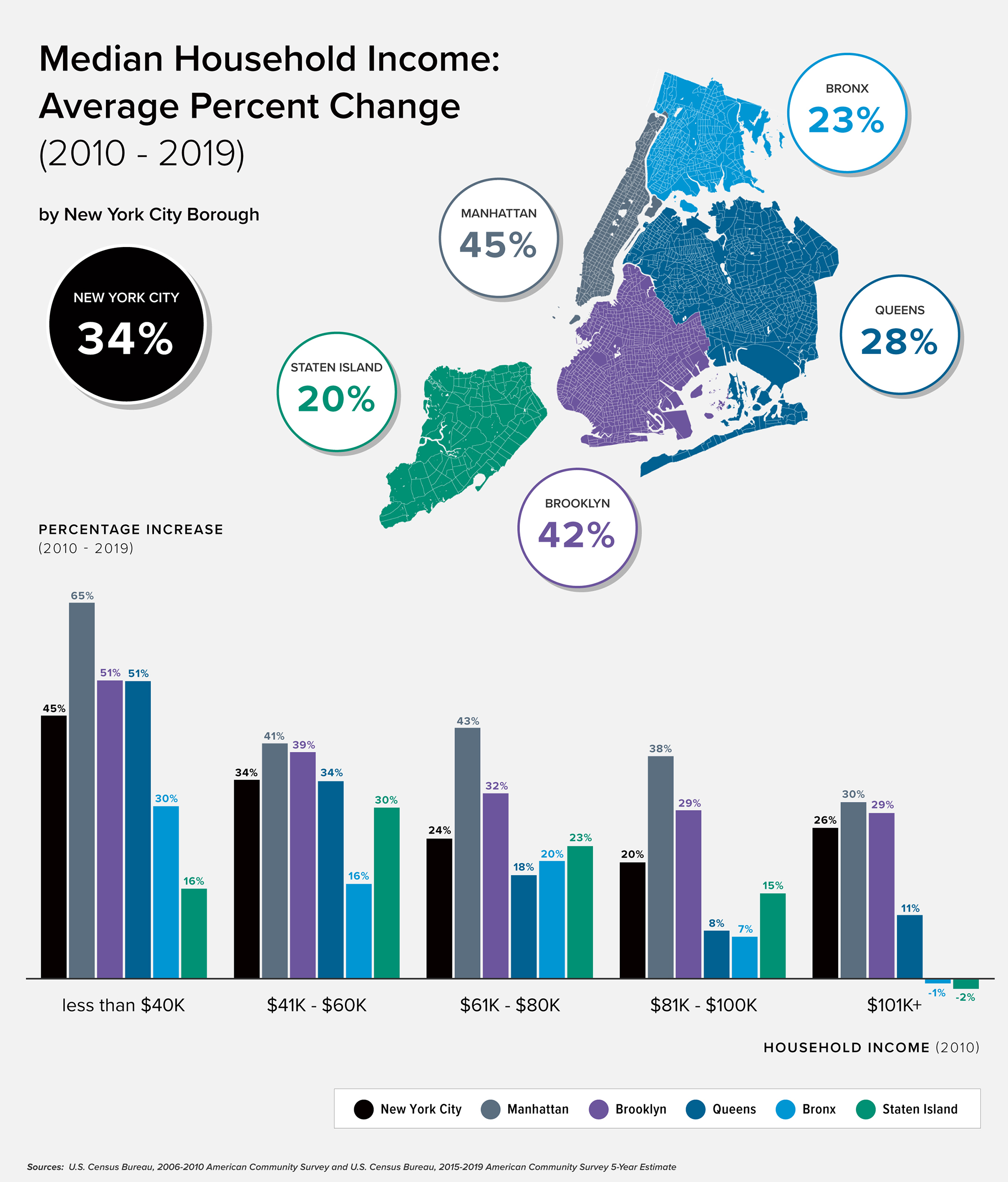
Mapping how median incomes have changed across New York City's five boroughs from
2010-2019. Additionally, exploring how various income brackets have increased (and, in a few
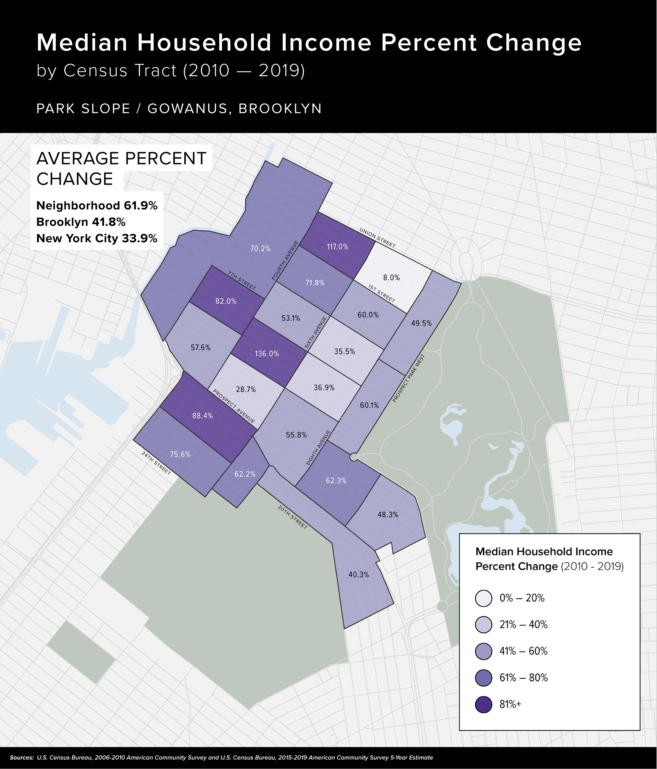
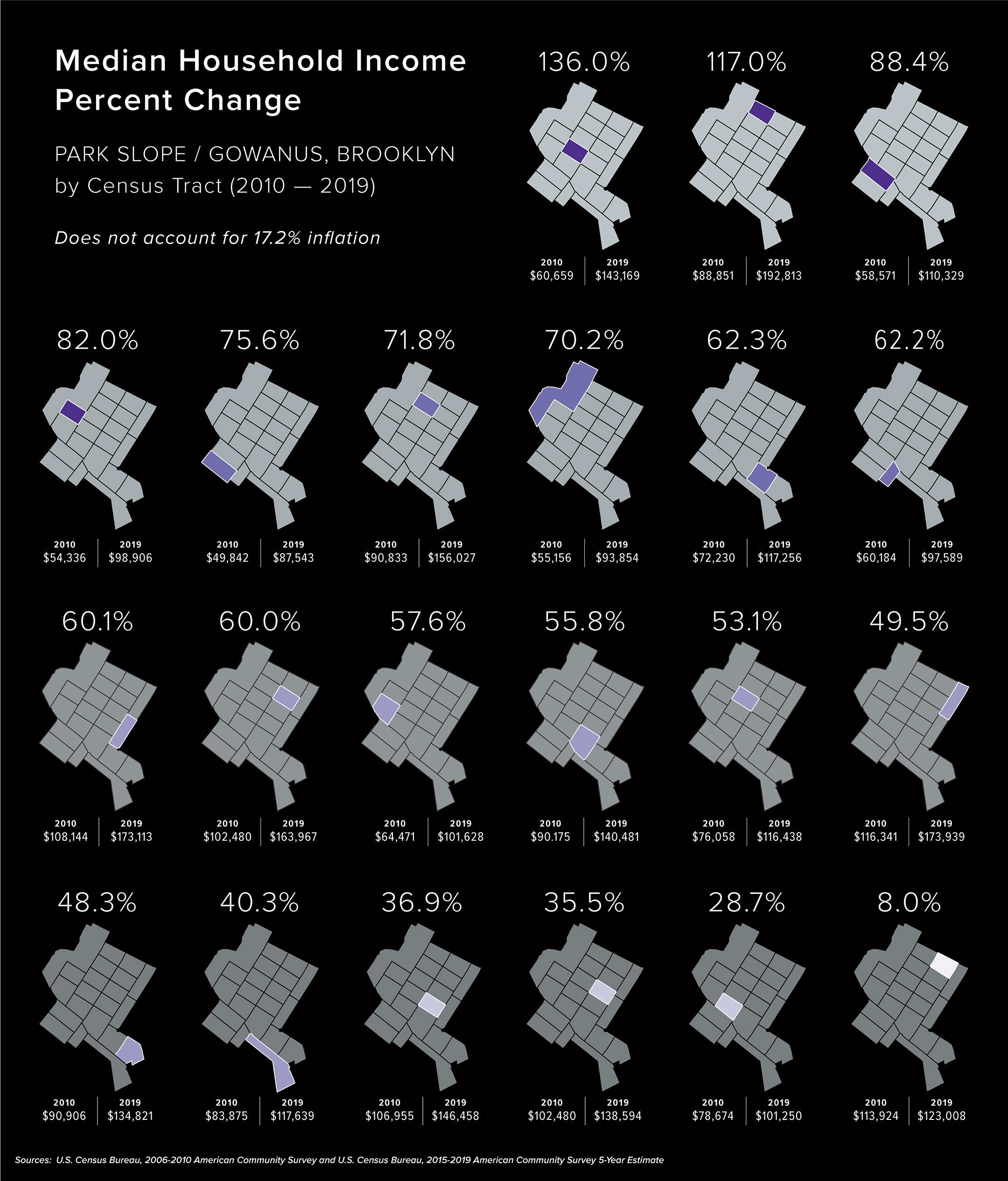
cases, decreased) during this time. Finally, zooming into one Brooklyn neighborhood, Park Slope,
to examine incomes changed on a census tract level.


