Above the Poverty Line?

Income distribution and disparity in the United States
Excel | QGIS | Illustrator
CURIOSITY In 2019, any household of one in the contiguous United States earning an annual income of more than $12,490 would, as per the federal government, be considered living above the poverty line. As someone who has spent the majority of her adult life living alone, it is hard to fathom how anyone could sustain themselves on such an inadequate amount. With this incongruity in mind, rather than look towards the poverty line when exploring income data, I opted to draw my own lines, in the hopes of achieving a more accurate snapshot of disparity.

DATA My initial aim was to research and map how income distribution has changed over time, but I quickly discovered that the majority of historical data was only available for median incomes. (For a deeper dive into the limitations of medians, please view my project, When the Median isn't the Message).

The U.S. Census Bureau's Current Population Survey, does provide annual, nationwide income quintile data, onwards from 1947 — not ideal for mapping purposes, but worth including as to provide some historical perspective.

My focus shifted to more recent data. I worked with the U.S. Census Bureau's 2015-2019 ACS (American Community Survey) data - as it provided a snapshot of pre-pandemic incomes for all individuals 16 years or older with full time earnings. Incomes were broken down into eight brackets and provided as a percent of population per census tract, thus already normalized. Over 72,500 census tracts in the contiguous United States were included, representing over 99% of the country.
line graph, income quintiles, united states, 1947-2020
METHODOLOGY (AND SOME MORE DATA) Aiming for more accessible and mappable data, my first task was to simplify the eight income brackets into three more manageable categories: lower, middle and upper. Not wanting to arbitrarily determine what constitutes lower, middle and upper incomes, I referenced the U.S. Bureau of Labor Statistics' 2019 Consumer Expenditure Survey (CE). The CE is a nationwide survey, representing over 98% of the population, that captures data on demographics, earnings, and expenditures. Although complex and detailed, the data is limited in that it looks at individuals and does not take into account when multiple earners contribute to household expenses. Yet, even with this limitation, I found the data to be a helpful guide. 2019 survey respondents were broken down into income quintiles - each representing one fifth of the total population. Incomes and average expenditures were provided for each quintile — painting a stark picture of which income groups were and were not able to live within their means.

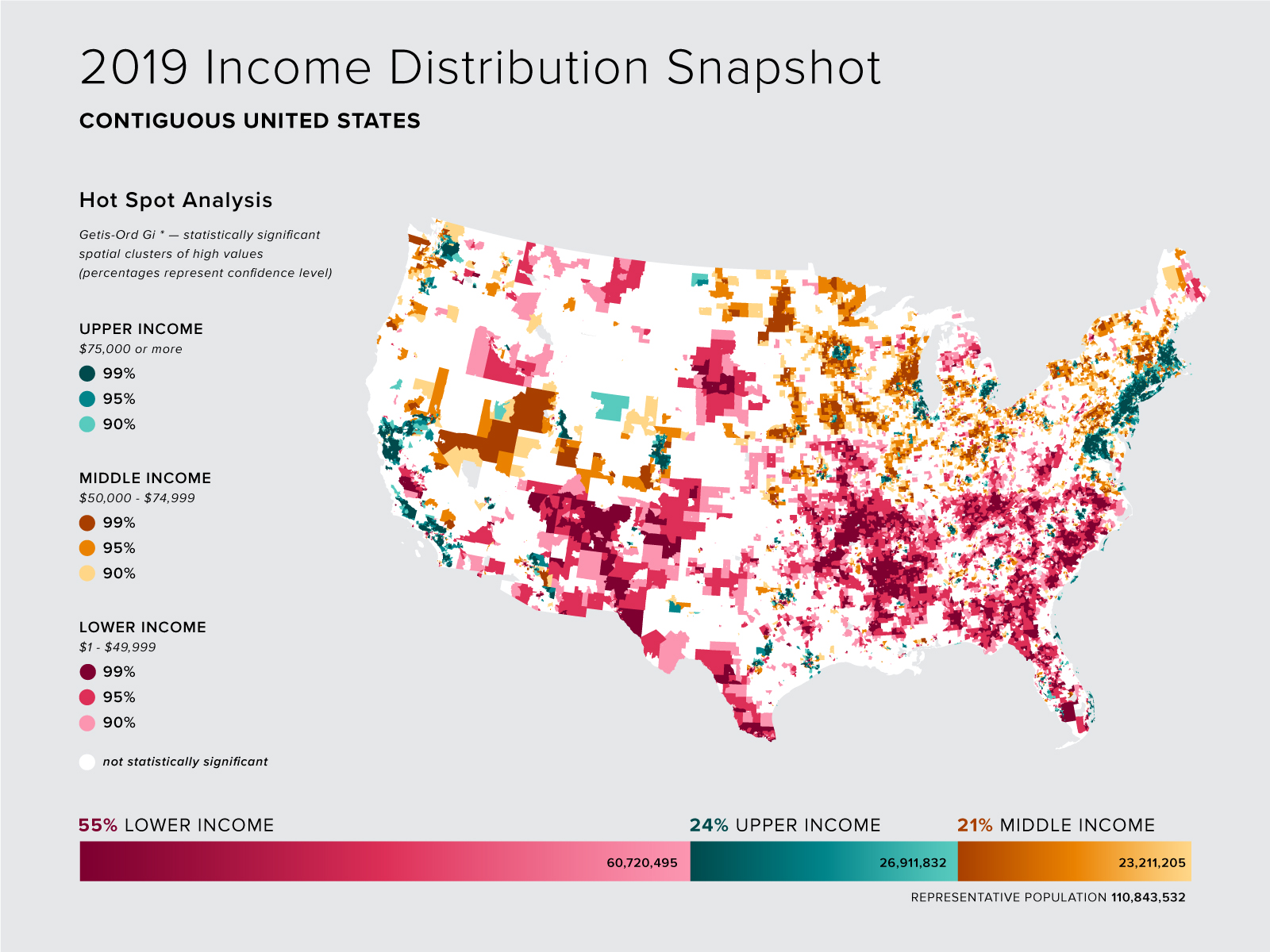
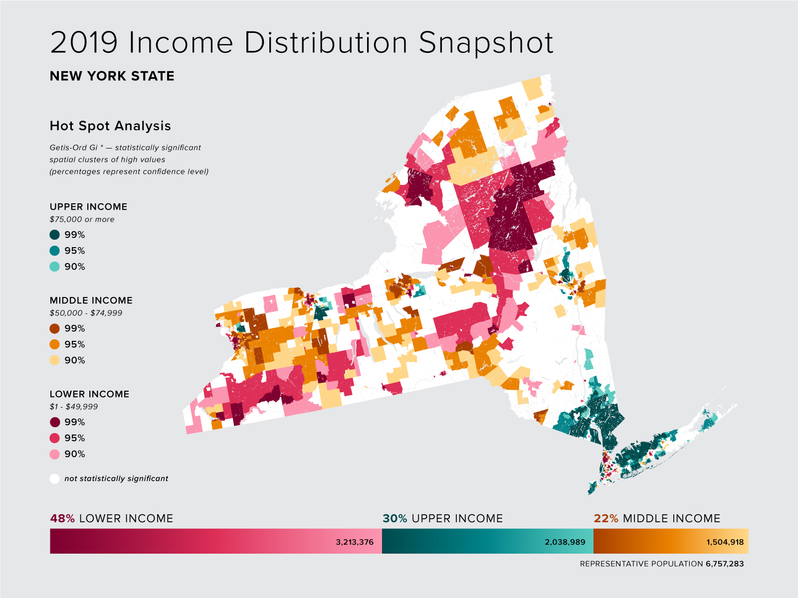
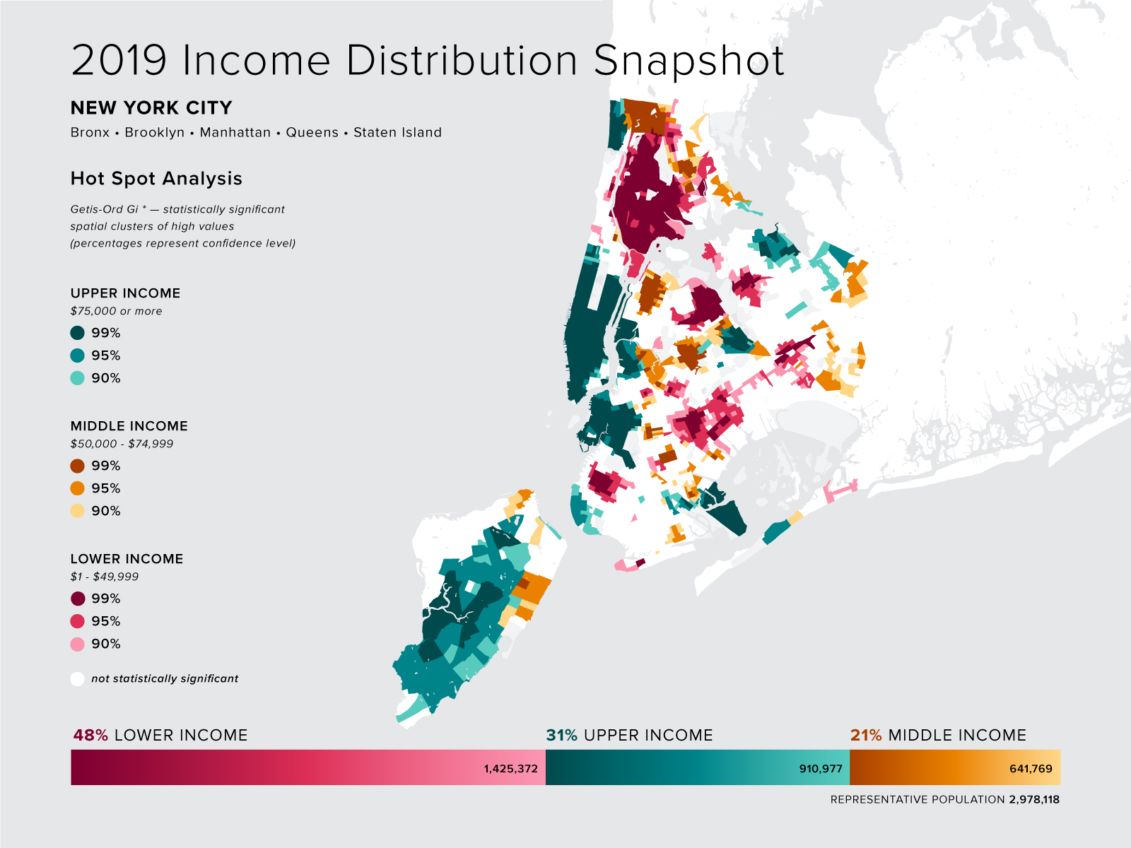
After an initial review of the data, I determined that lower incomes (anything less that $50,000) constituted those unable to meet their expenses, while middle incomes ($50,000 - $74,999) could meet their expenses and, potentially, get slightly ahead, and upper incomes ($75,000 and higher) could comfortably pay all expenses while also generously saving.
2019 US Census income quintiles; dot matrix; lower, middle and upper classes
GEOSPATIAL ANALYSIS With each census tract broken down into the three income categories, I brought the data into QGis to explore mapping options. Using the Hot Spot plugin, I performed a Getis-Ord Gi * analysis on each income bracket — resulting in three separate maps, each displaying where there were statistically significant spatial clusters (both high and low occurrences). The three maps were interesting, yet, not ideal. When viewed independently, no one map told a complete story — and, when displayed together, they were not readily comprehensible.

After much trial and error, I opted to combine the data onto one map, displaying the hot spots for each income bracket, while removing the cold spots, as they represented repetitive information (a cold spot for upper incomes is a hot spot for lower incomes, and vice versa). I first looked at the country as a whole, and further zoomed into smaller geographies ­— New York State and New York City.
2019 US incomes; mapped as per lower, middle, and upper class, by census tract
2019 New York State incomes; mapped as per lower, middle, and upper class, by census tract
2019 New York City incomes; mapped as per lower, middle, and upper class, by census tract
CONCLUDING THOUGHTS My maps may not display anything unexpected — most would have guessed that incomes are lower in the South than along the coasts, and that earners in Manhattan make more than those in the Bronx. Yet visualizing that over half of the population falls within the lower income bracket is disheartening. I acknowledge that my methods of segmenting incomes can be argued — I am neither accounting for geographic cost of living, nor number of contributors to, or dependents of, a household. But, even if my figures were halved, the result would be over 30 million Americans unable to afford their basic living expenses.

As someone whose income has fluctuated, I have experienced the peace of mind that accompanies the ability to build a savings account, and the stress of amassing a mountain of credit card debt in order to simply get by. Income is not merely a financial figure — it effects physical and mental health, and both determines and limits life choices. These effects go beyond the individual income earners and impact society as a whole. The pandemic may have exacerbated income disparities — yet, as these maps display, even in 2019 (prior to COVID-19), far too many people were struggling.

This analysis and these maps may not offer any solutions, but maybe acknowledging the depths of the disparity can at least be a start to the conversation.
BACK NEXT