When the Median isn't the Message

Consider what gets lost by focusing only on the middle
Excel | JavaScript | D3 | GitHub
(graphics are interactive and best viewed on a desktop)

The median is as ubiquitous as data itself. In any given set of numbers, the median is the “middle” value — where half of the numbers fall above it, and half fall below it. It's a tidy figure, not easily skewed by outliers. Consider the median a snapshot, focused on the midpoint and conveniently cropping out the messy highs and lows — an appropriate view for some datasets, but not all. This post explores what gets lost when the median is the message.

The median provides an especially limited view when it comes to economic data. An ideal dataset to demonstrate this point is the Consumer Expenditure Survey (CE). The CE, a nationwide household survey conducted for the U.S. Bureau of Labor Statistics (BLS), explores how Americans spend their money. The CE's robust data includes information on demographics, incomes, and expenditures — and represents 98% of the US population.

This post explores the CE data through a series of visualizations:
30 Years of the Median
   • a 30 year snapshot - capturing median spending from 1990 to 2019
2019 — The Median and Beyond
   • a closer look at 2019 spending, broken down by income quintile
Highs and Lows of 2019
   • a zoomed-in comparison of the lowest and highest quintiles of 2019

30 Years of the Median

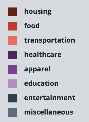
The below visualization displays annual median spending, as broken down into eight categories: housing, food, transportation, healthcare, apparel, education, entertainment, and miscellaneous. In 2019, Americans on average spent 87% of their earnings on all expenses — which is an improvement over 1990, when they spent 98% — but, yet, not as prosperous as 2010-2011, when a mere 79% of earnings would get you everything you need. All and all, though, this chart paints a rosy picture of the past 30 years. Spending does not fluctuate wildly, and at no point is anyone living beyond their means.
MEDIAN ANNUAL EXPENDITURES (1990-2019)

roll over bars for detailed information

2019 — the Median and Beyond

Fortunately, the CE data goes beyond the median and is also available in income quintiles — each representing one fifth of the total population. The median is essentially the third (middle) quintile. The below visualization displays the income brackets both below and above the middle - depicting a more complete snapshot of Americans' living expenses.

It should be noted that the CE captures data from individuals regarding their household expenses — but does not take into account when multiple individuals are contributing to a single household. I mention this finer point as a way to explain how someone's expenditures can be as much as 135% more than their income.

2019 ANNUAL EXPENDITURES BY INCOME QUINTILES

roll over dots for detailed information

Lowest
20%

income after taxes
$12,236

average annual
expenditures
$28,761

Second
20%

income after taxes
$32,945

average annual
expenditures
$40,424

Third
20%

income after taxes
$53,123

average annual
expenditures
$52,988

Fourth
20%

income after taxes
$83,864

average annual
expenditures
$71,090

Highest
20%

income after taxes
$174,777

average annual
expenditures
$121,533


The Highs and Lows of 2019

Comparing detailed spending for the lowest and highest quintiles offers further insight into income inequality. Expenditures on housing differ dramatically, with the lowest earners spending 94% of their income on housing, versus the 21% spend by the highest earners.

2019 ANNUAL EXPENDITURES: LOWEST VS. HIGHEST QUINTILES

roll over dots for detailed information

Lowest
20%

income after taxes
$12,236

average annual
expenditures
$28,761

135% OVER BUDGET

Highest
20%

income after taxes
$174,777

average annual
expenditures
$121,533

29% UNDER BUDGET

color key

Median: One Size Doesn't Fit All

The median is, admittedly, not without its merits. It can be found with little to no math, it is above the influence of outliers, and it is convenient for visualization purposes. The intention of this post is not to disregard the median entirely, but, rather - as this data demonstrates, to create an awareness of the median's limitations. Forthrightly addressing any data's limitations can help to counter people's inherent distrust of its seeming omnipotence

The best data raises more questions than answers. Next time the median makes an appearance in an article or visualization, pause to consider what has been lost by focusing only on the middle.
notes
1. The BLS provides aggregated spending data by income quintile. Several calculations were necessary to reveal spending at the consumer level.
2. In order to simplify the visualizations, some CE spending categories were combined: 'reading' was added to 'entertainment', 'personal care' was added to 'apparel, and 'alcohol and tobacco', 'cash contributions', and 'personal insurance / pensions' were all added to 'miscellaneous'.

source
U.S. Bureau of Labor Statistics: Consumer Expenditure Surveys
BACK     NEXT