A Tale of 12 Cities

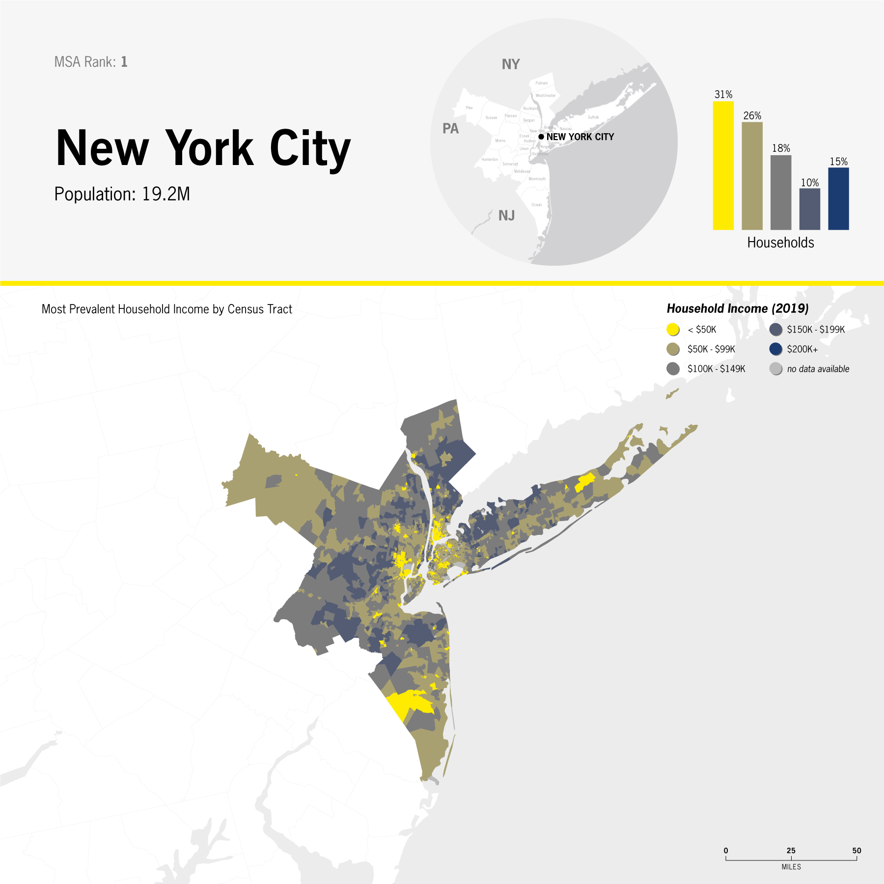
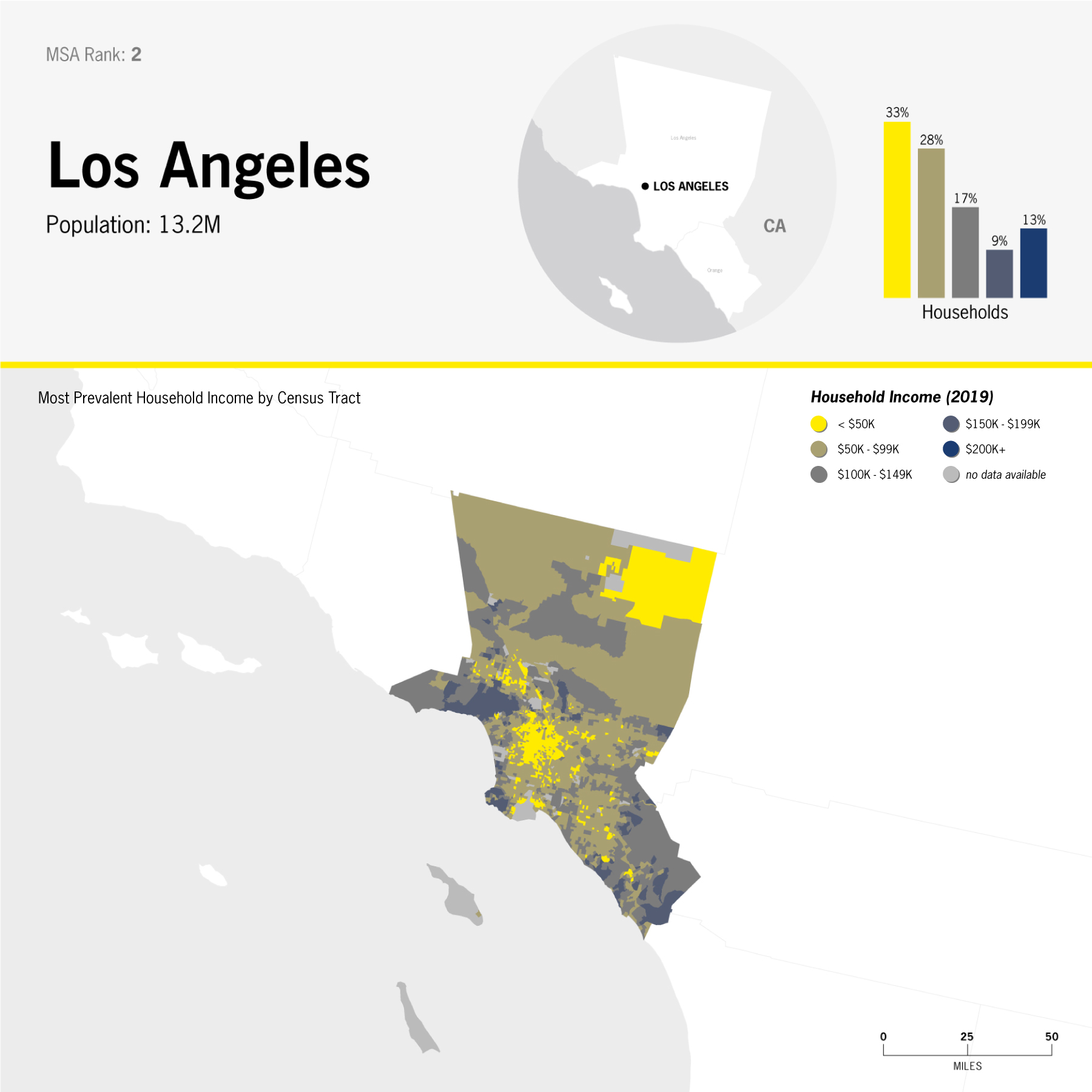
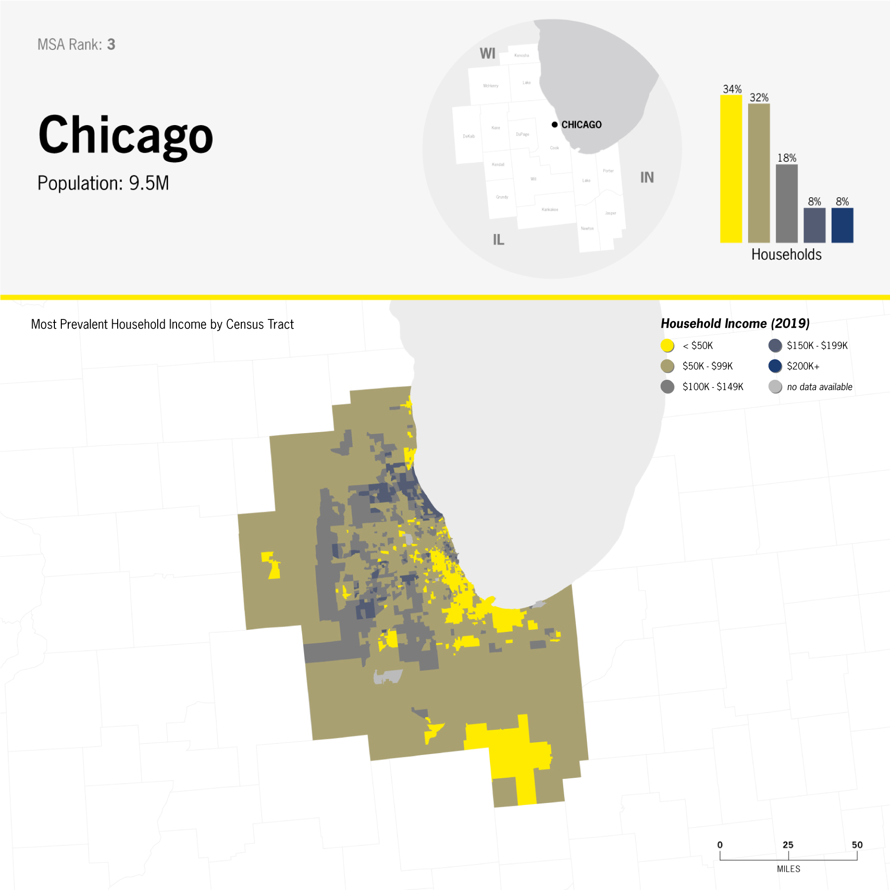
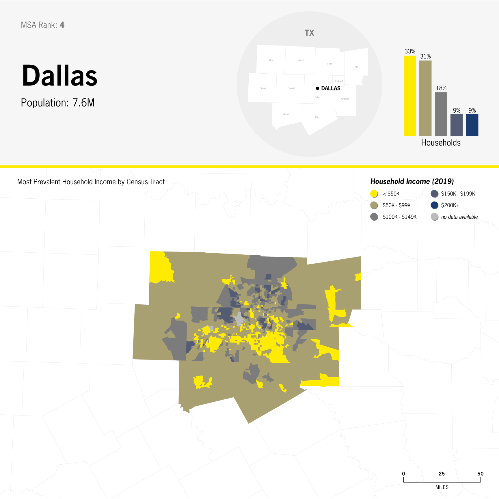
Income distribution in the United States' 12 most populated MSAs [Metropolitan Statistical Areas]
Excel | QGIS | Illustrator | InDesign
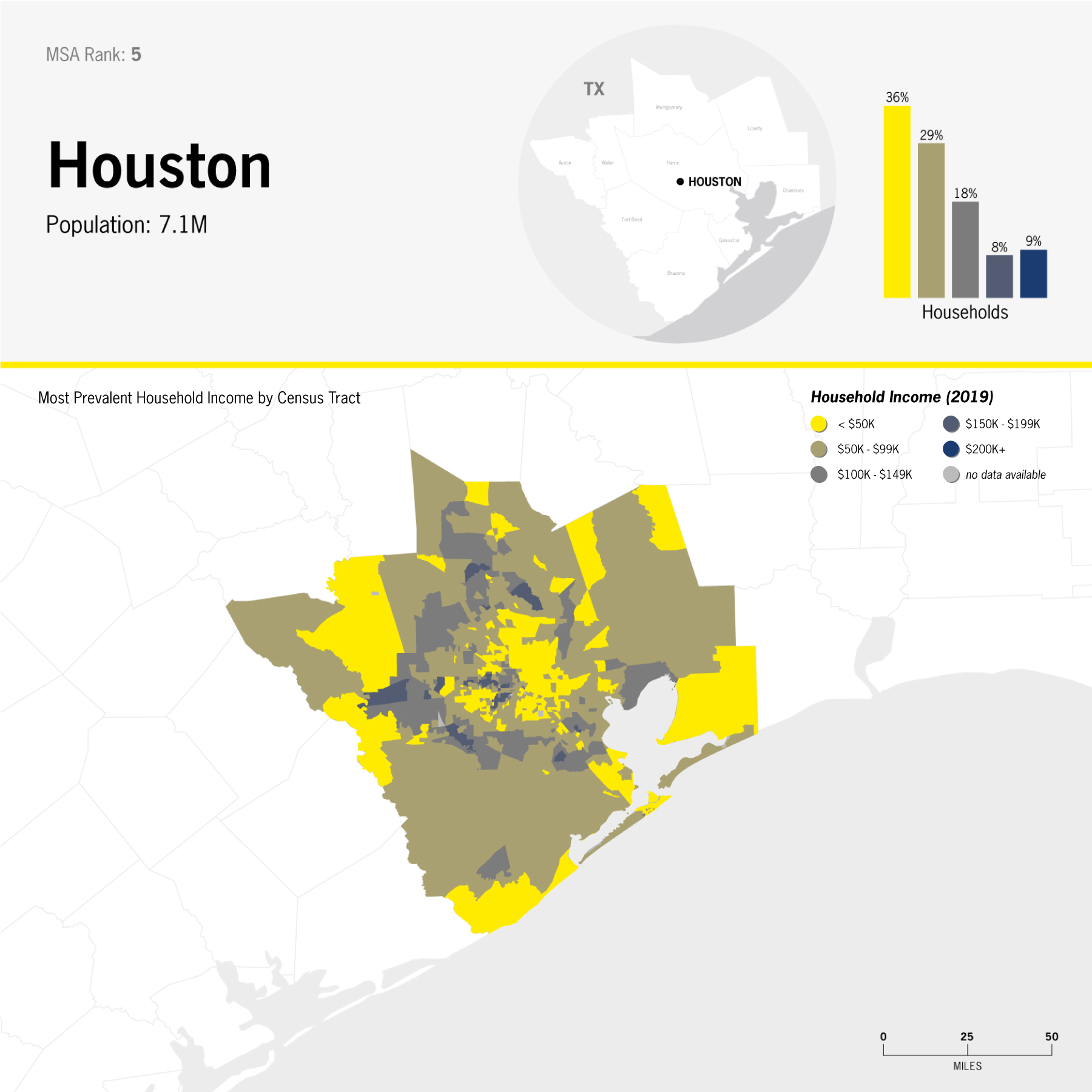
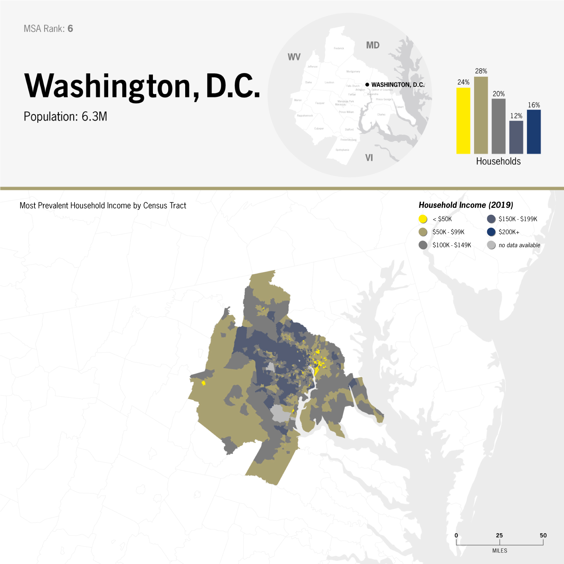
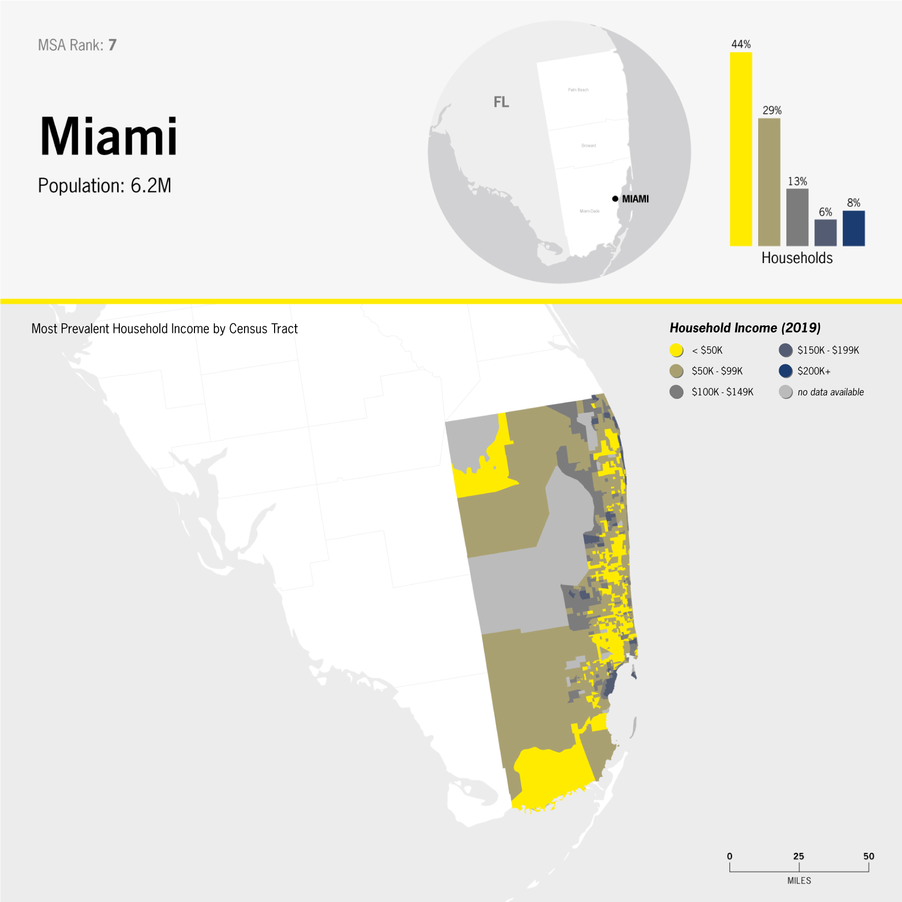
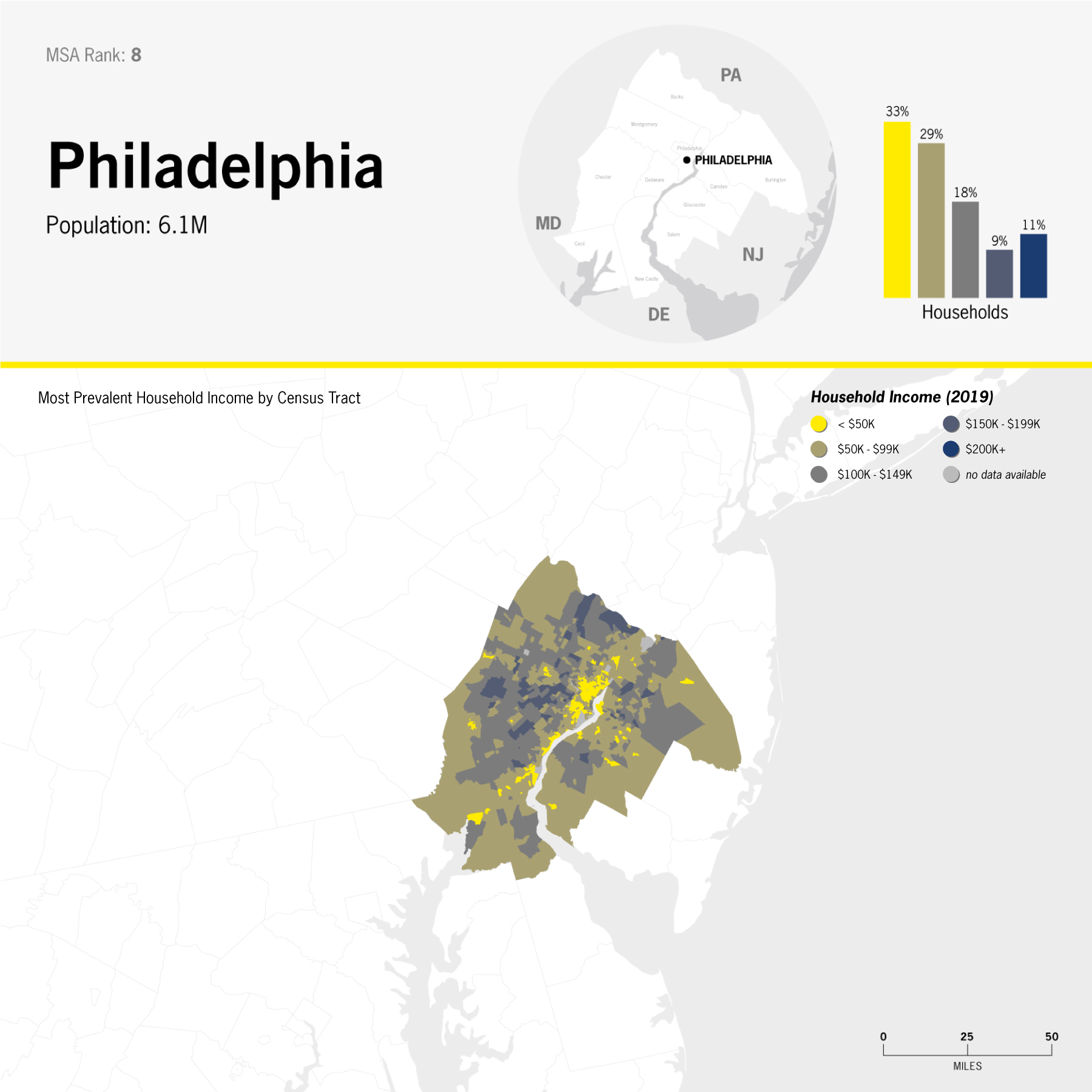
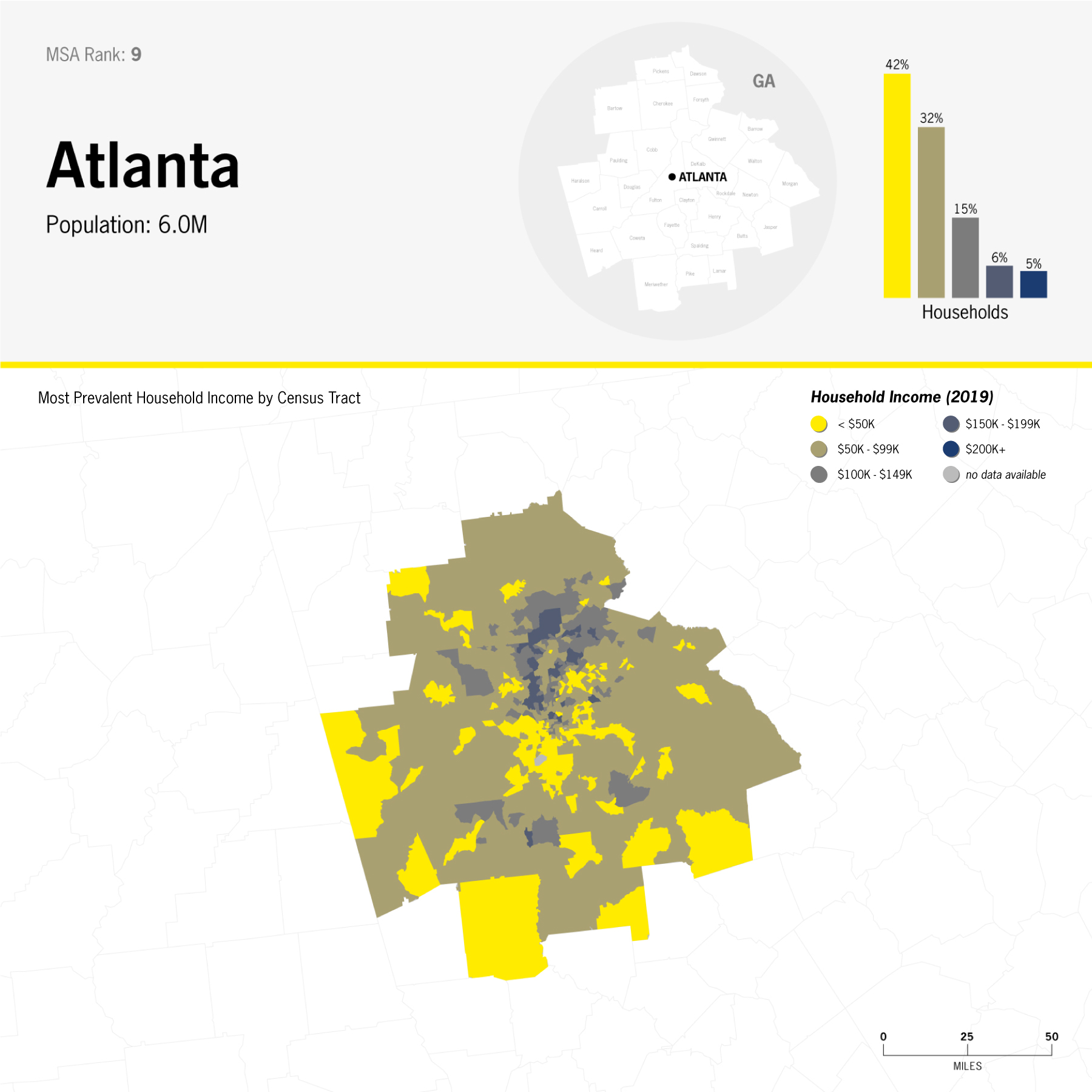
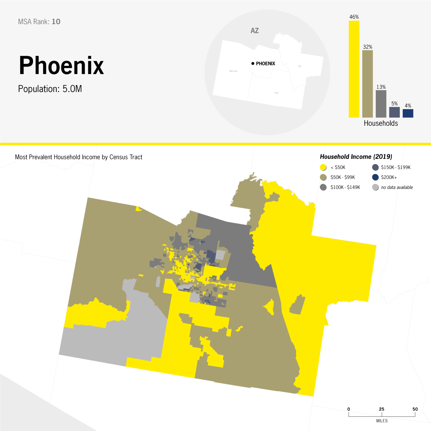
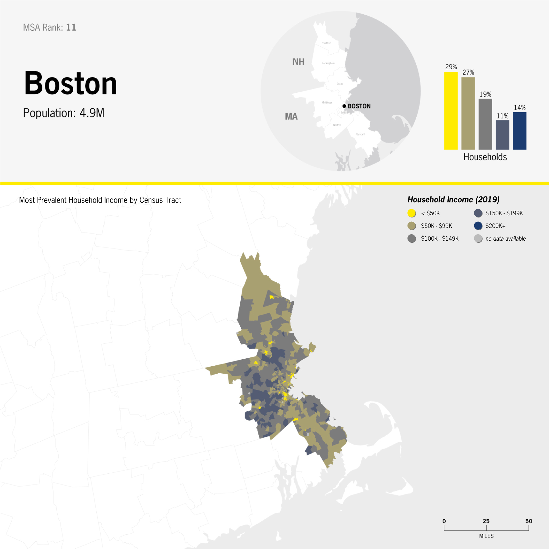
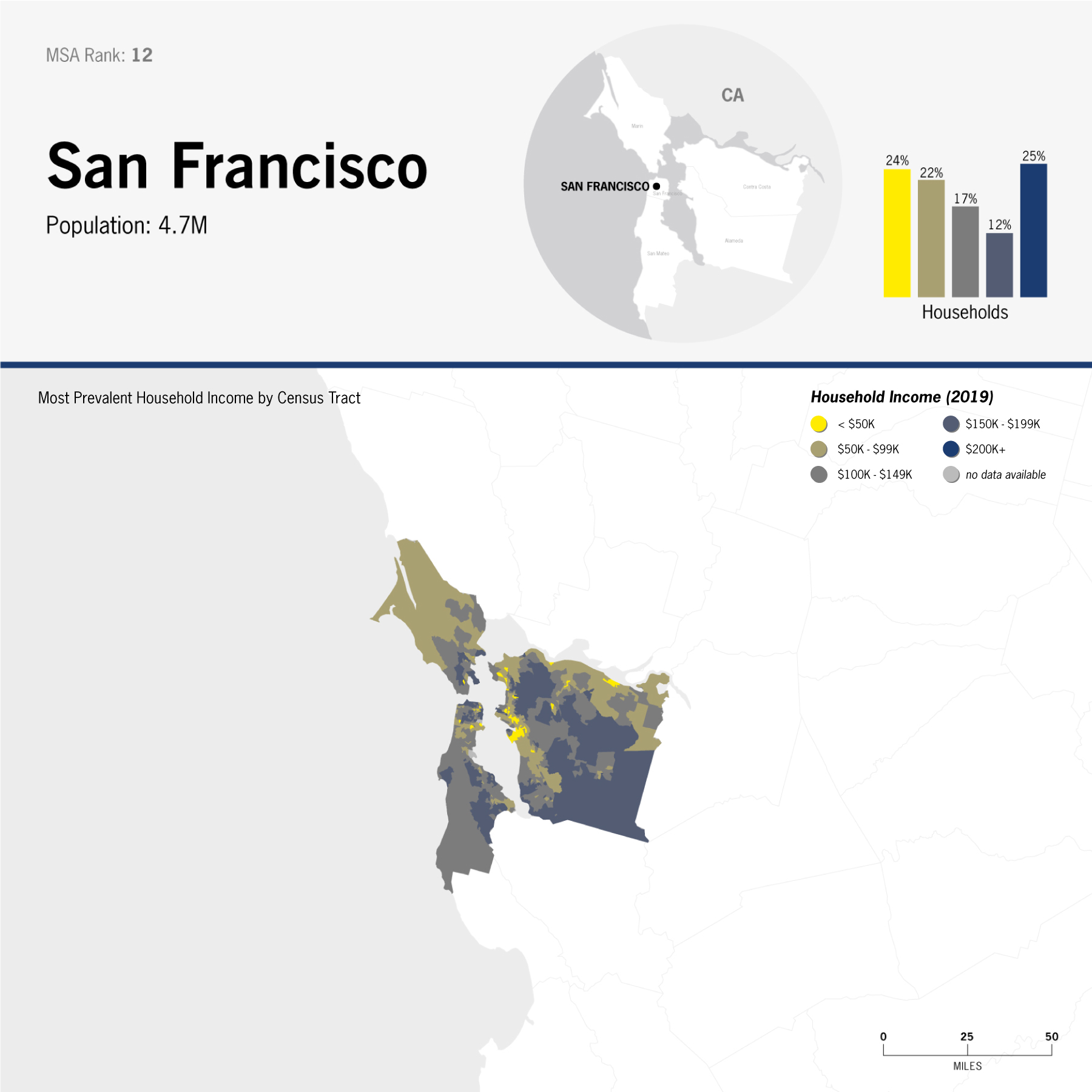
Working with U.S. Census data, I mapped income distribution in the United State's most populated metropolitan areas. Bar charts display the income breakdown for the entire MSA (Metropolitan Statistical Area), and, to add a layer of granularity, the maps are broken down by census tract.

data: income distribution in the United States' 12 most populated MSAs [Metropolitan Statistical Areas], ranked by population; 2019; 12 choropleth maps by Census Tract
data: income distribution in New York City; choropleth map by Census Tract
data: income distribution in Los Angeles; choropleth map by Census Tract
data: income distribution in Chicago; choropleth map by Census Tract
data: income distribution in Dallas; choropleth map by Census Tract
data: income distribution in Houston; choropleth map by Census Tractt
data: income distribution in Washington, D.C.; choropleth map by Census Tract
data: income distribution in Miami; choropleth map by Census Tract
data: income distribution in Philadelphia; choropleth map by Census Tract
data: income distribution in Atlanta; choropleth map by Census Tract
data: income distribution in Phoenix; choropleth map by Census Tract
data: income distribution in Boston; choropleth map by Census Tract
data: income distribution in San Francisco; choropleth map by Census Tract
BACK NEXT