CURIOSITY
In 2019, a single-person household in the contiguous United States earning more than $12,490
annually was classified by the federal government as living above the poverty line. Having spent
most of my adult life living alone, I found it difficult to reconcile how anyone could
realistically sustain themselves on such an amount.
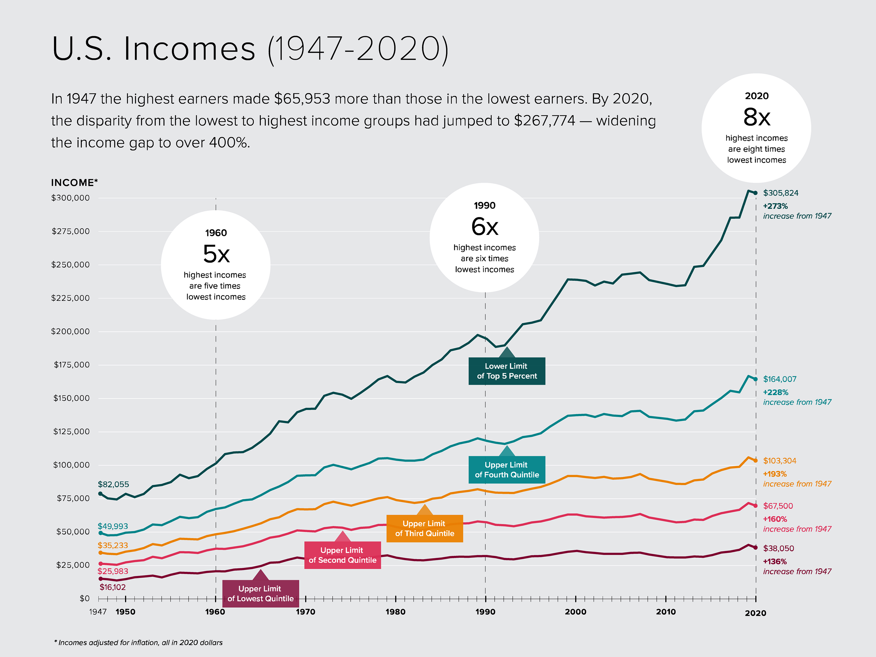
This tension became the starting point for the project. Rather than centering the analysis on the federal poverty threshold, I chose to draw my own reference lines across the income spectrum to better examine distribution and disparity. The goal was not simply to ask who falls below a fixed benchmark, but to explore how income is distributed—and concentrated—across the country.
DATA
My initial intention was to map how income distribution has shifted over time. However, most
historical datasets provide only median income, which limits deeper distributional analysis. The
U.S. Census Bureau's Current Population Survey does offer national income quintile data dating
back to 1947—useful for historical context, though not geographically granular enough for
mapping.
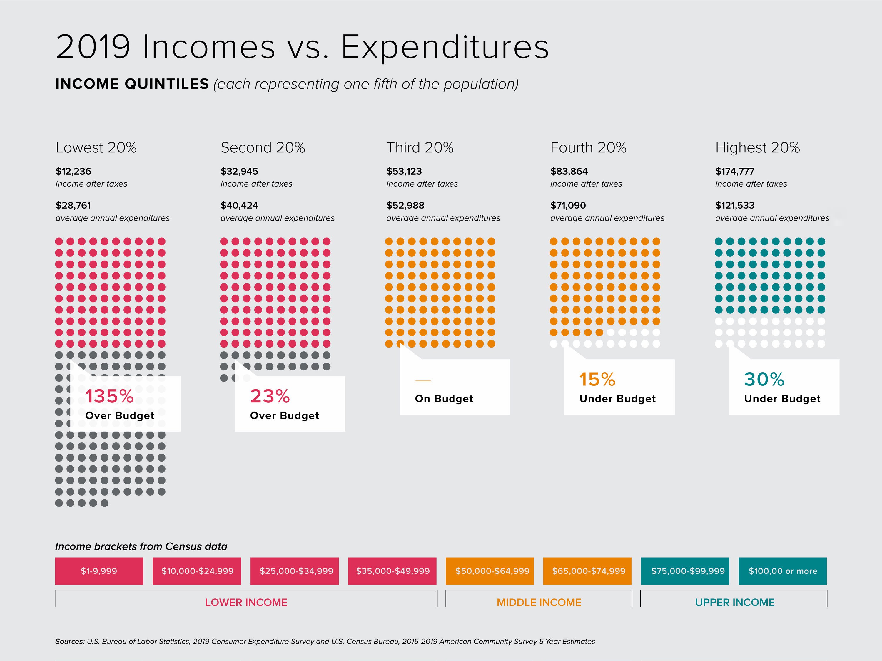
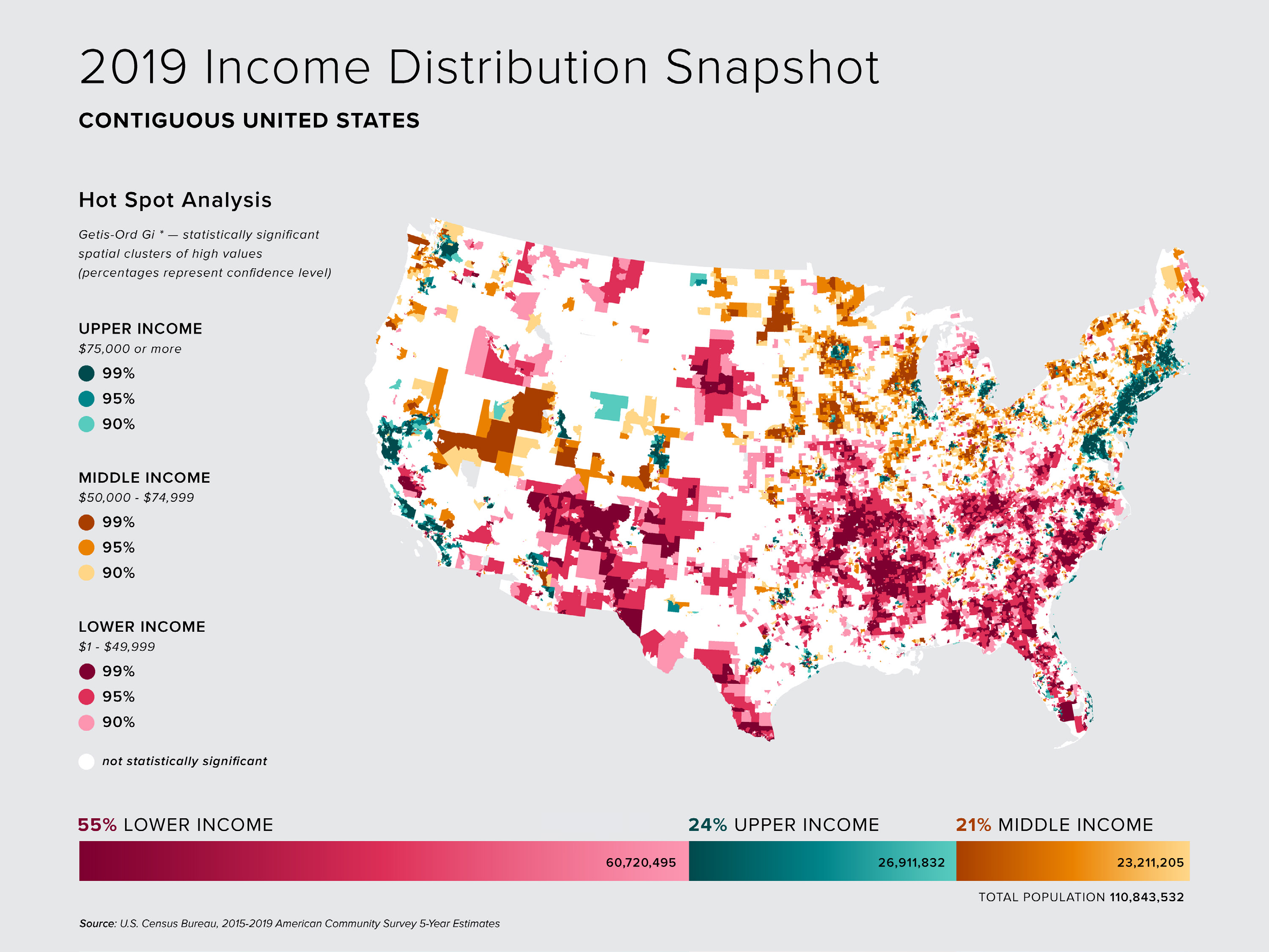
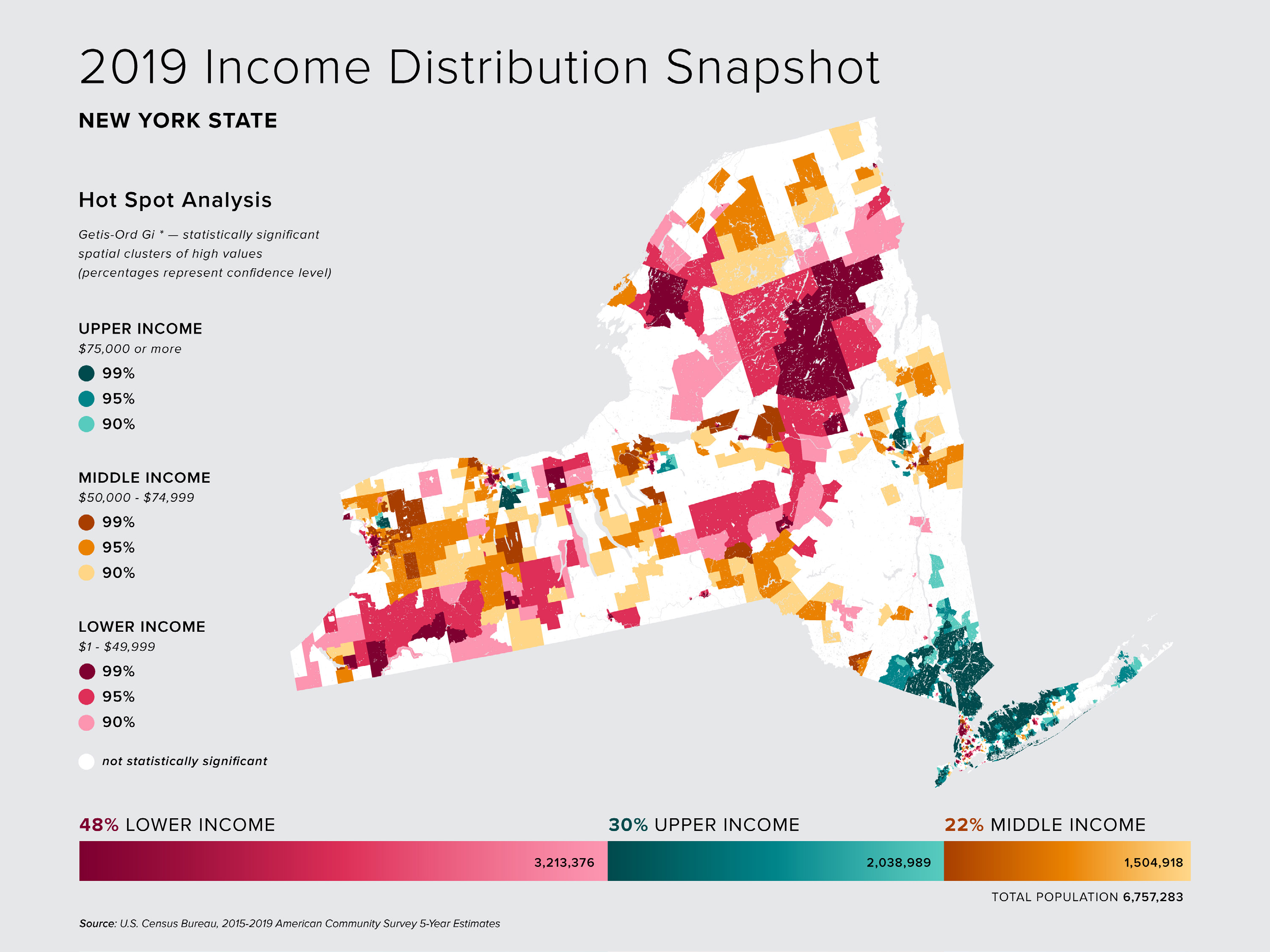
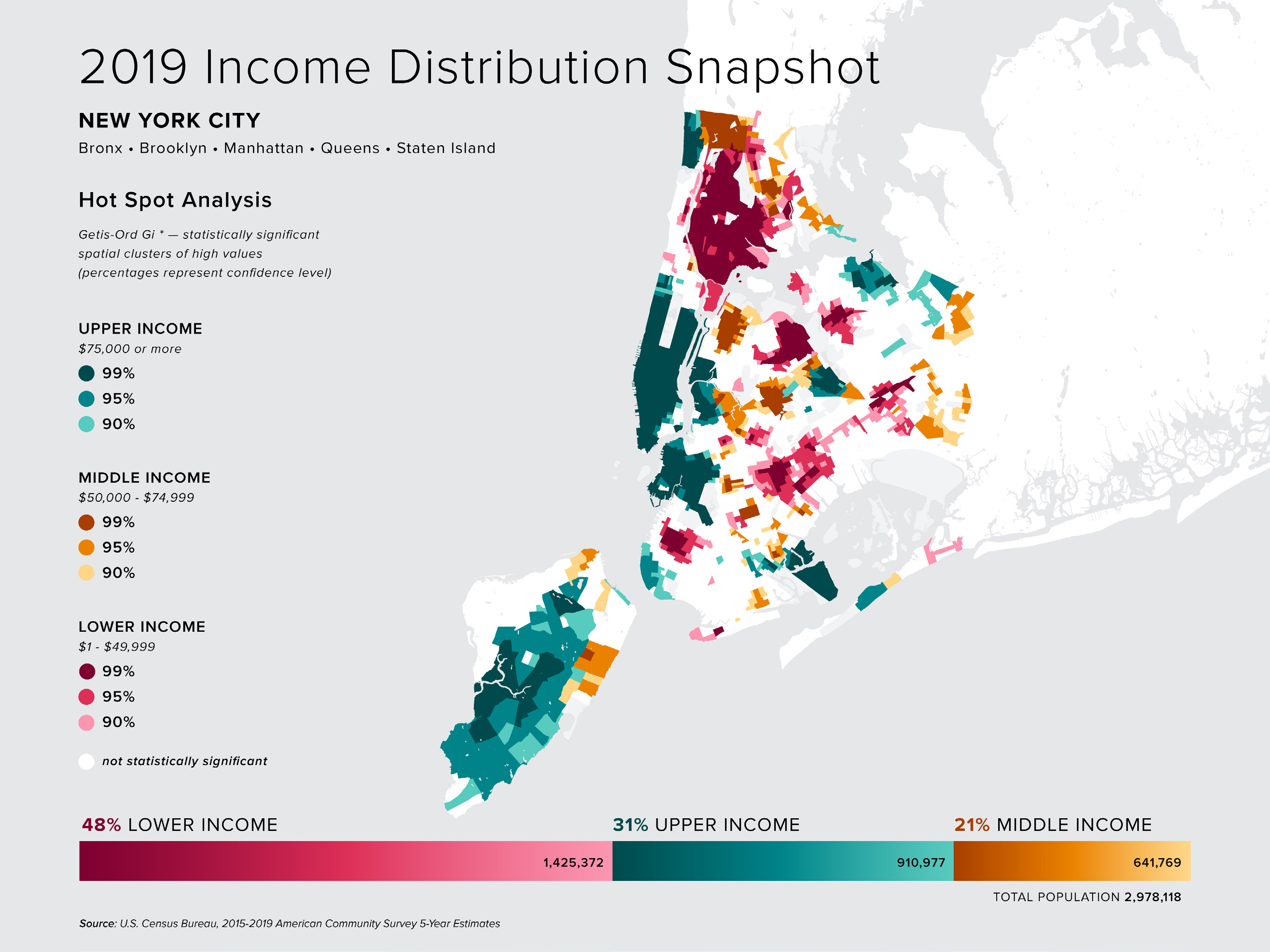
To support spatial analysis, I turned to the 2015–2019 American Community Survey (ACS) from the U.S. Census Bureau. This dataset provides a pre-pandemic snapshot of income for individuals aged 16 and older with full-time earnings. Income was categorized into eight brackets and reported as a percentage of the population within each census tract—already normalized for comparison.
The final dataset includes more than 72,500 census tracts across the contiguous United States, representing over 99% of the country.
Use side arrows to scroll through project
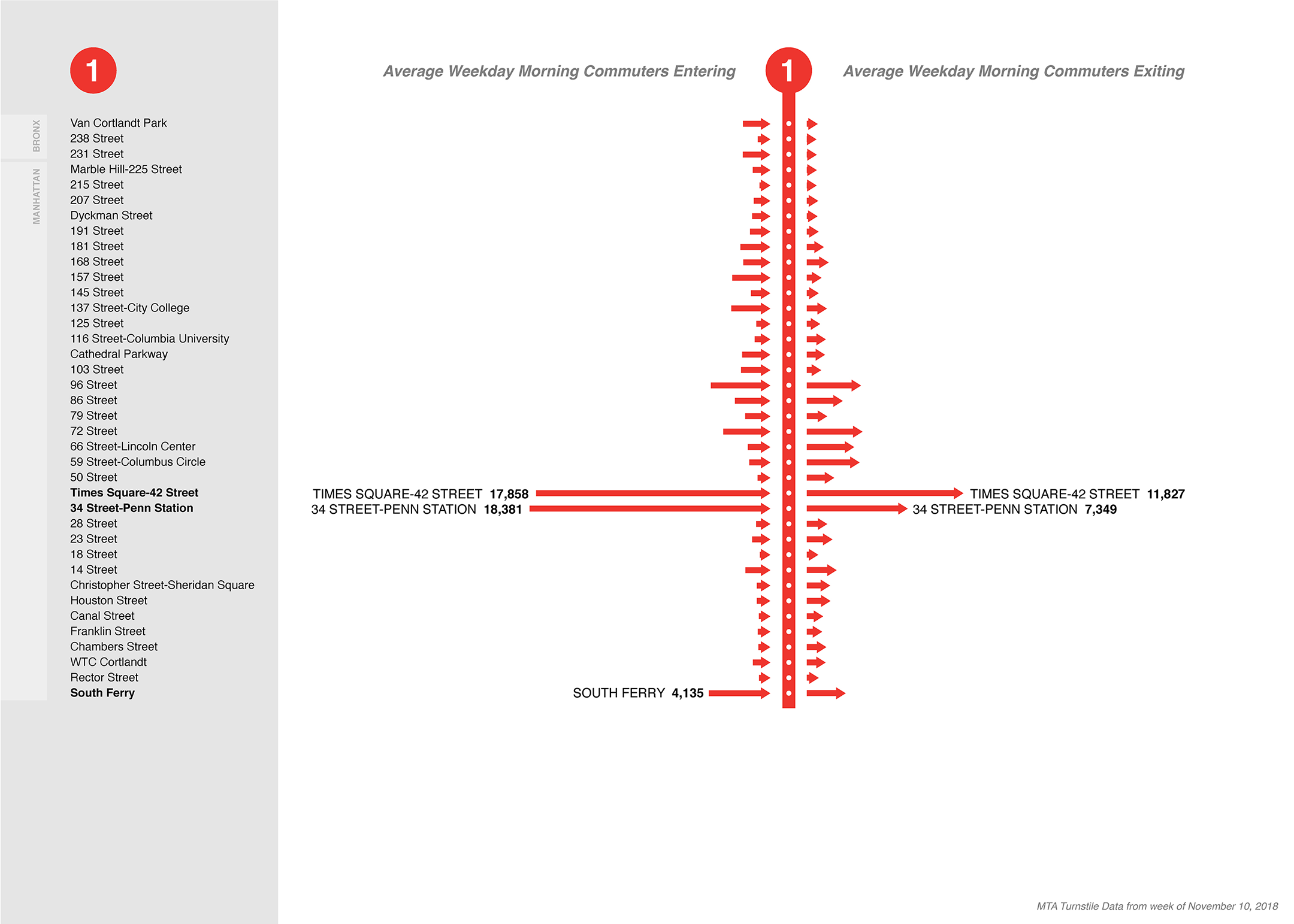
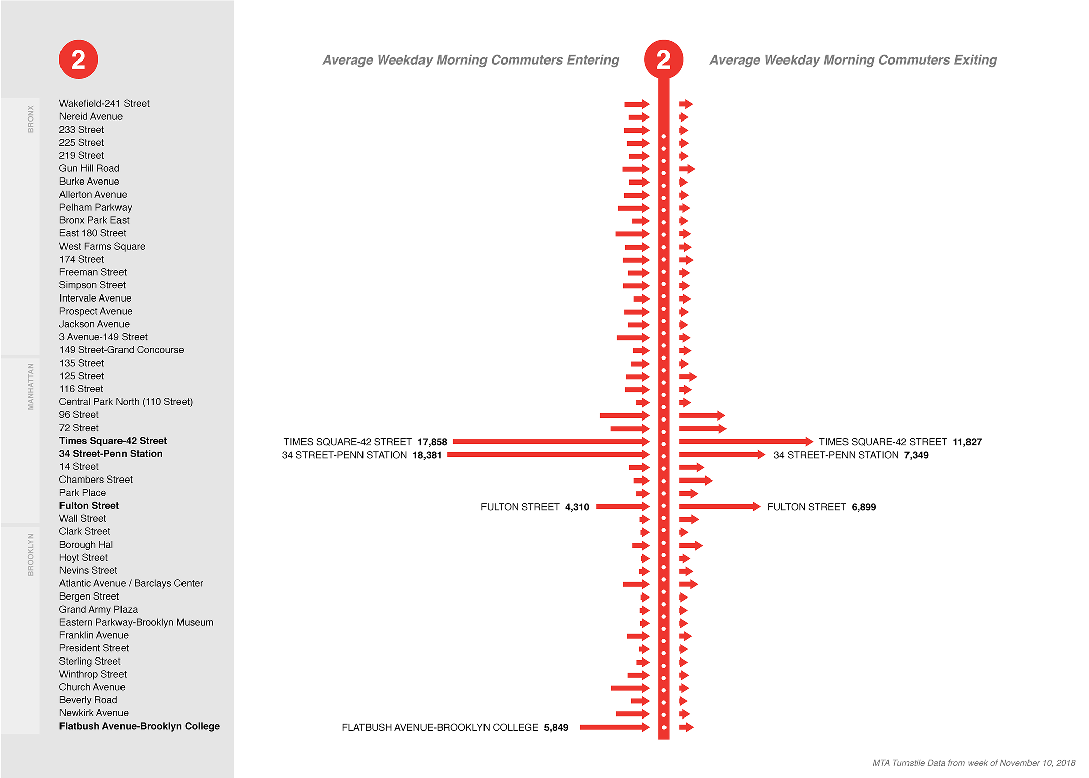
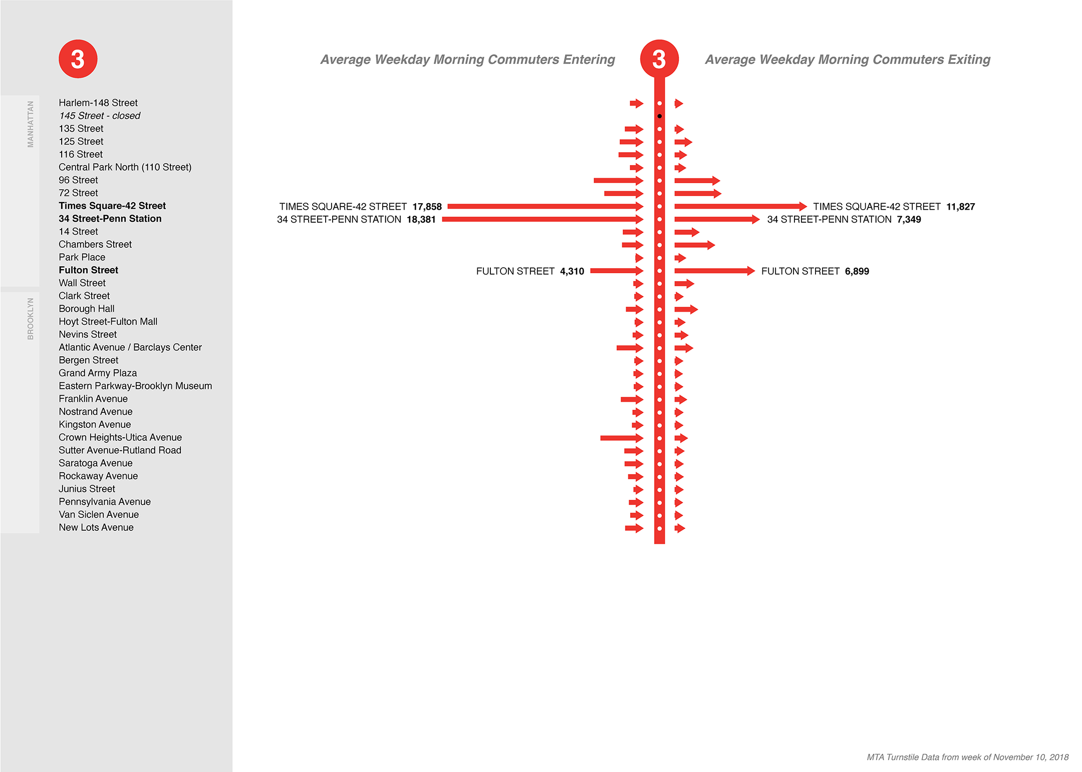
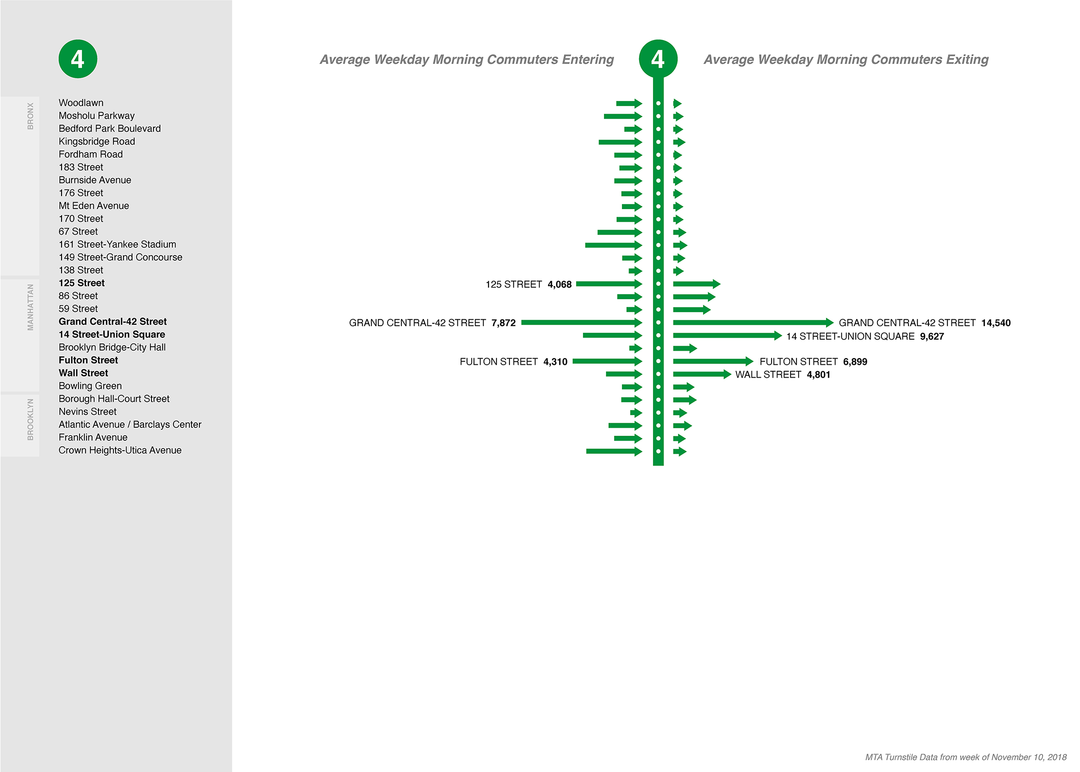
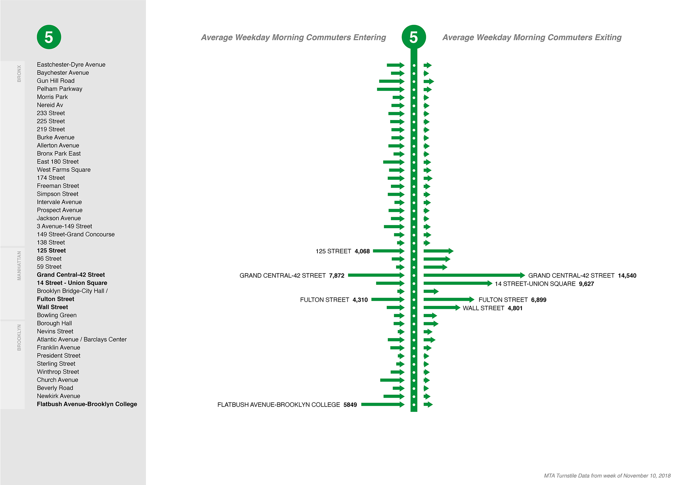
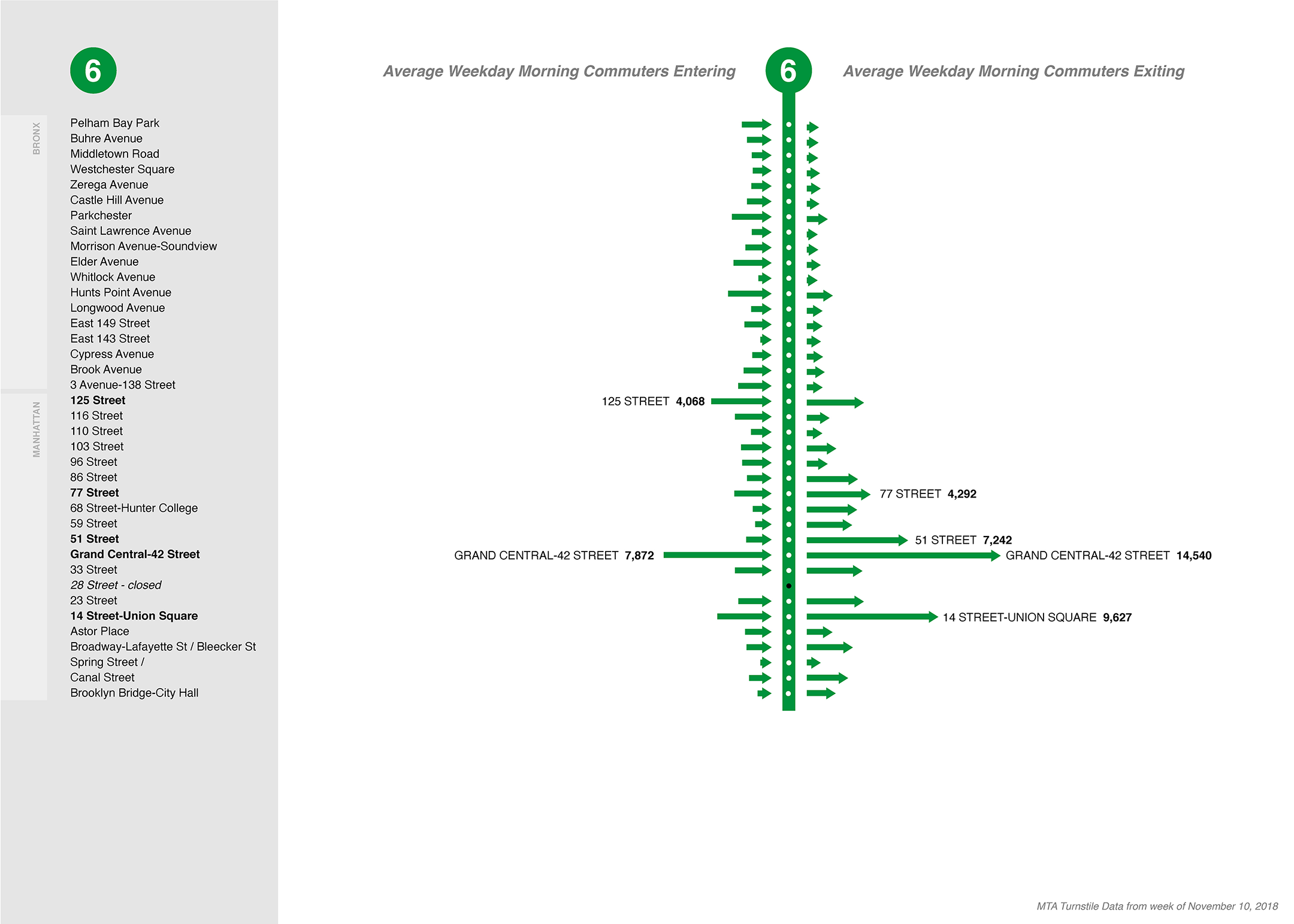
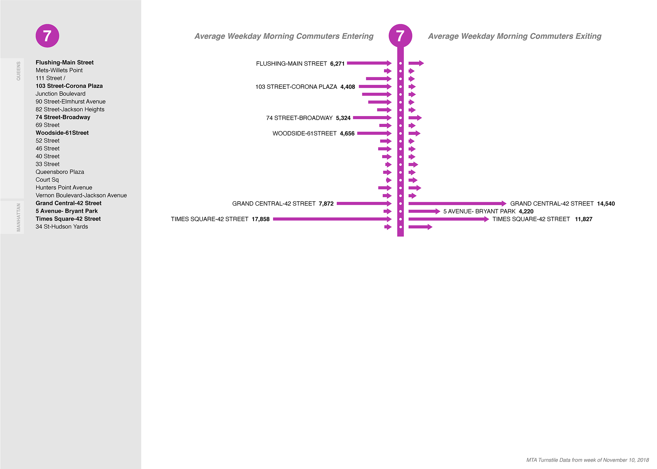
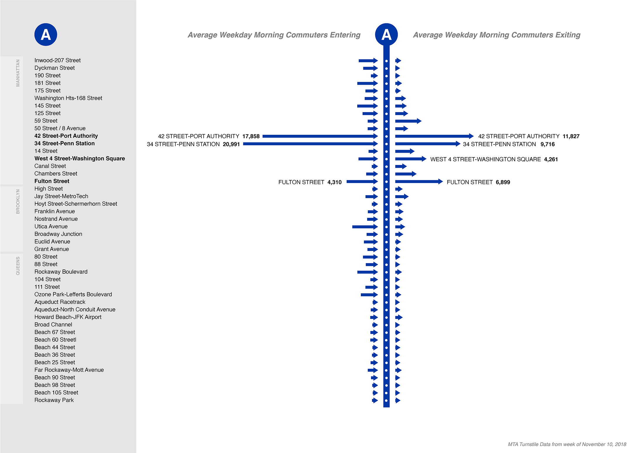
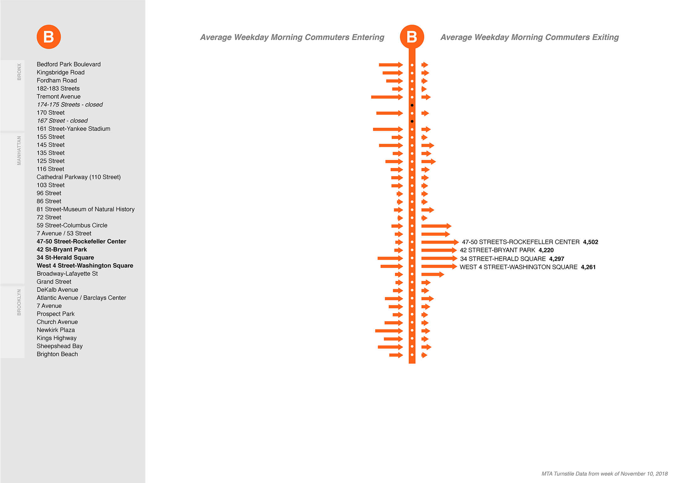
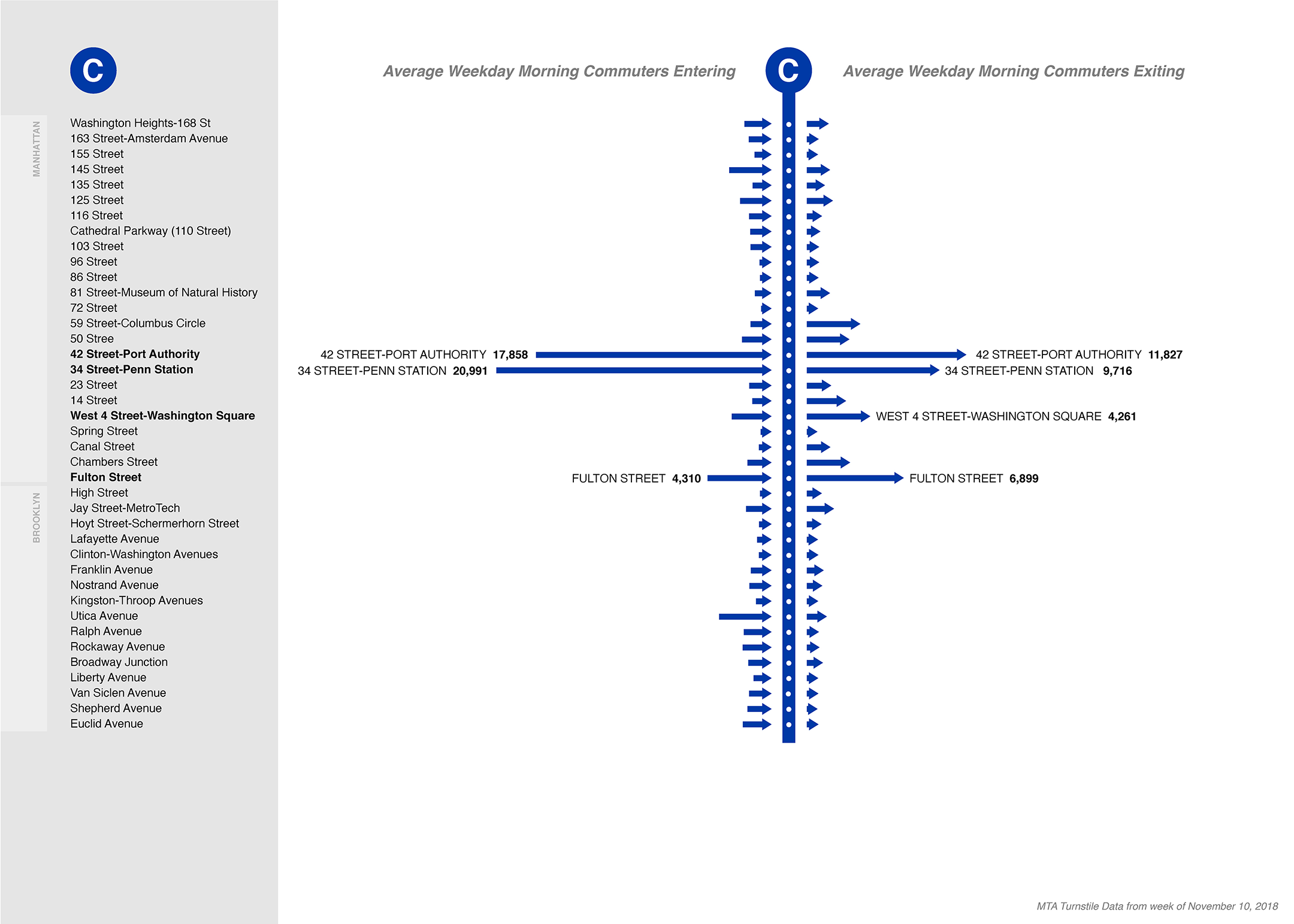
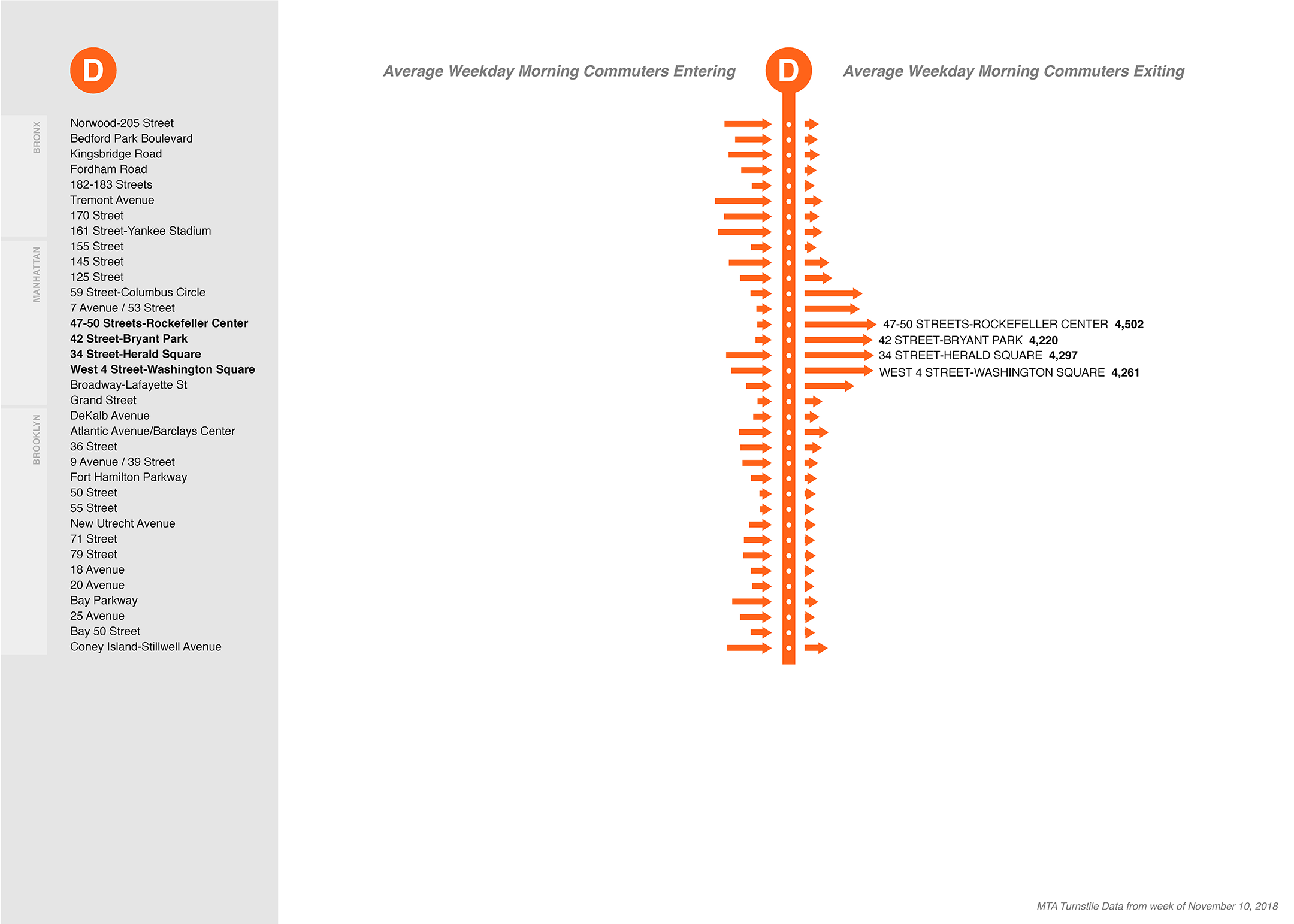
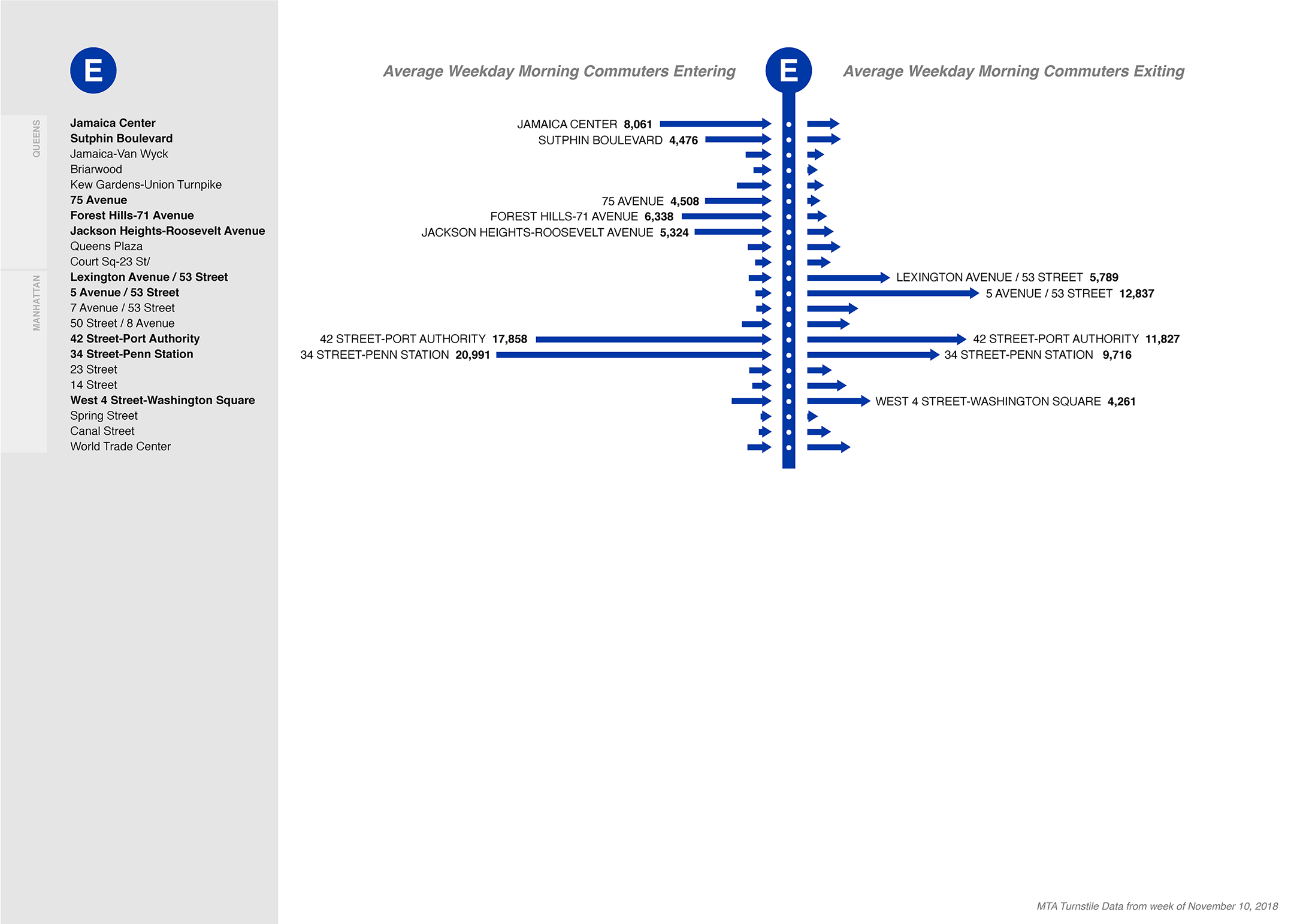
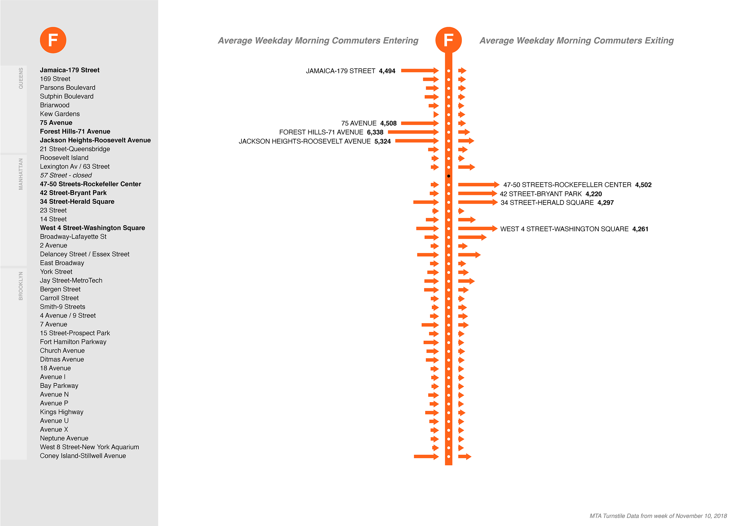
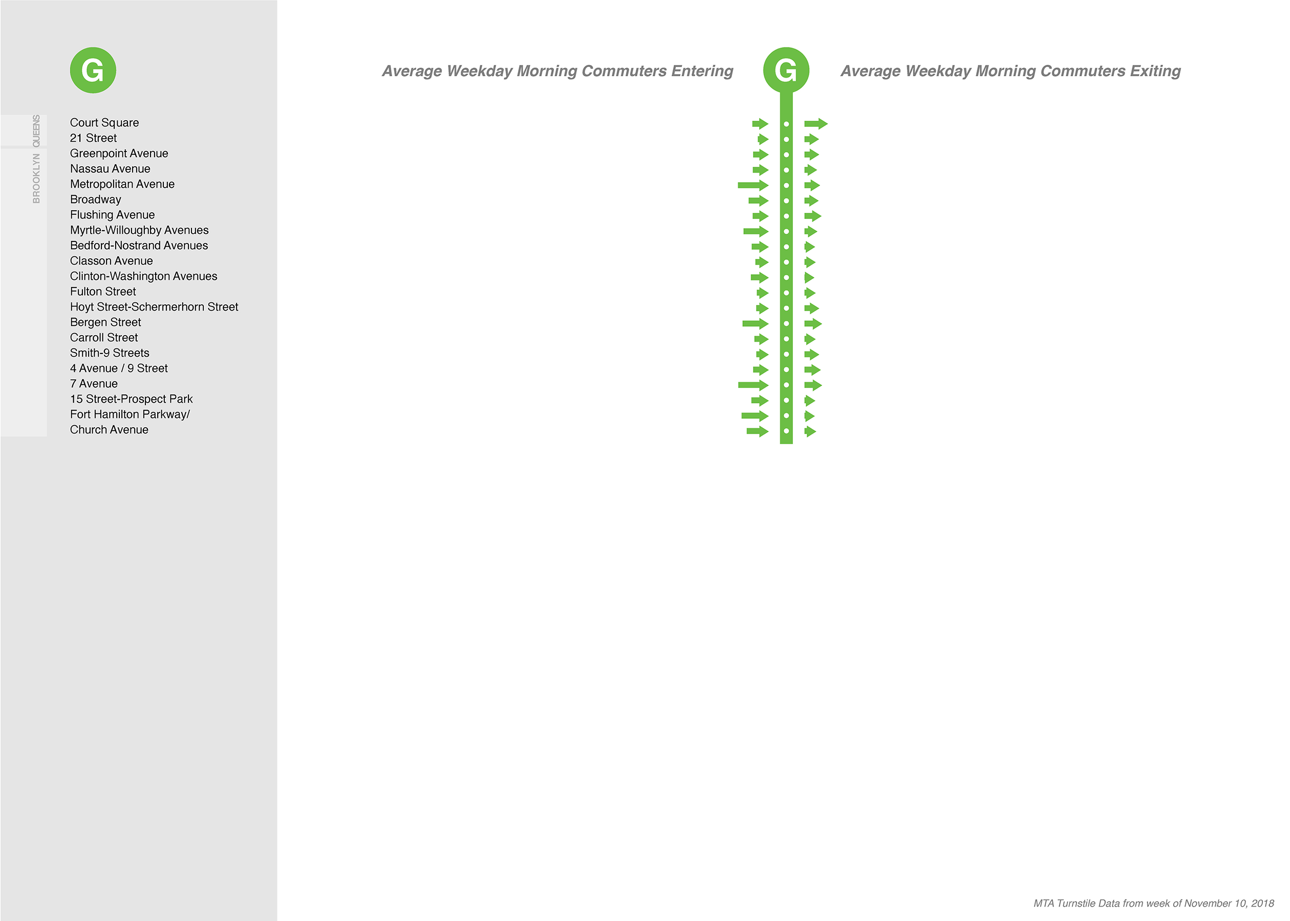
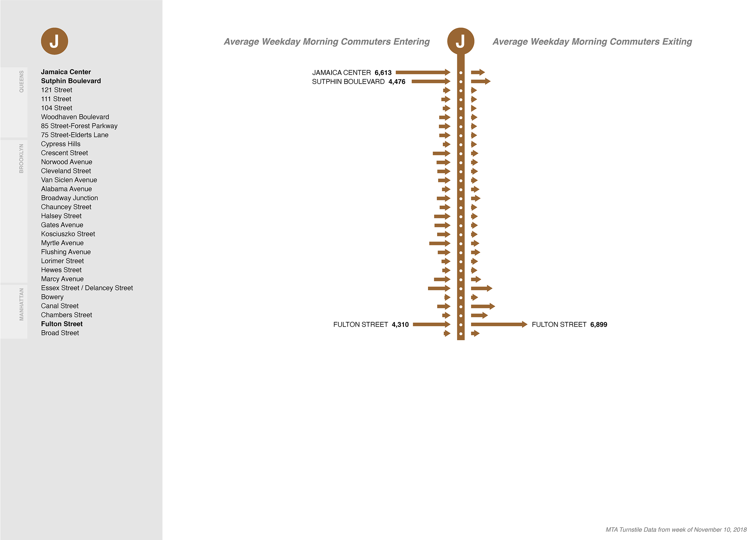
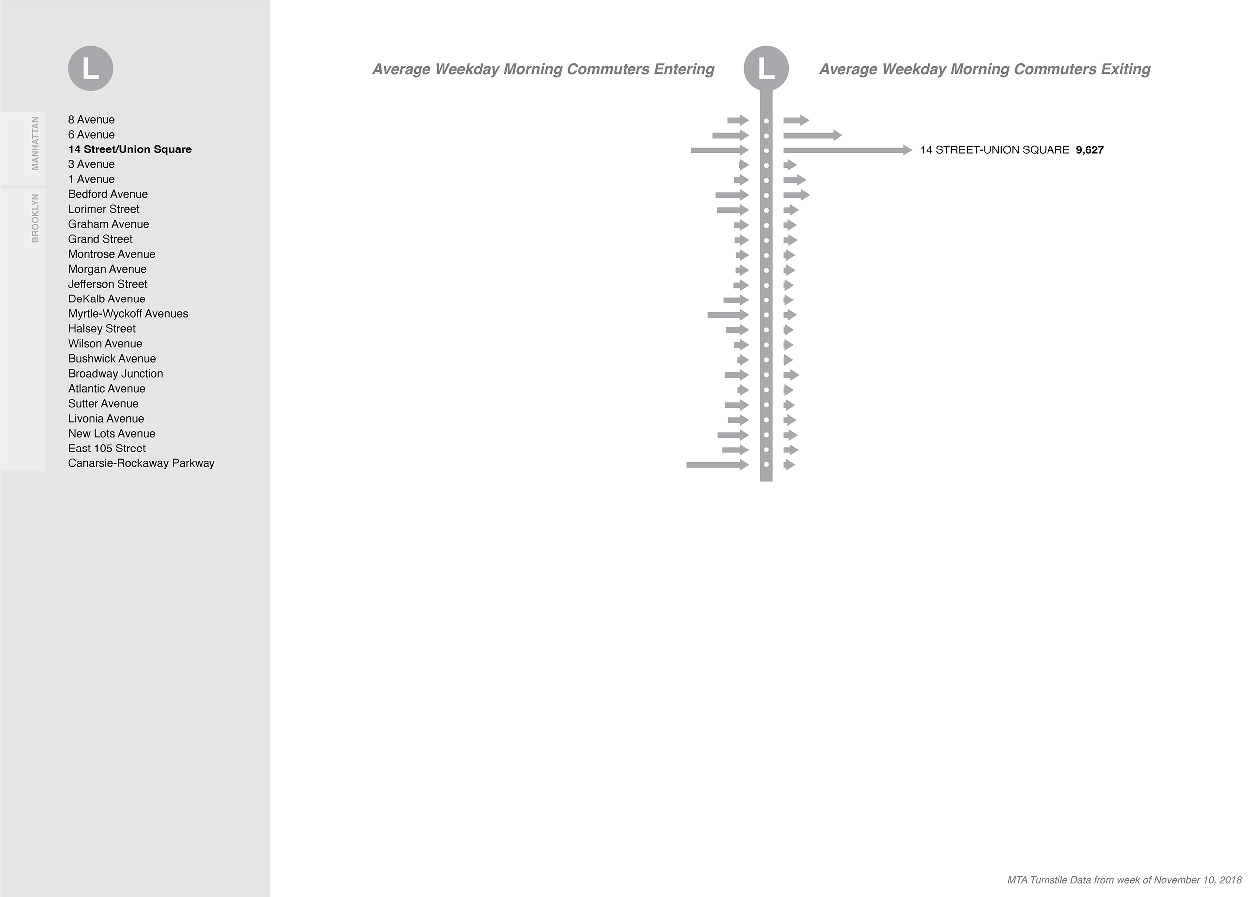
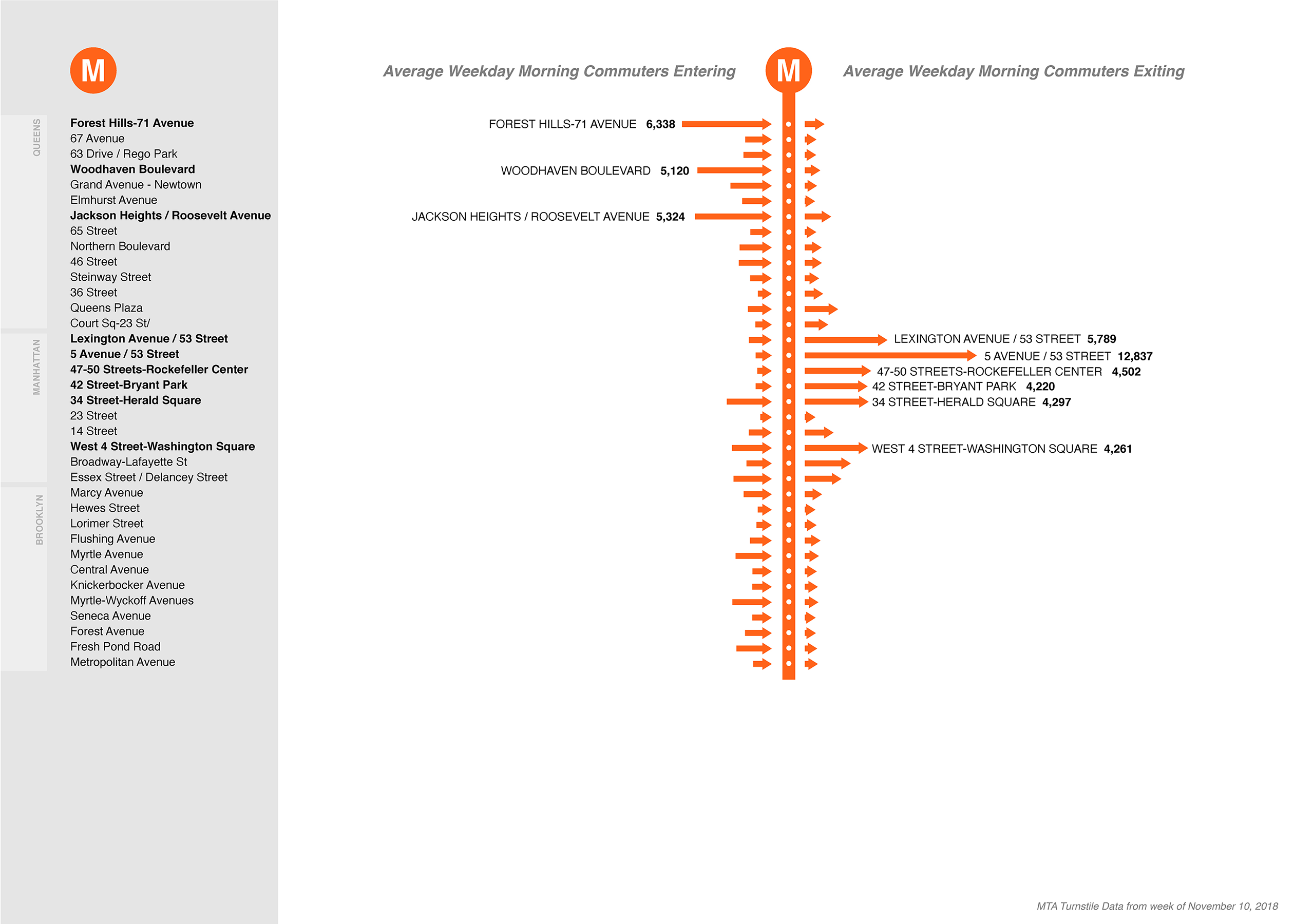
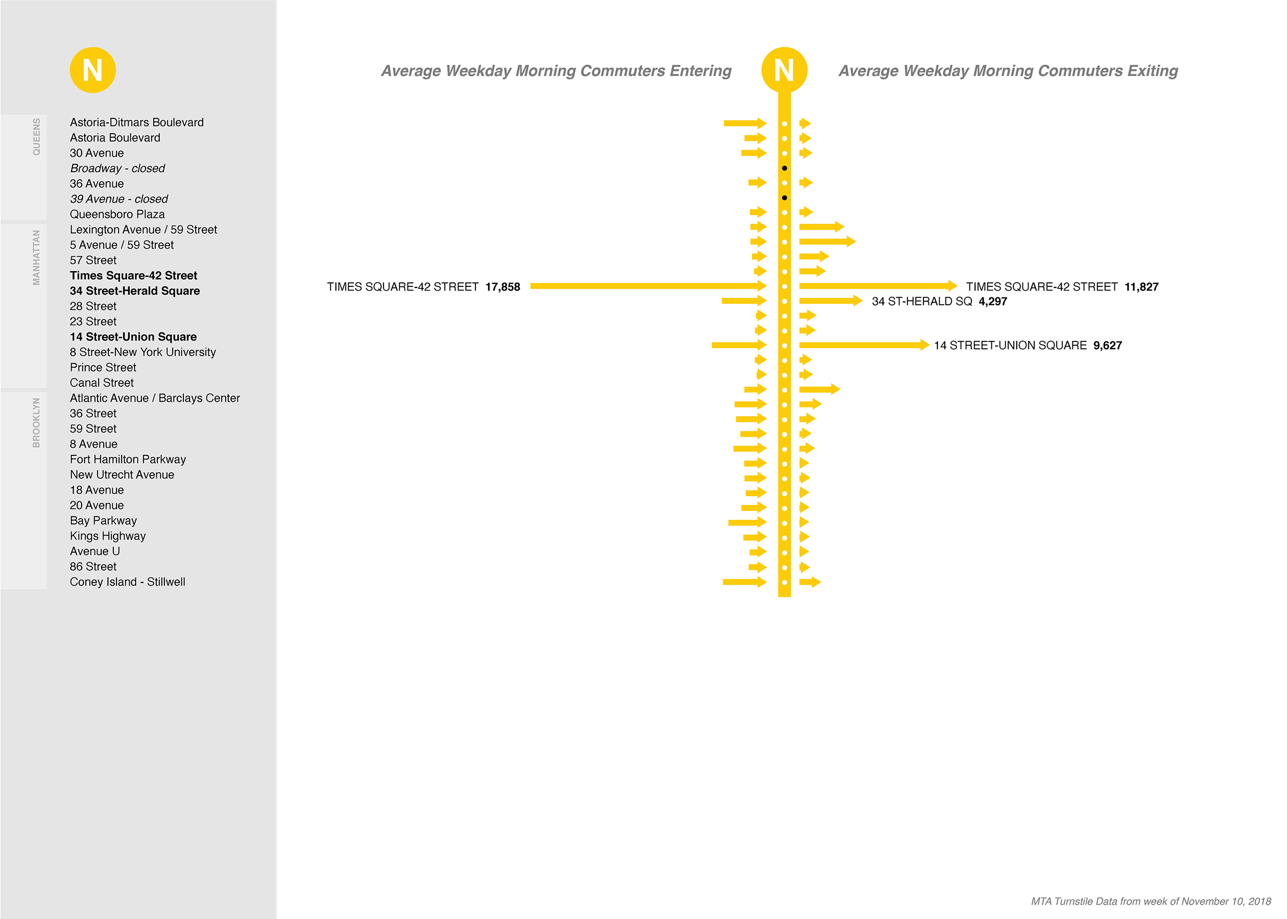
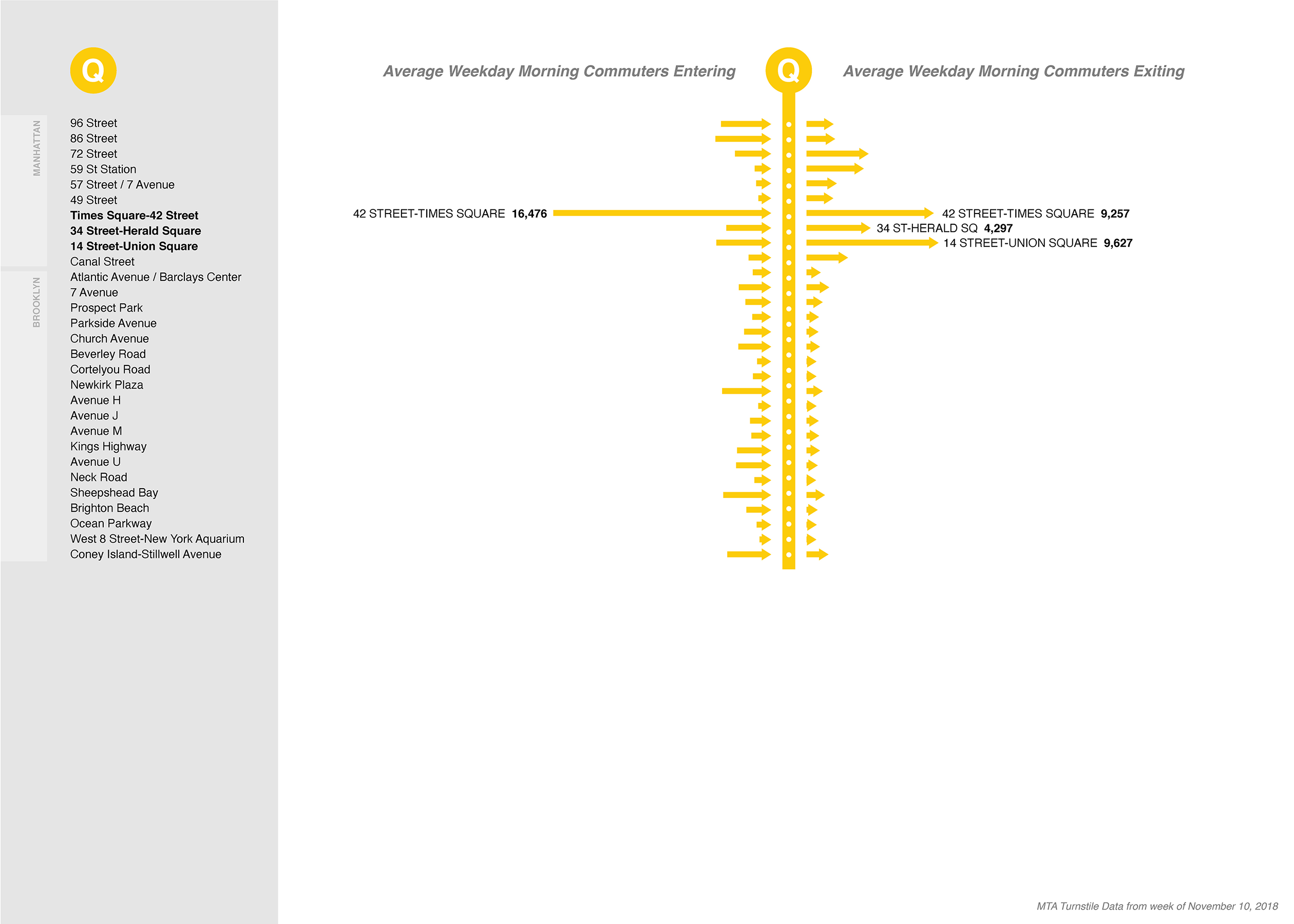
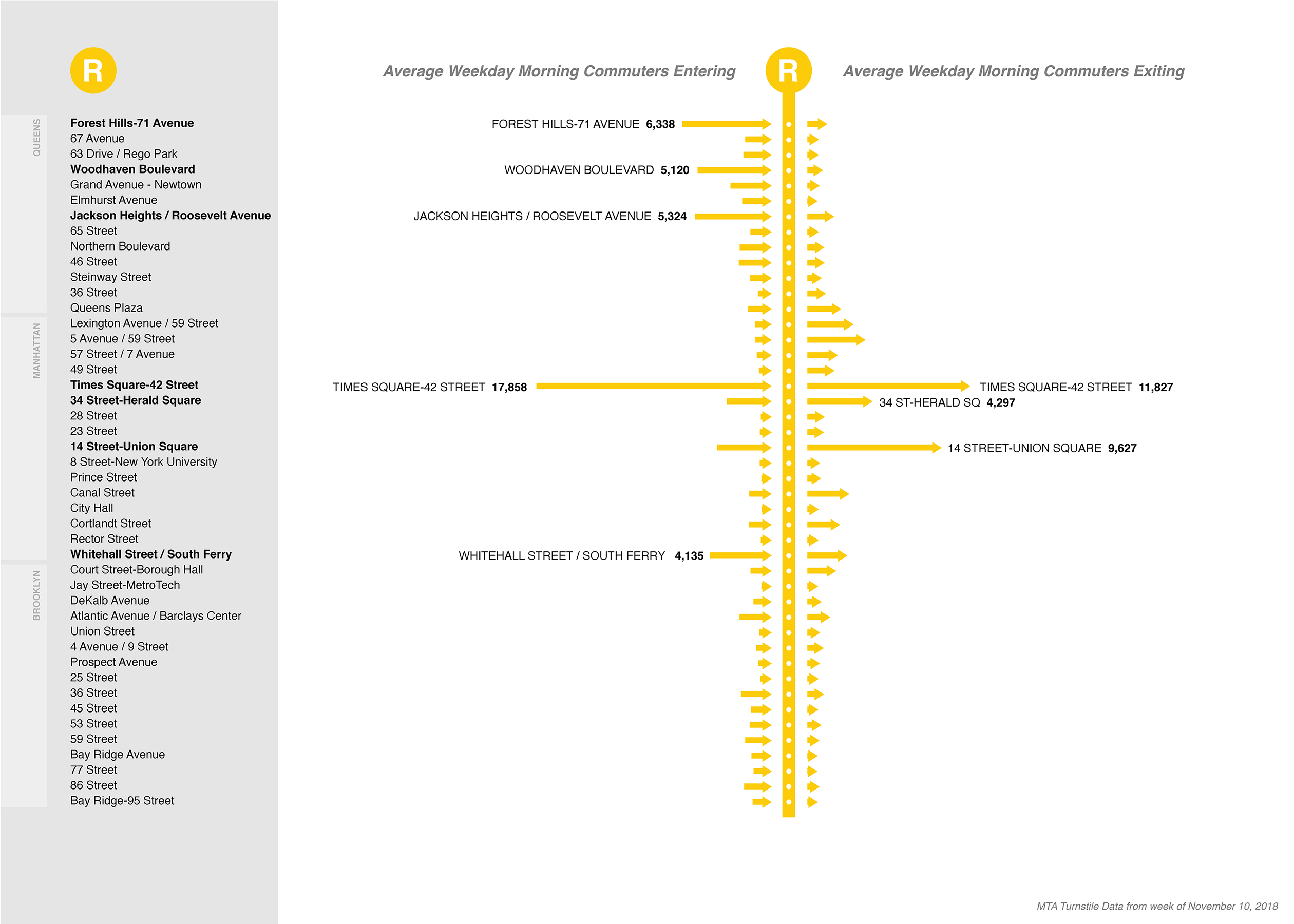
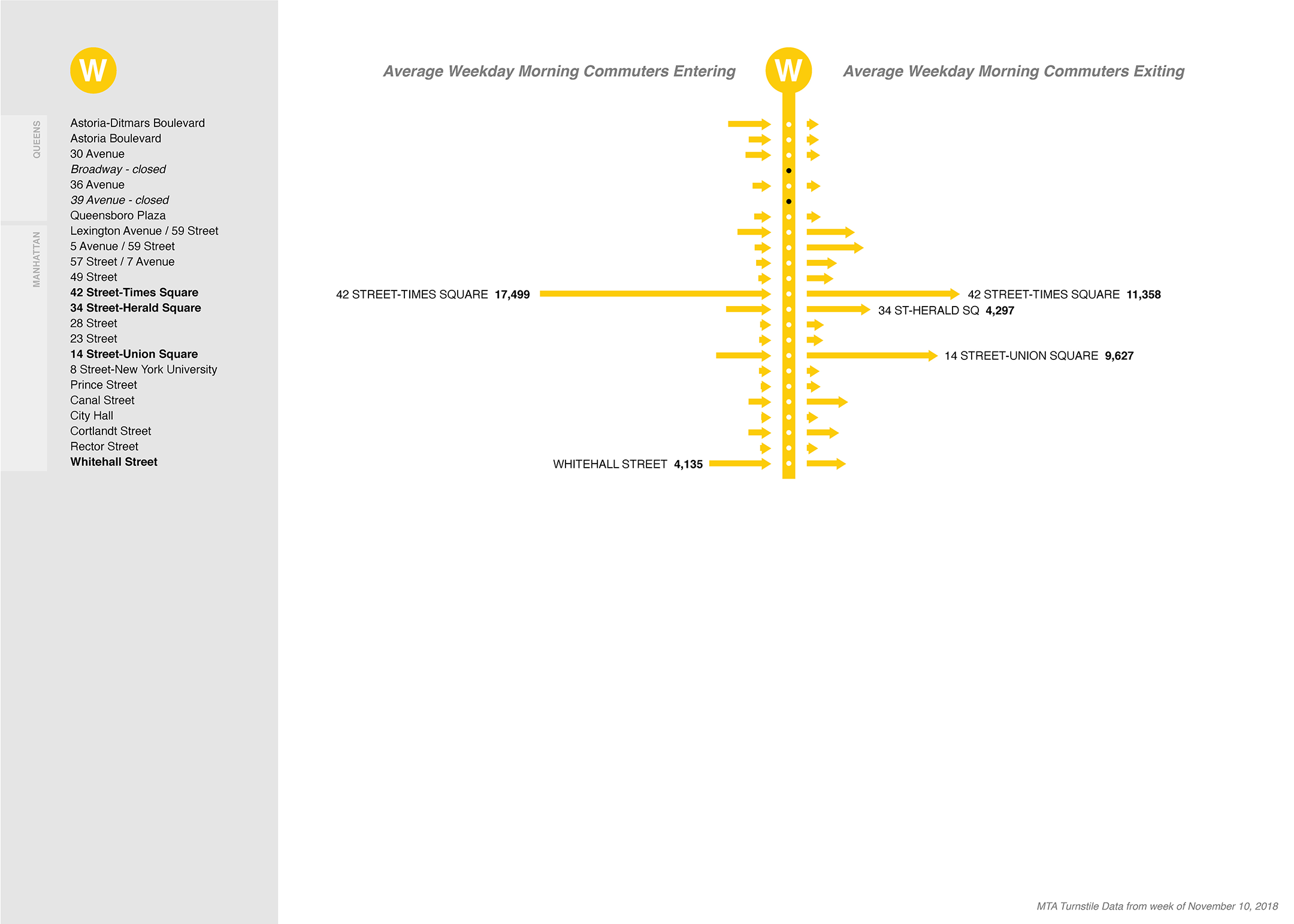
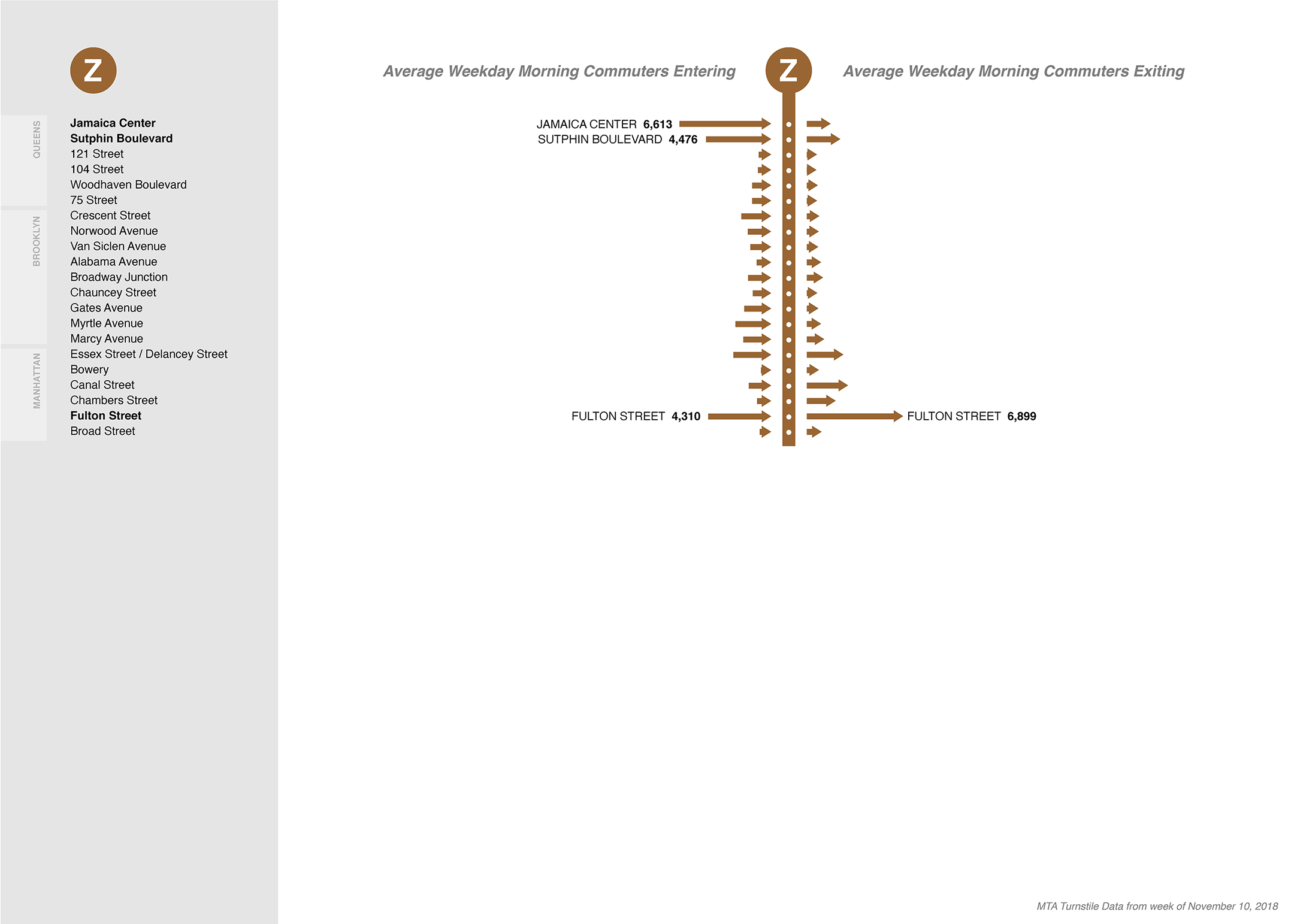
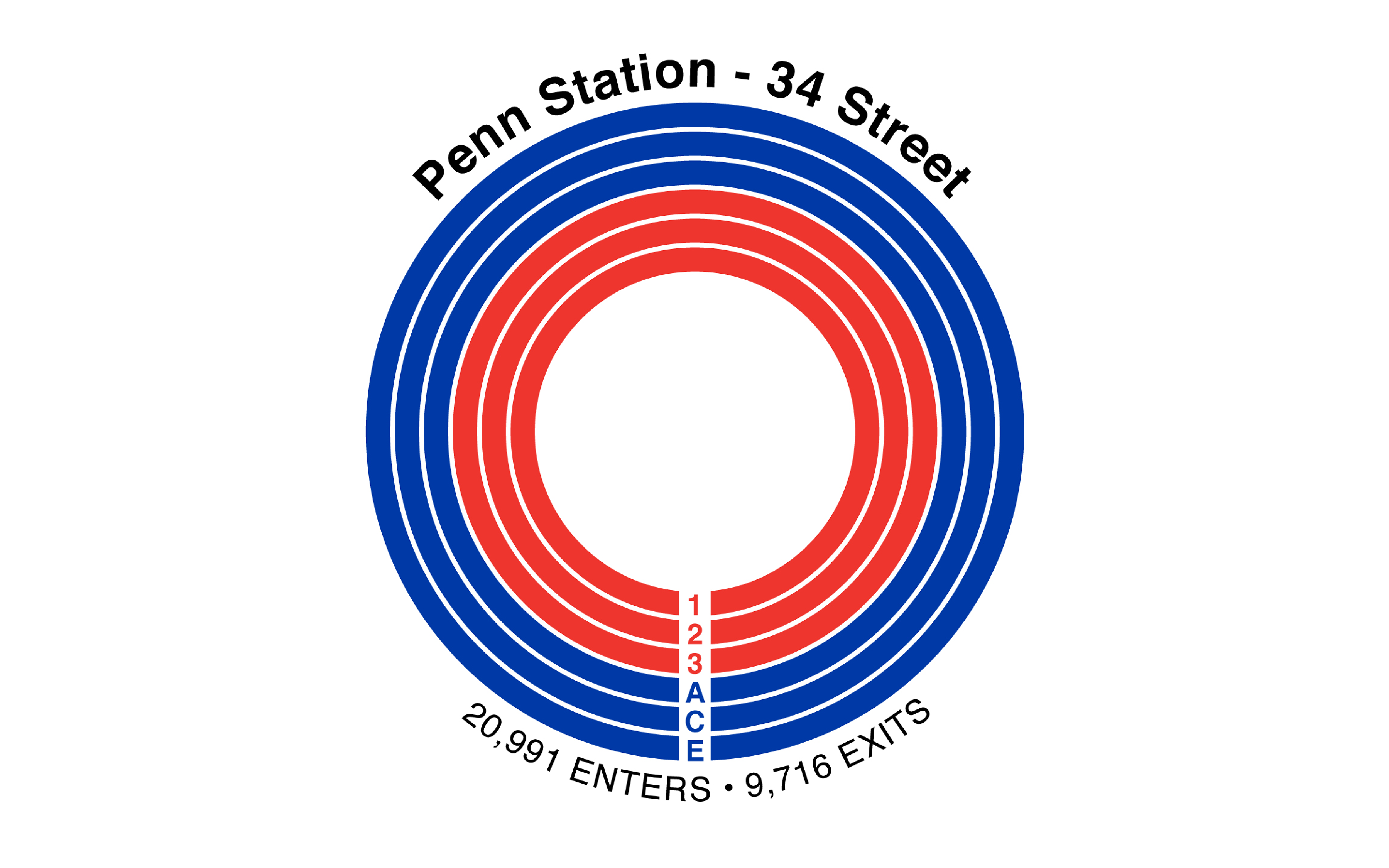
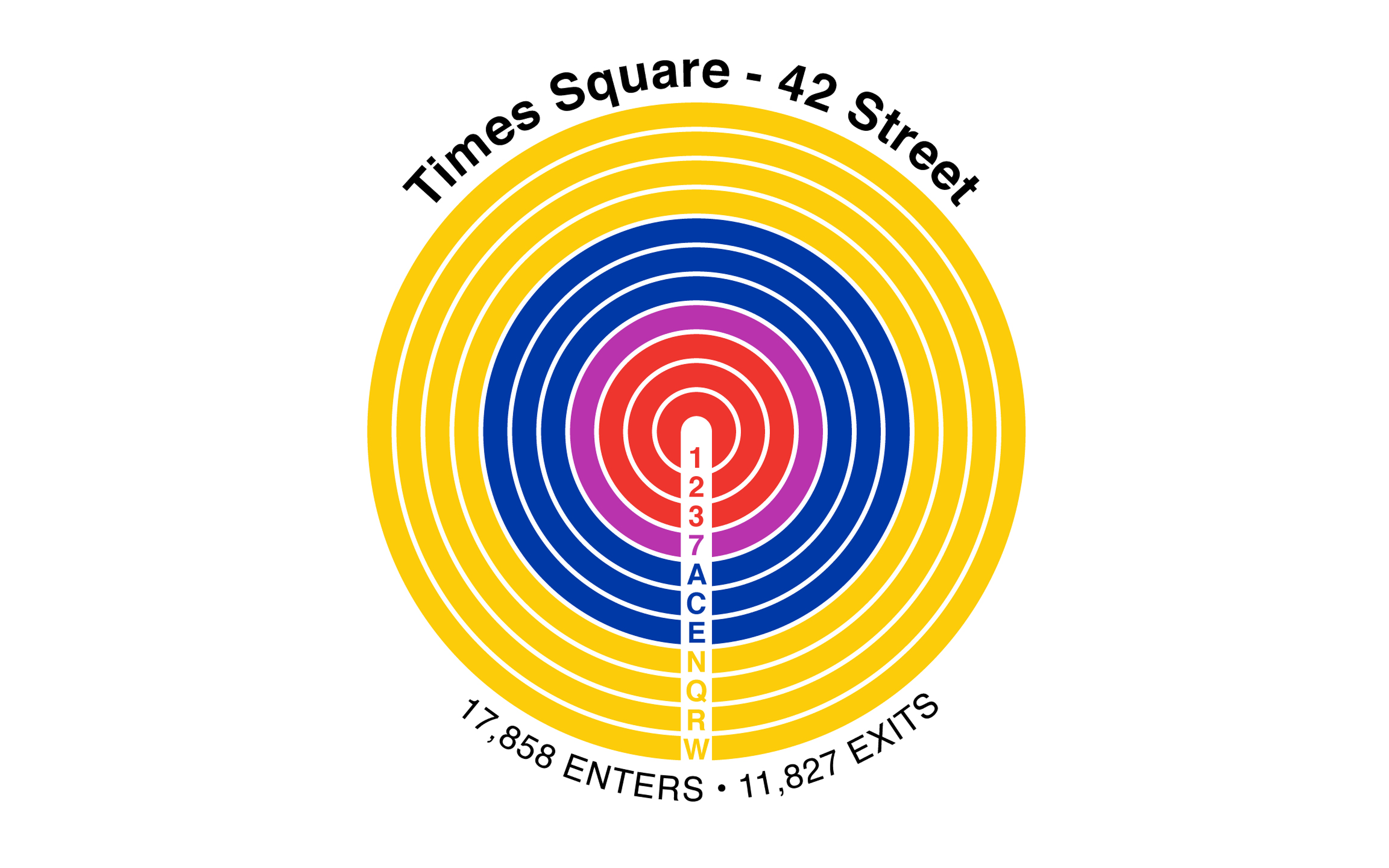
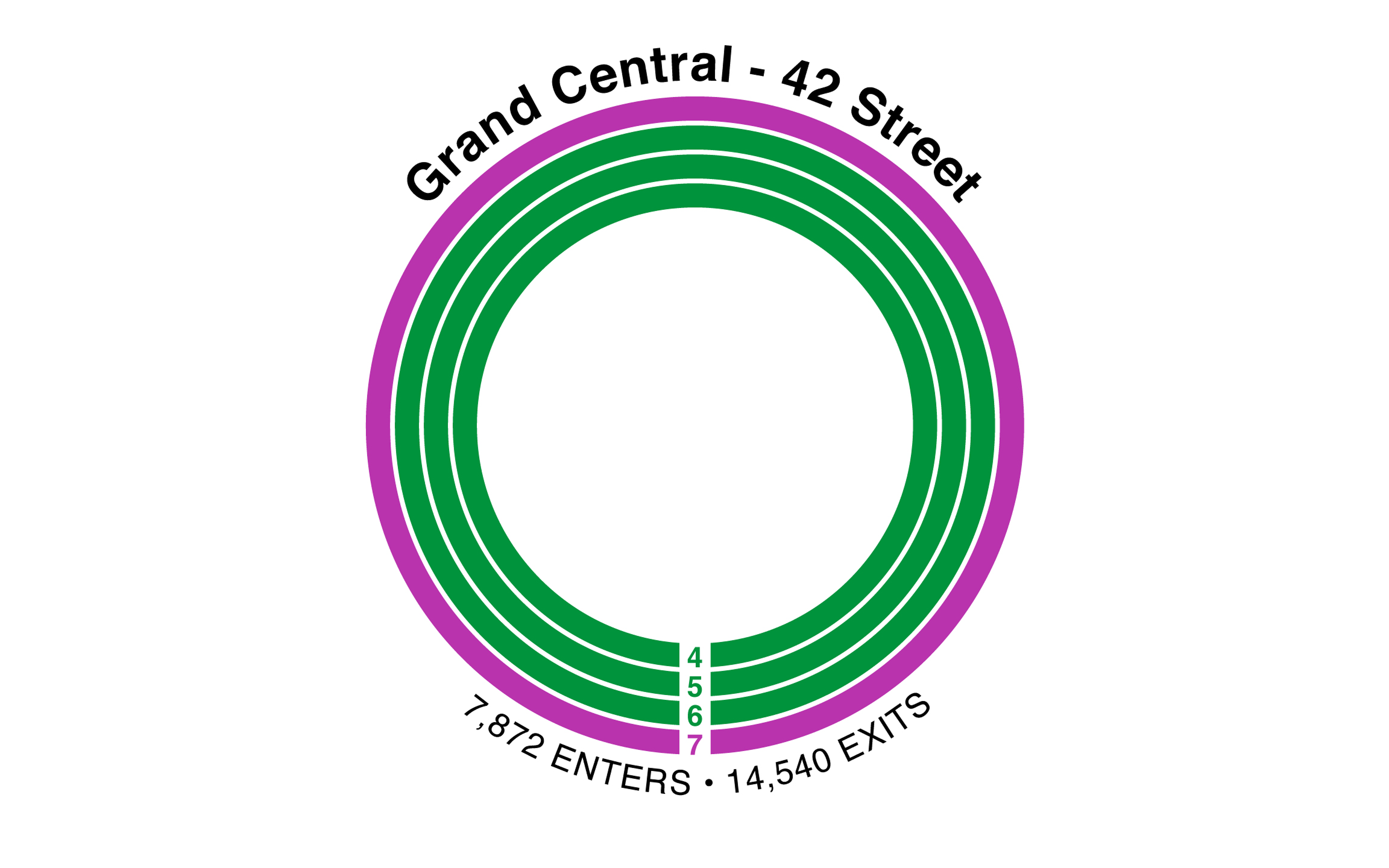
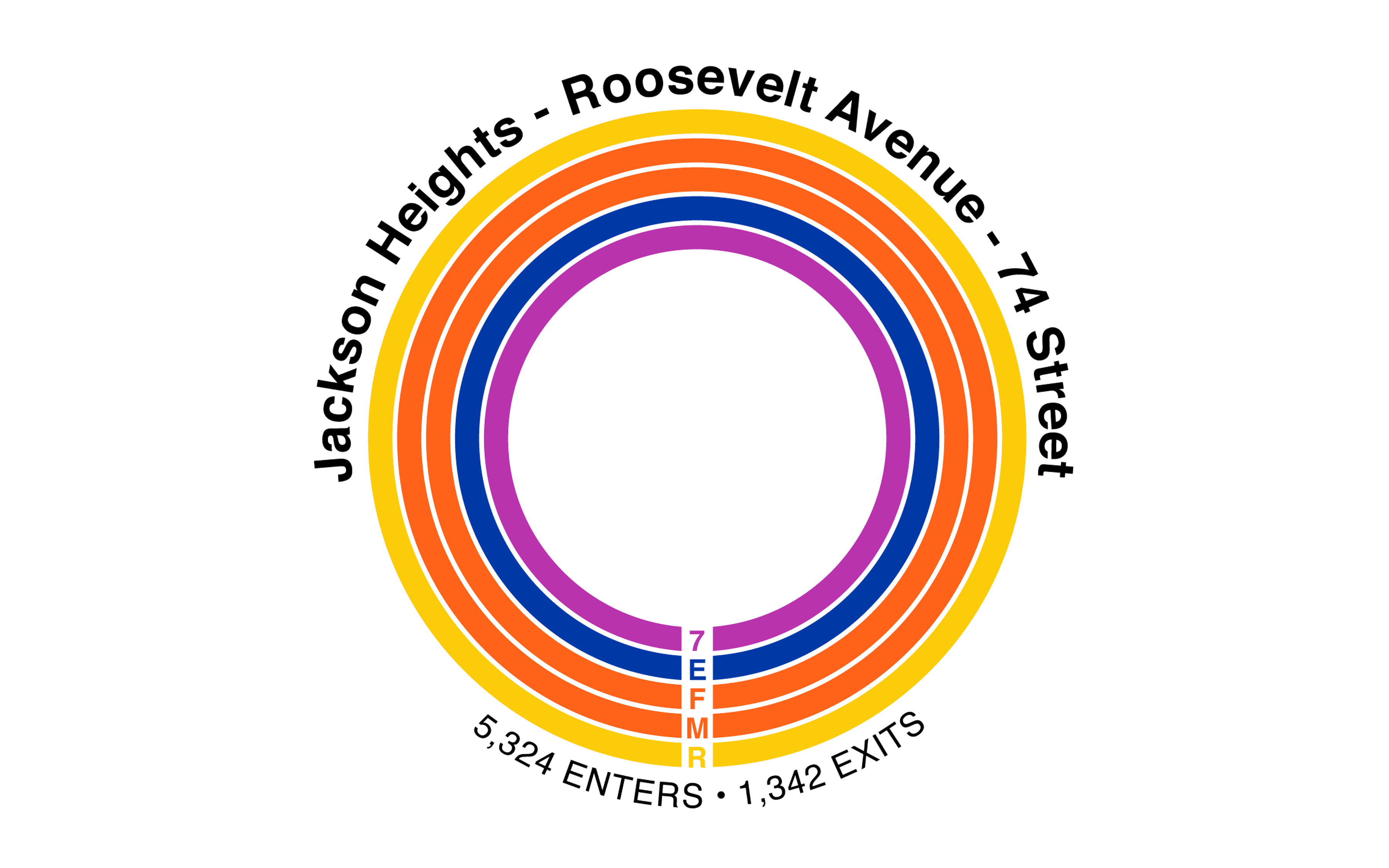
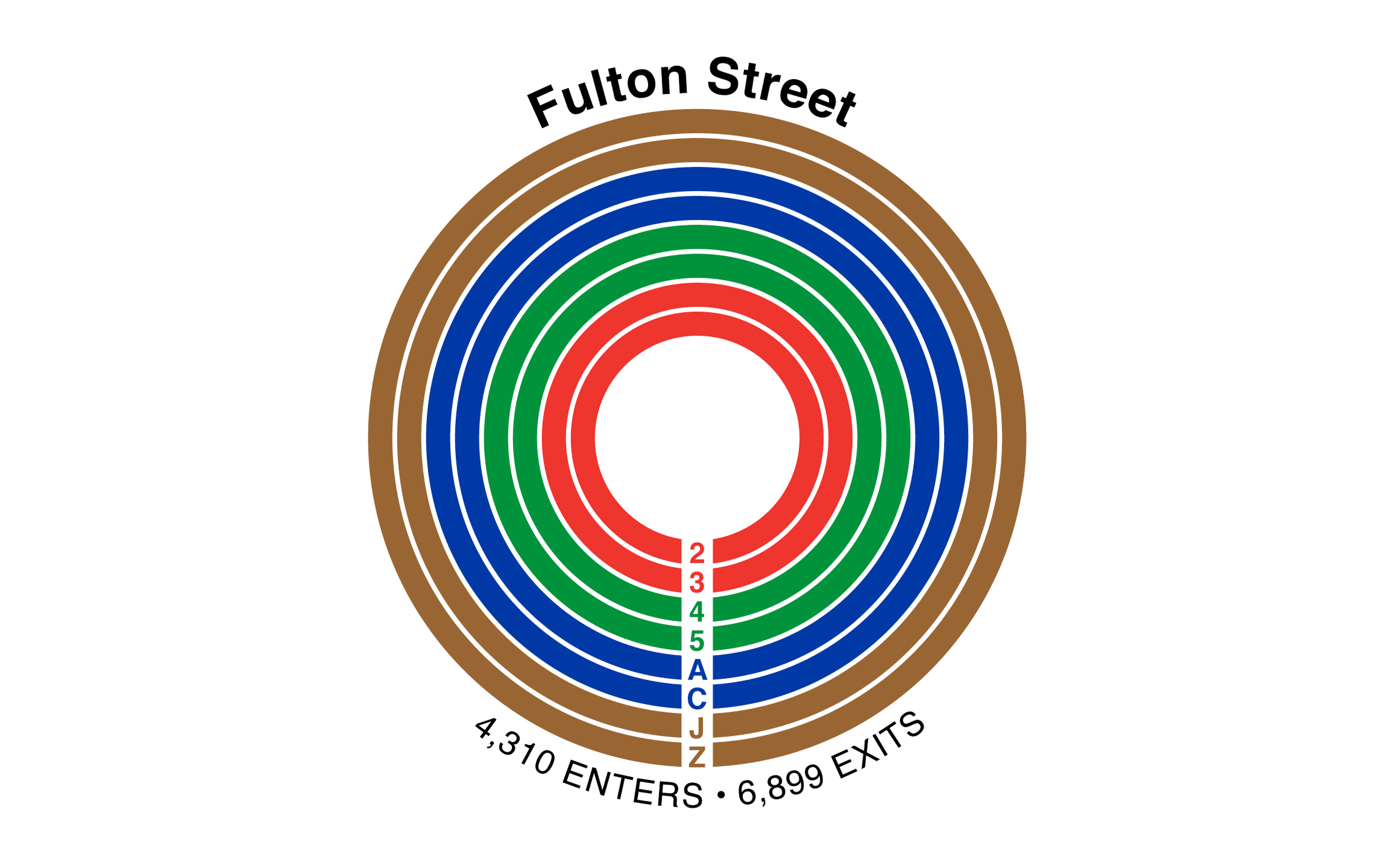
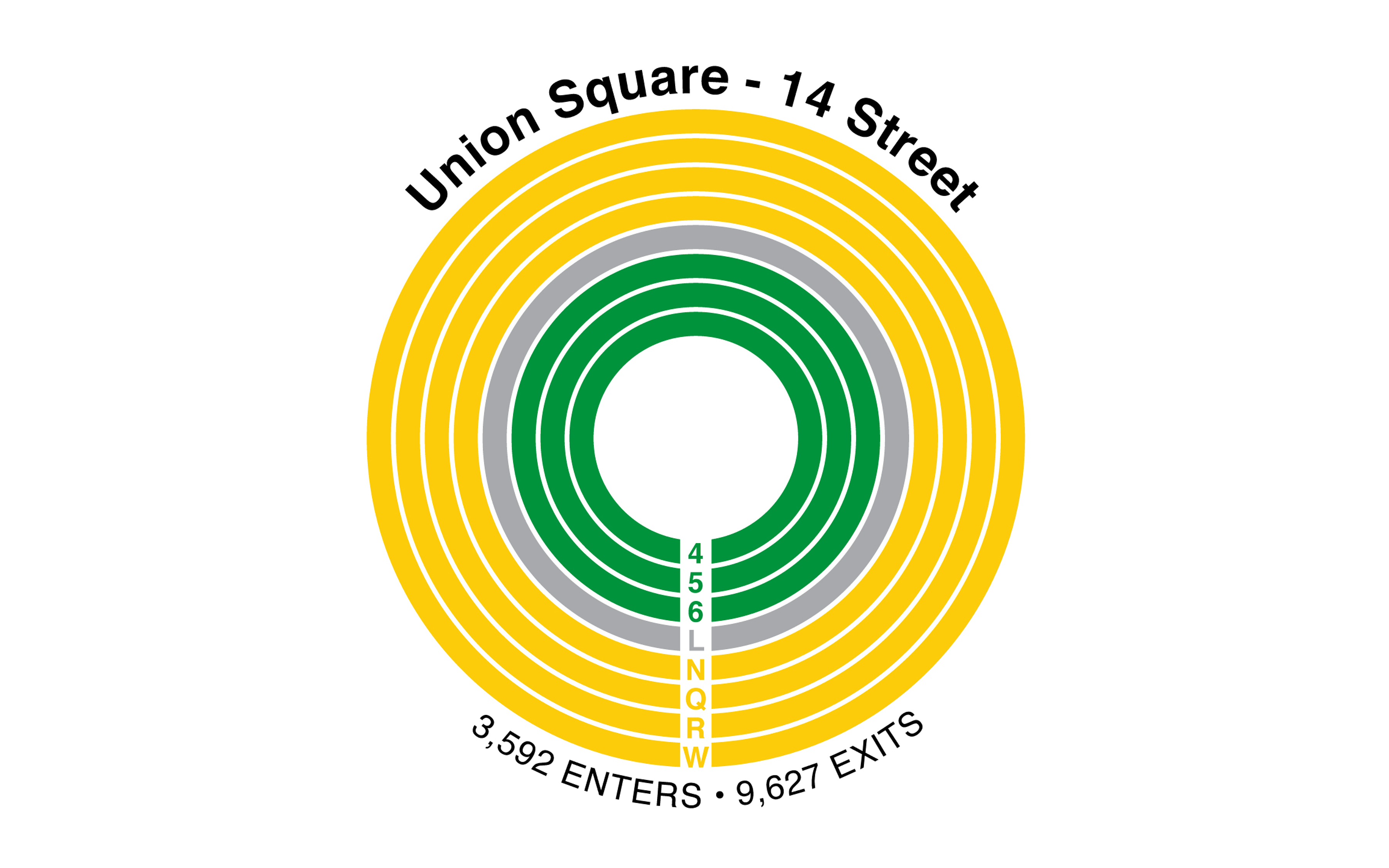
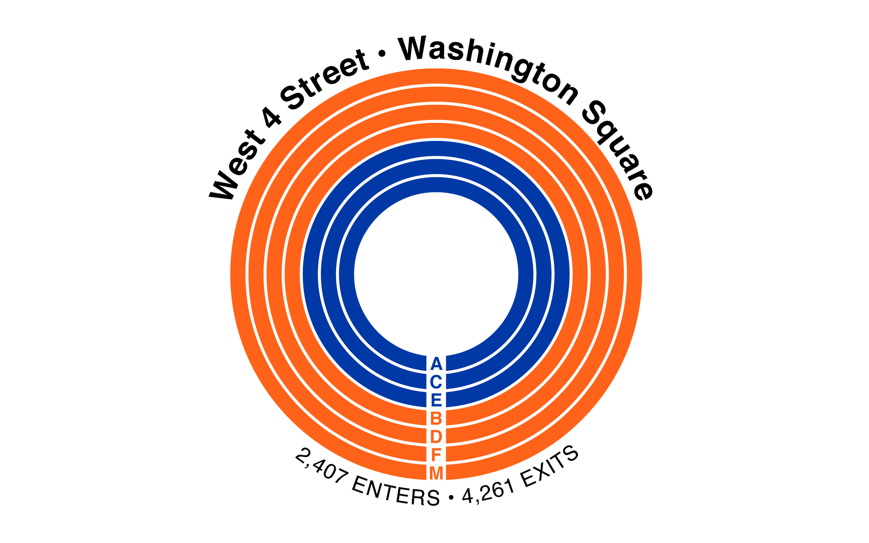
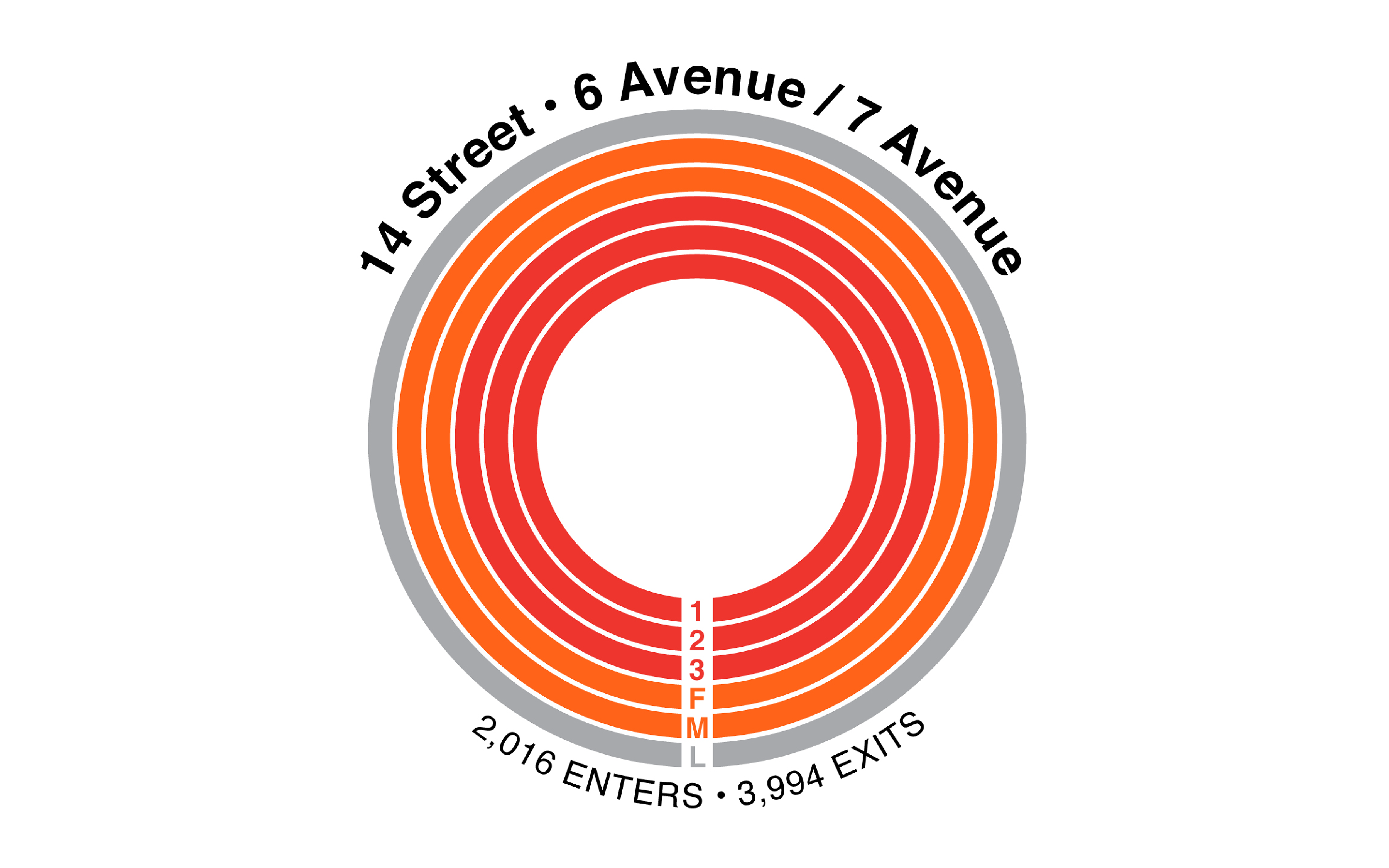
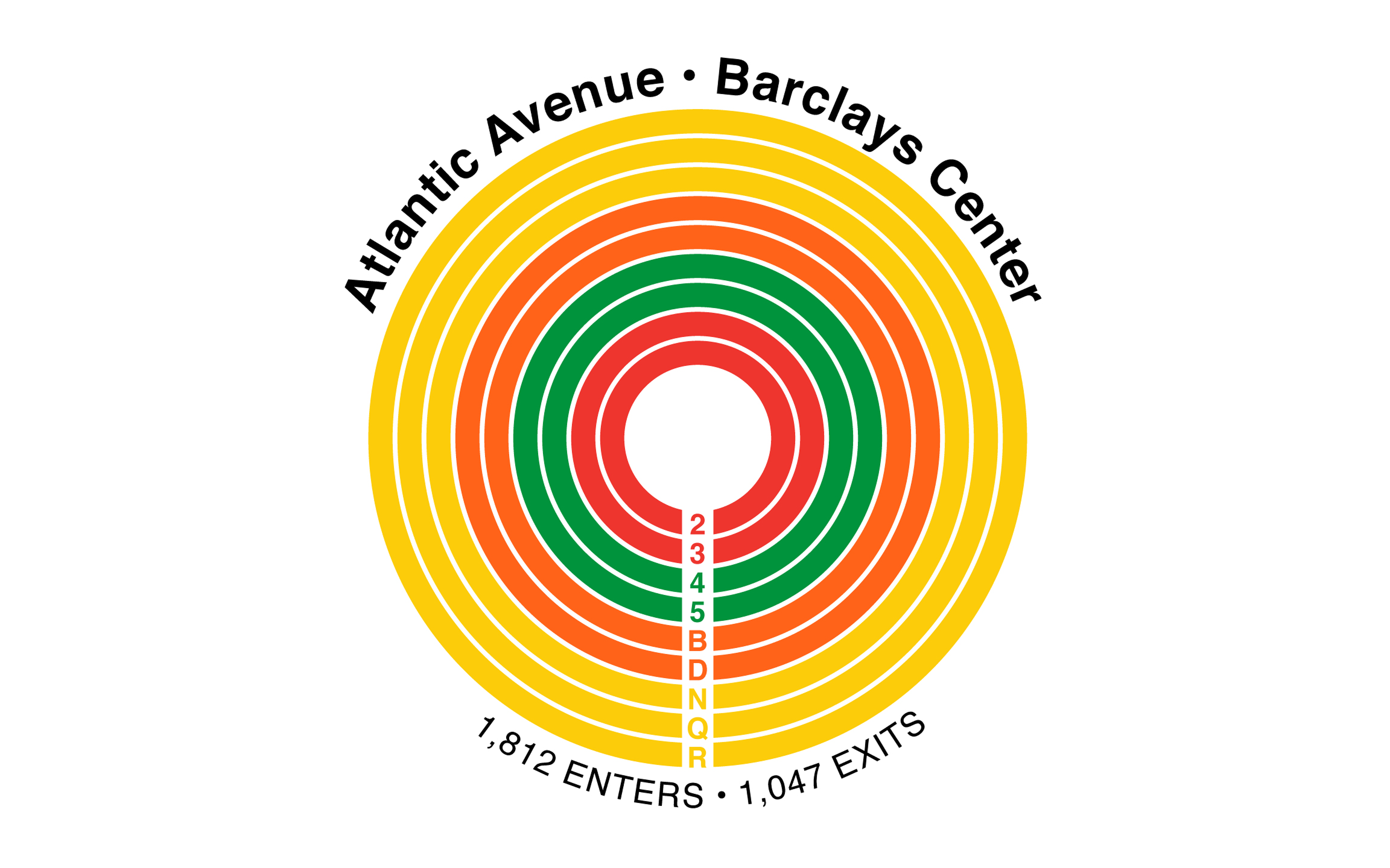
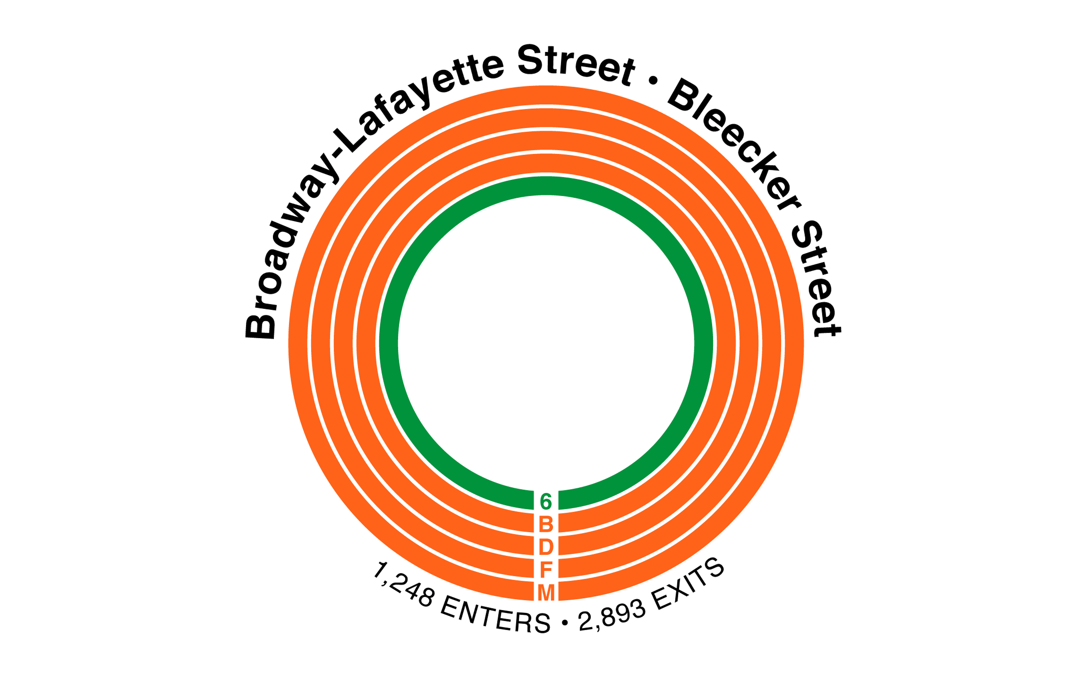
For my first substantial Python project, I cleaned and analyzed turnstile data from the Metropolitan Transportation Authority (MTA), collected over one week in November 2018. The dataset included every recorded entry and exit at each subway turnstile across all stations in the system.
I chose to focus specifically on weekday morning commuters, examining where riders entered and exited the subway during peak hours. While the dataset captures station-level movement, it does not account for specific train lines used or transfers made within stations—limitations that informed both the scope and interpretation of the analysis.
Initial visualizations were created in Python using Matplotlib, then refined and designed for presentation in Adobe Illustrator.
Use side arrows to scroll through project
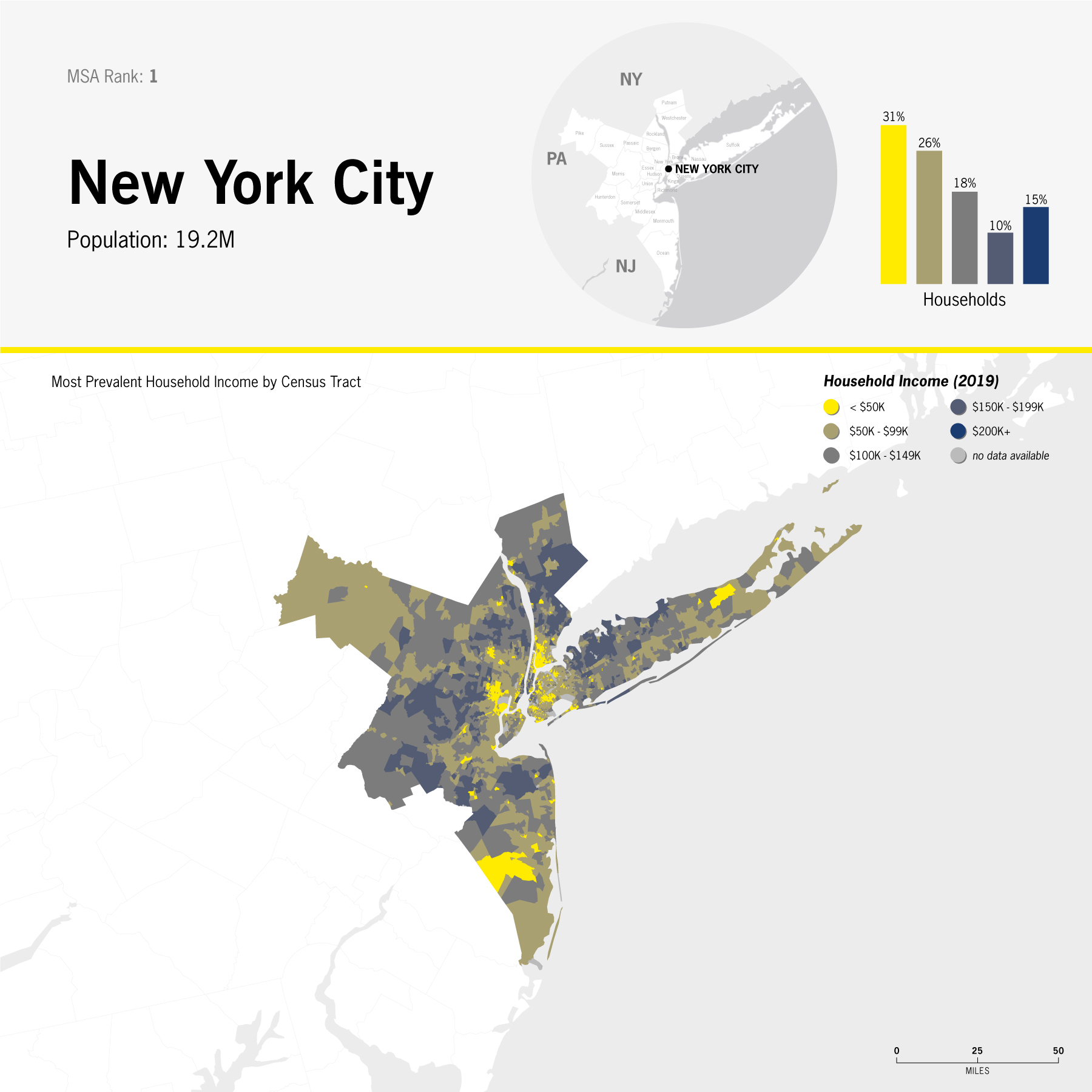
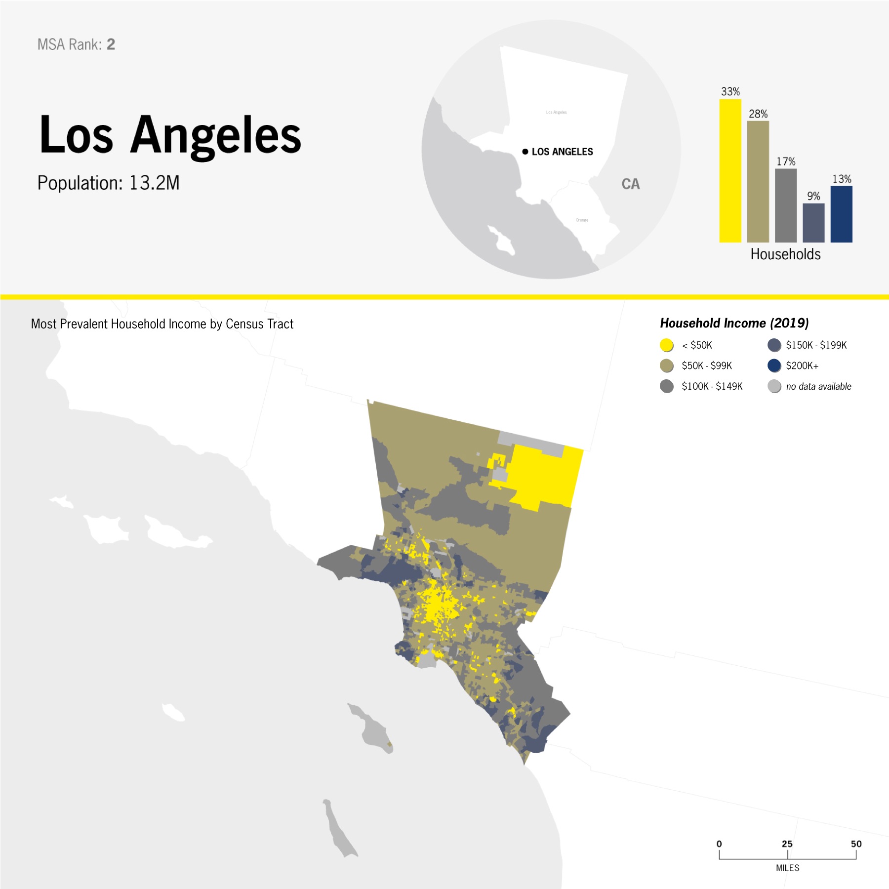
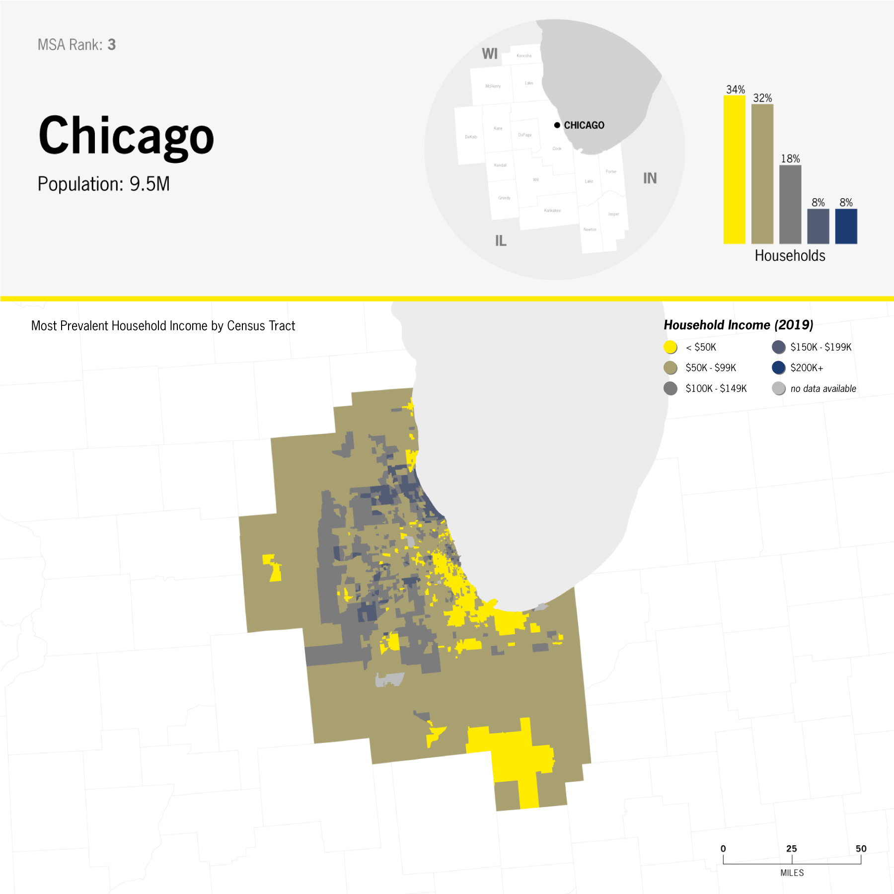
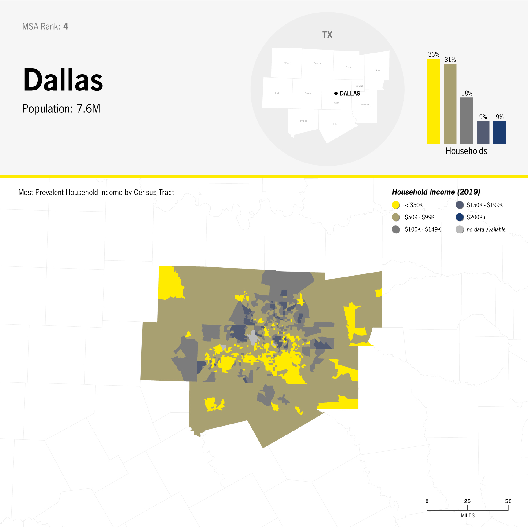
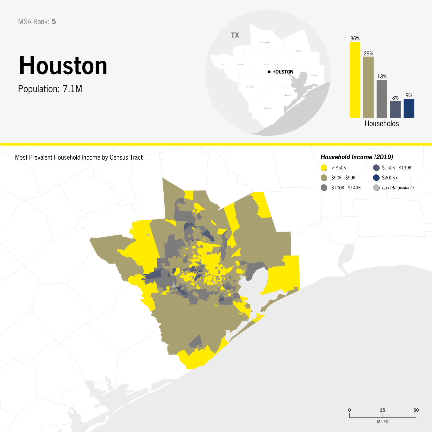
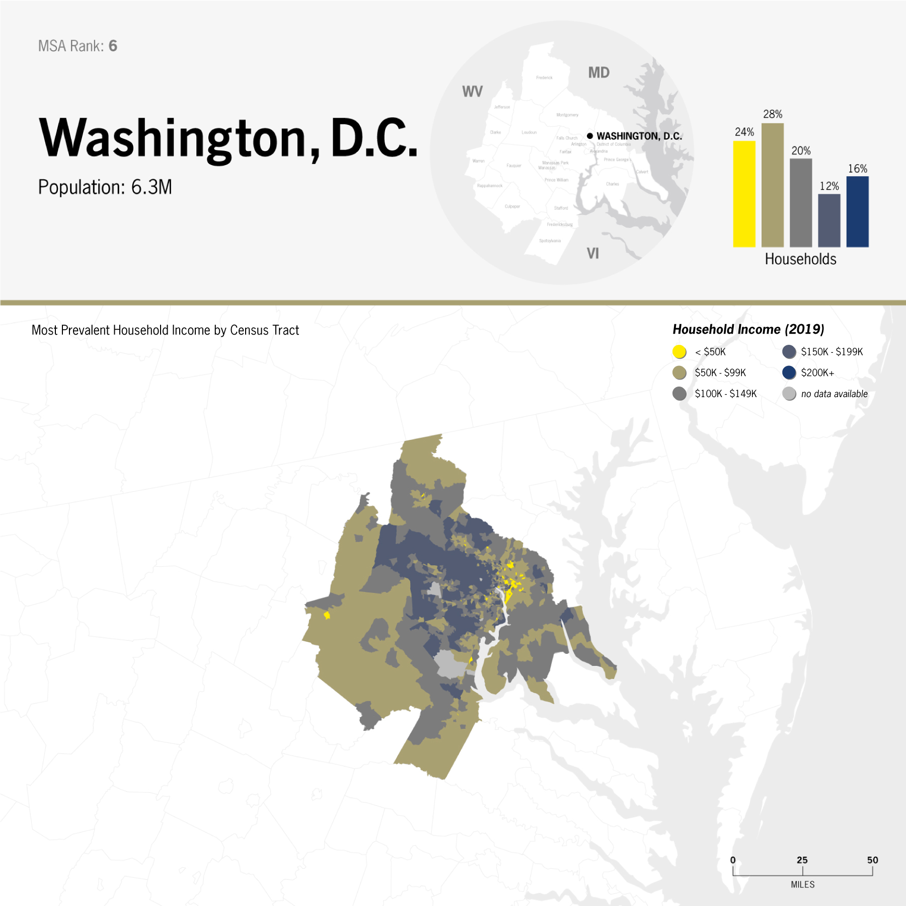
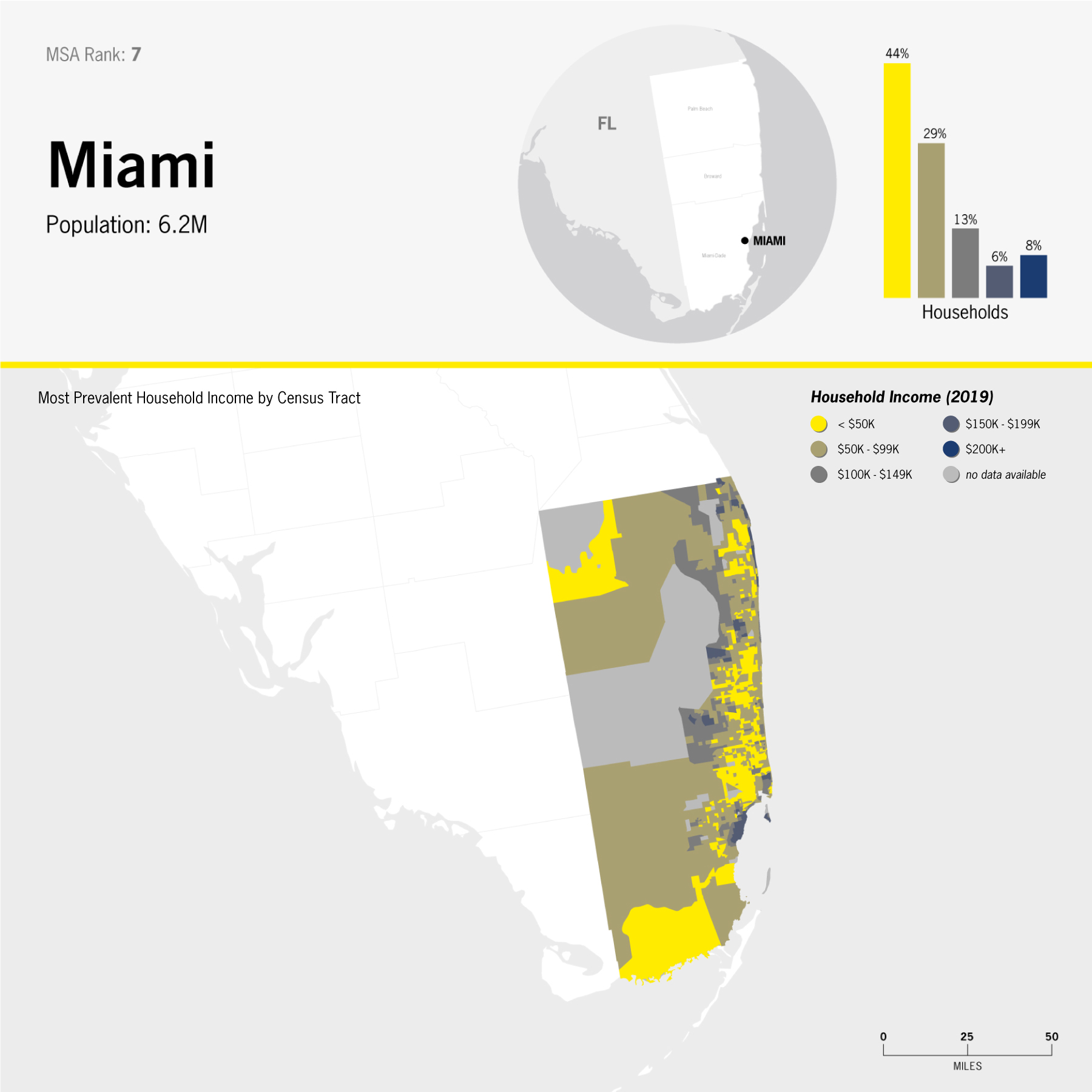
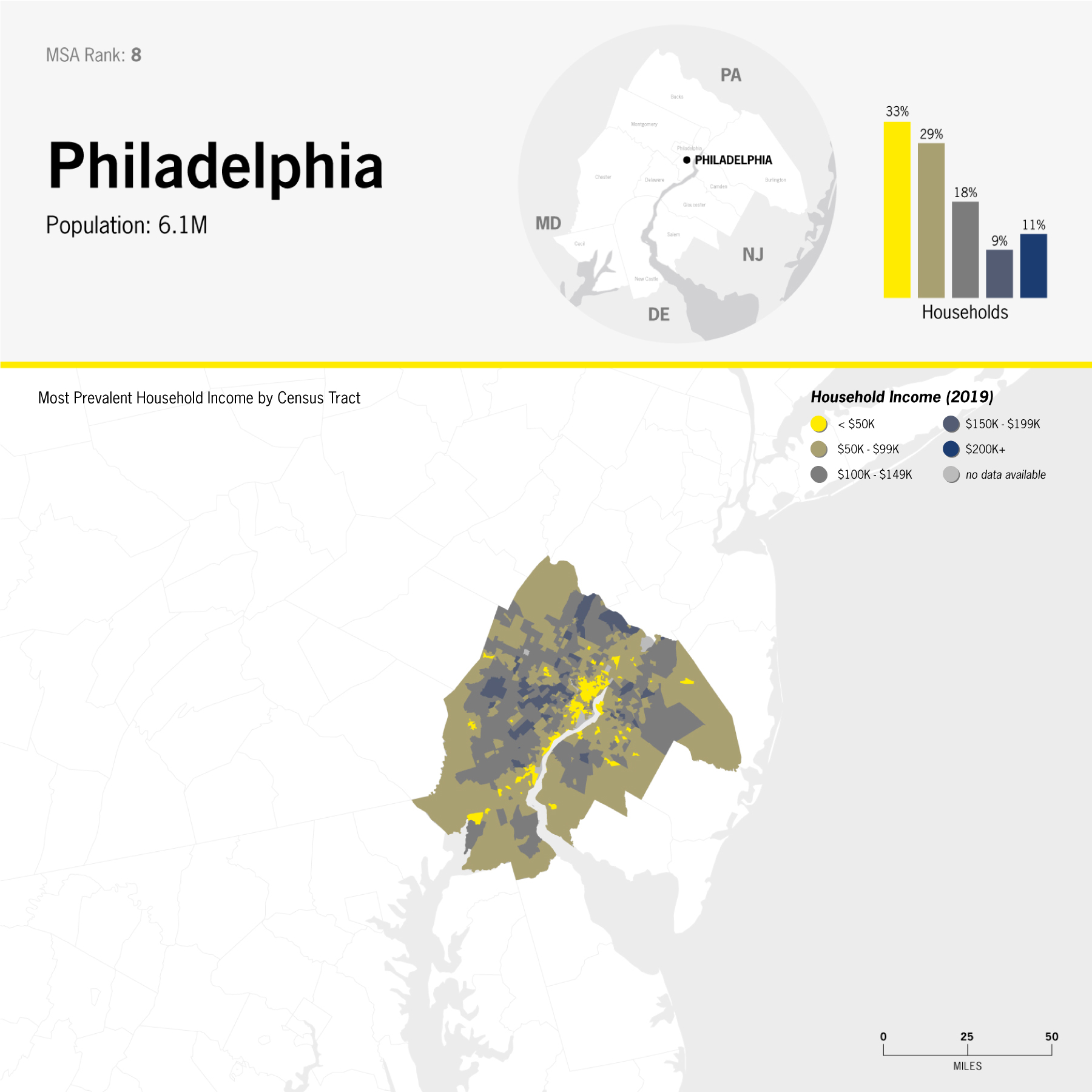
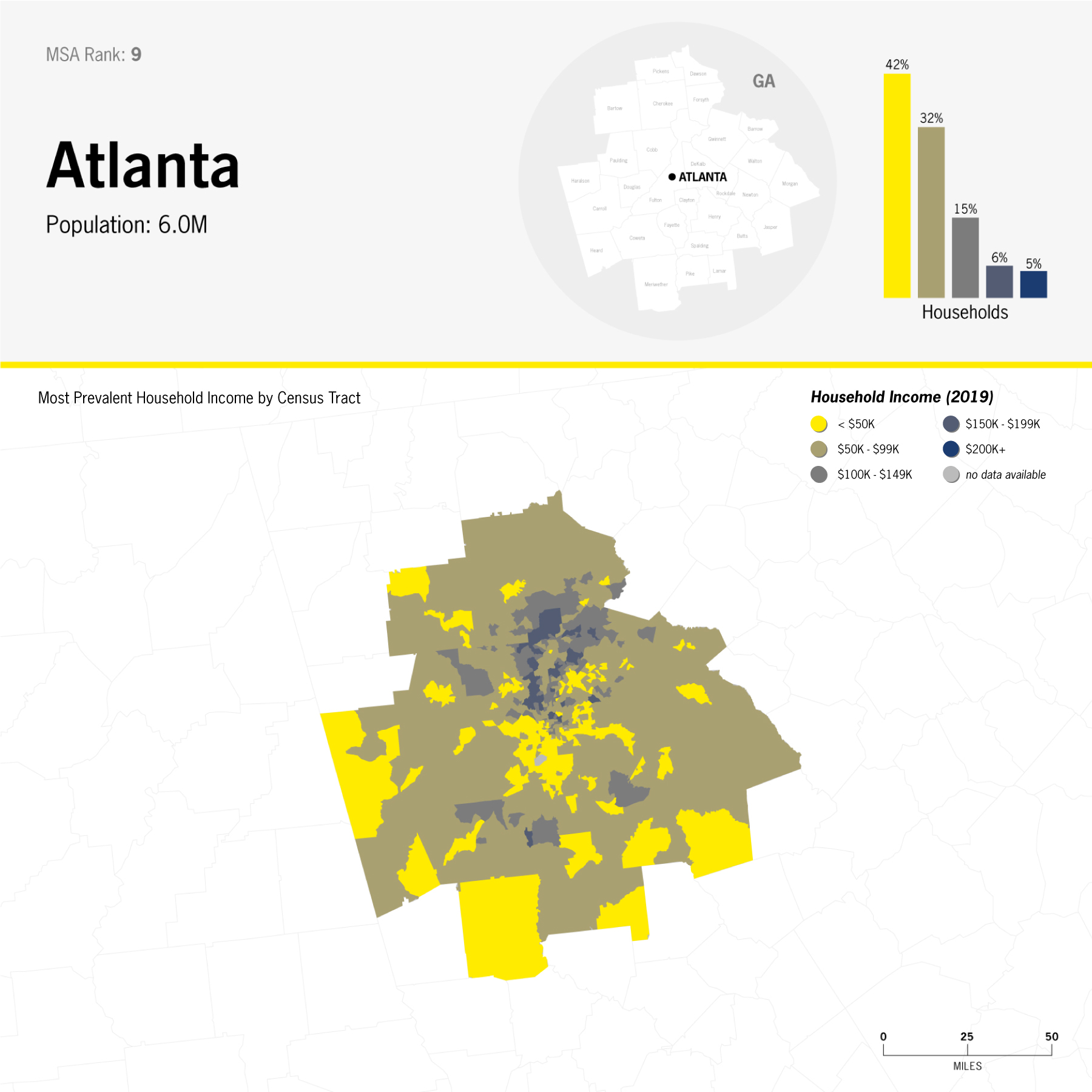
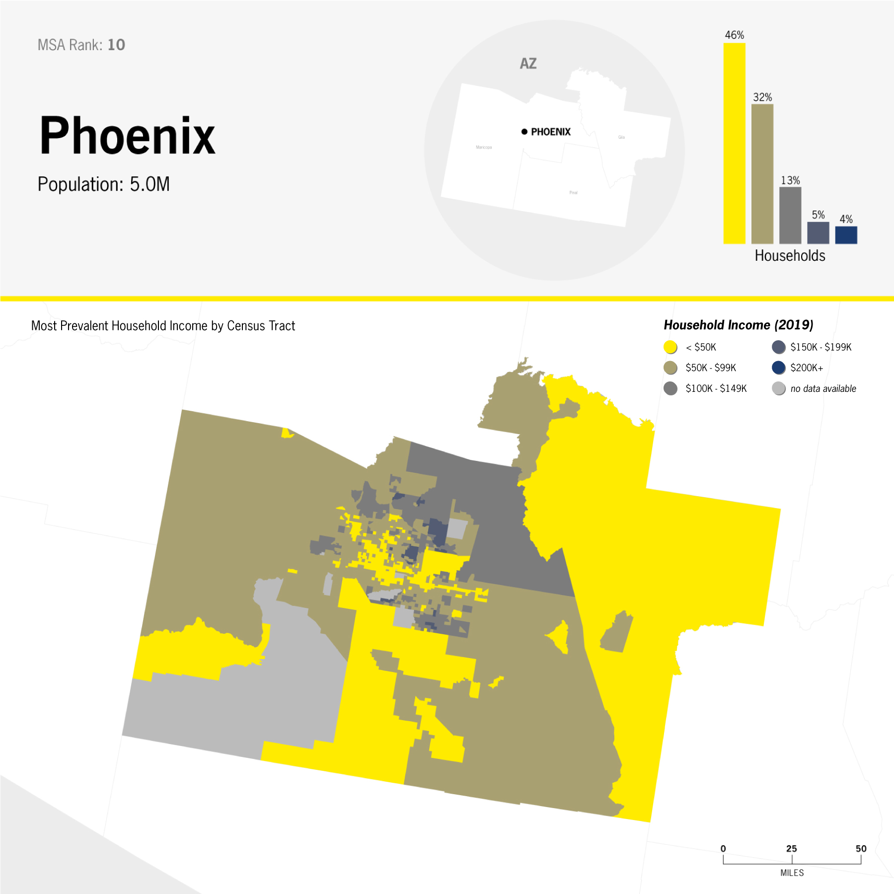
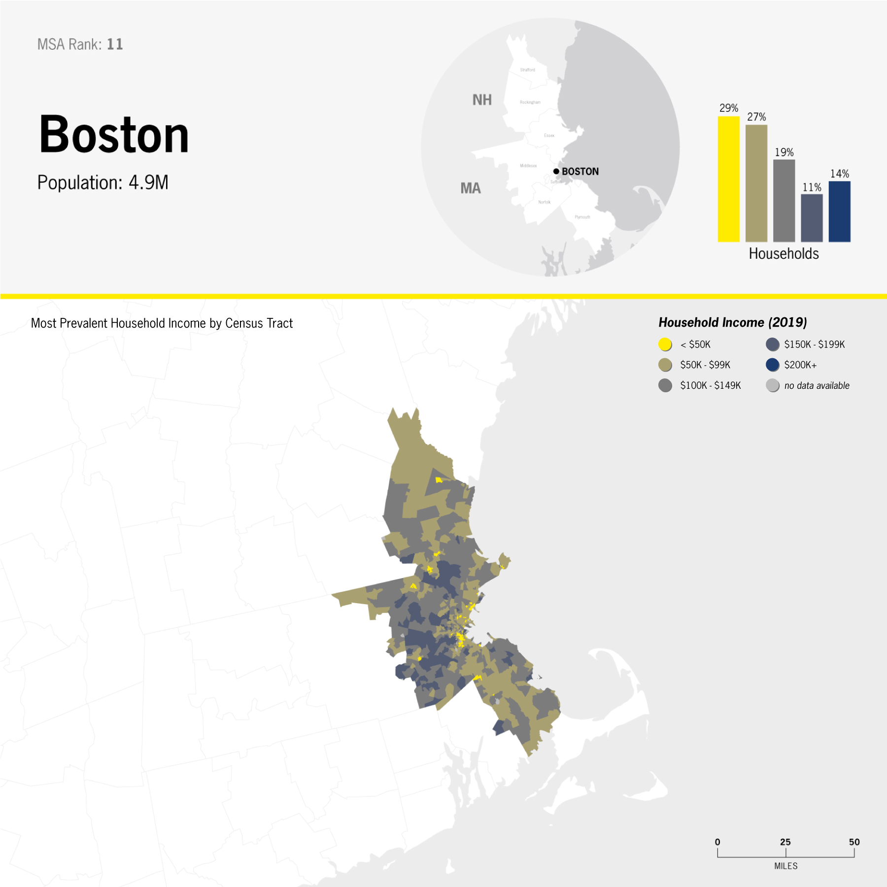
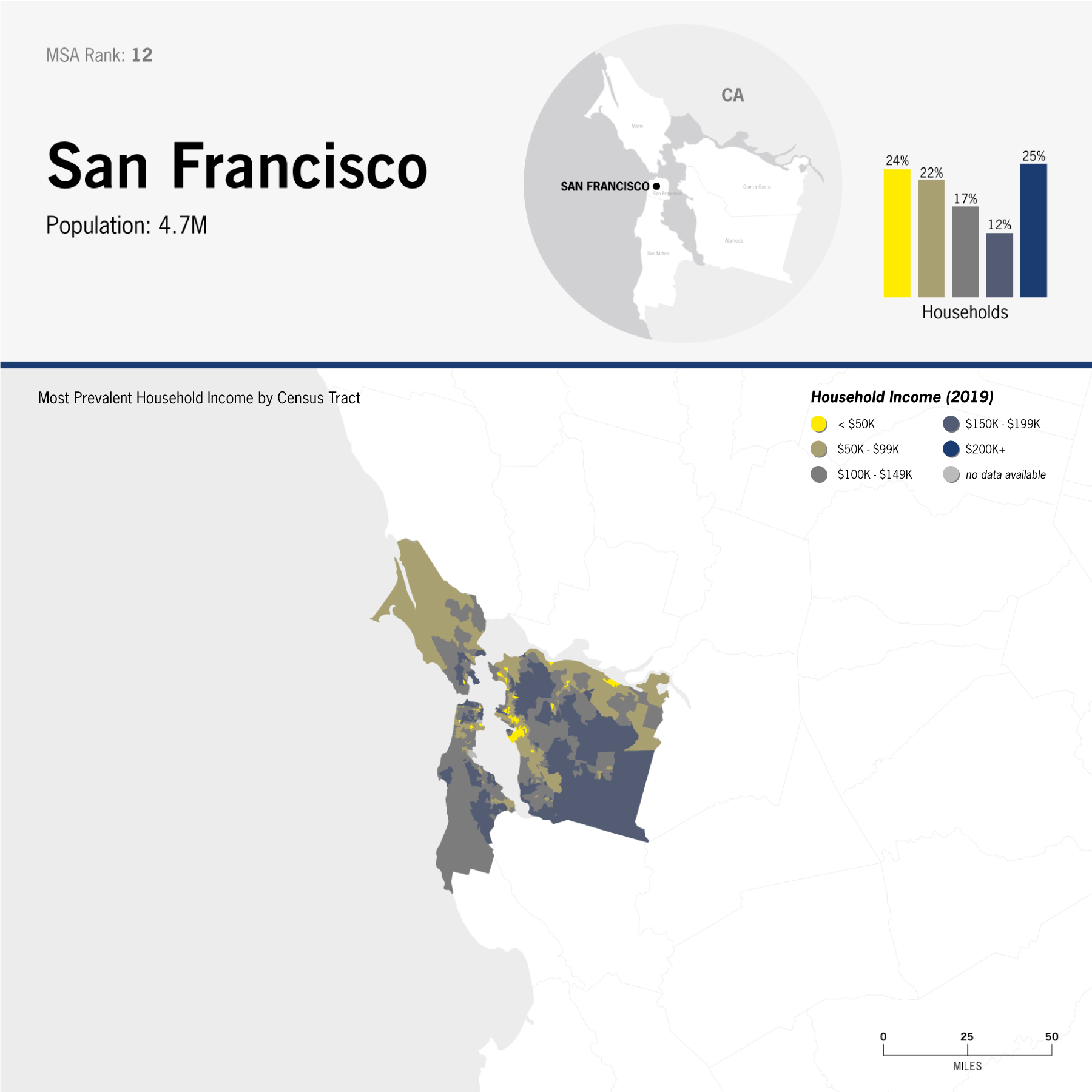
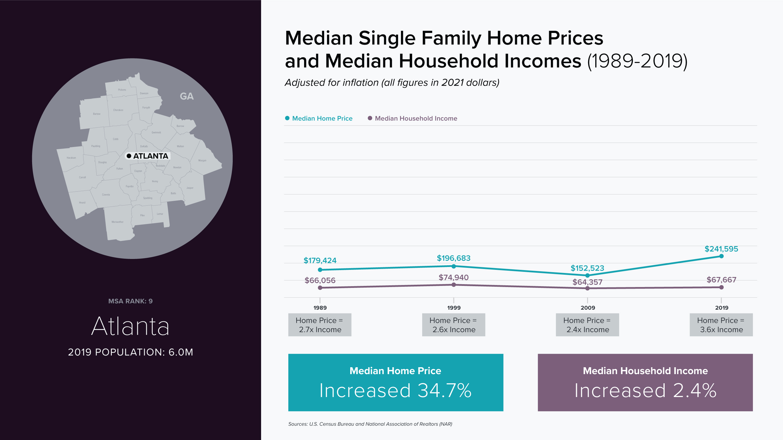
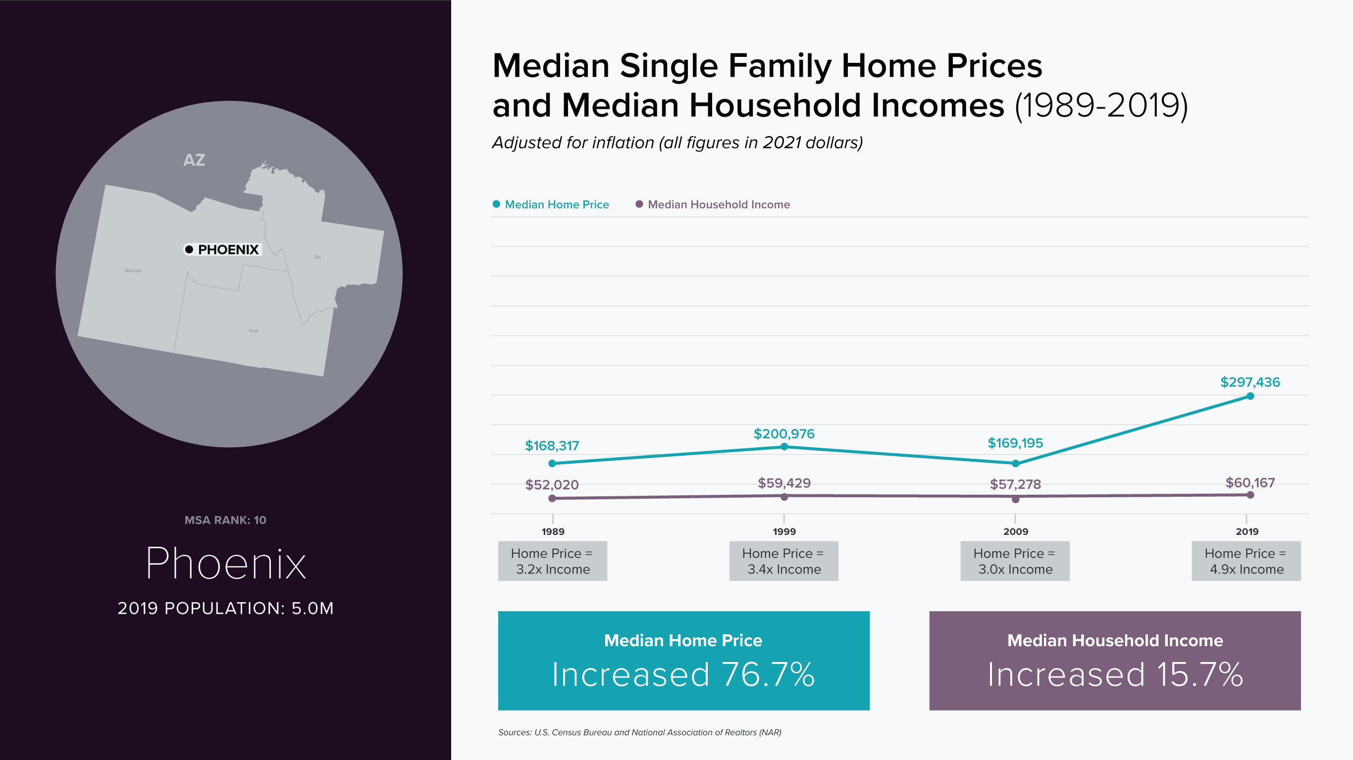
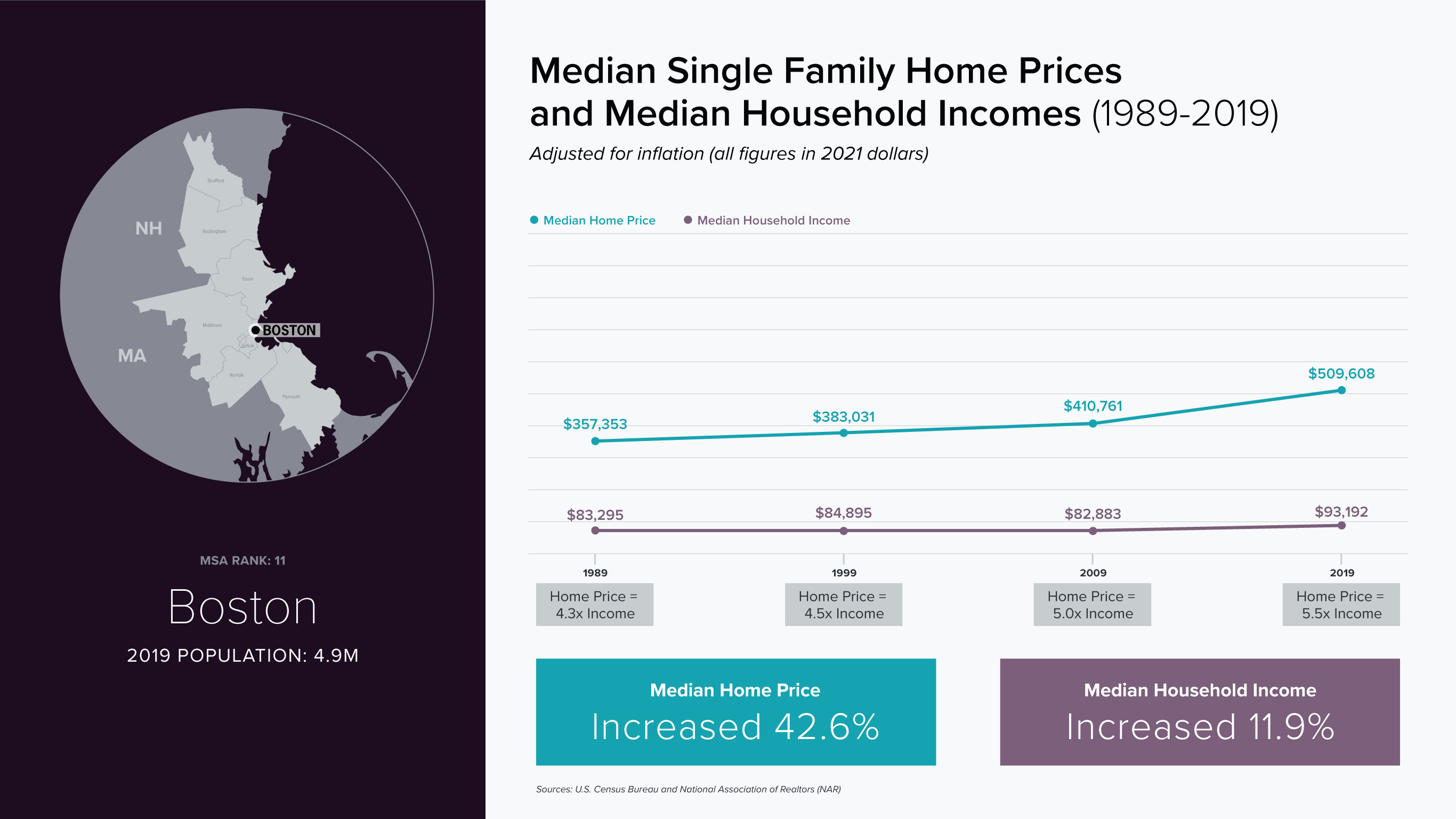
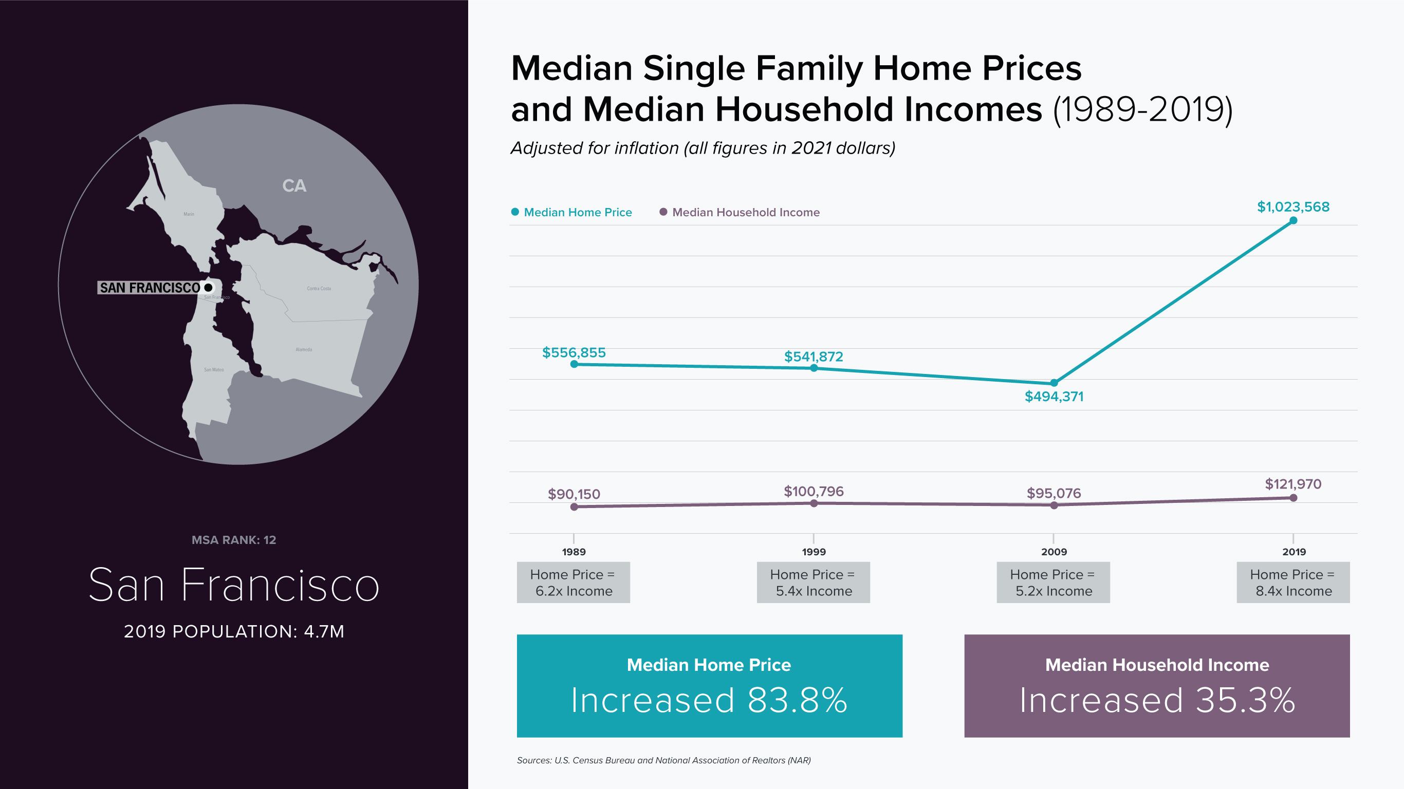
Using data from the U.S. Census Bureau, I mapped income distribution across the 12 most populous U.S. Metropolitan Statistical Areas (MSAs). The project compares how income is distributed within and across major metropolitan regions, highlighting patterns of concentration and disparity at multiple geographic scales.
Bar charts illustrate the overall income breakdown for each MSA, while accompanying maps provide greater granularity at the census tract level. Together, these visualizations reveal how regional averages can obscure significant variation within metropolitan boundaries.
Use side arrows to scroll through project
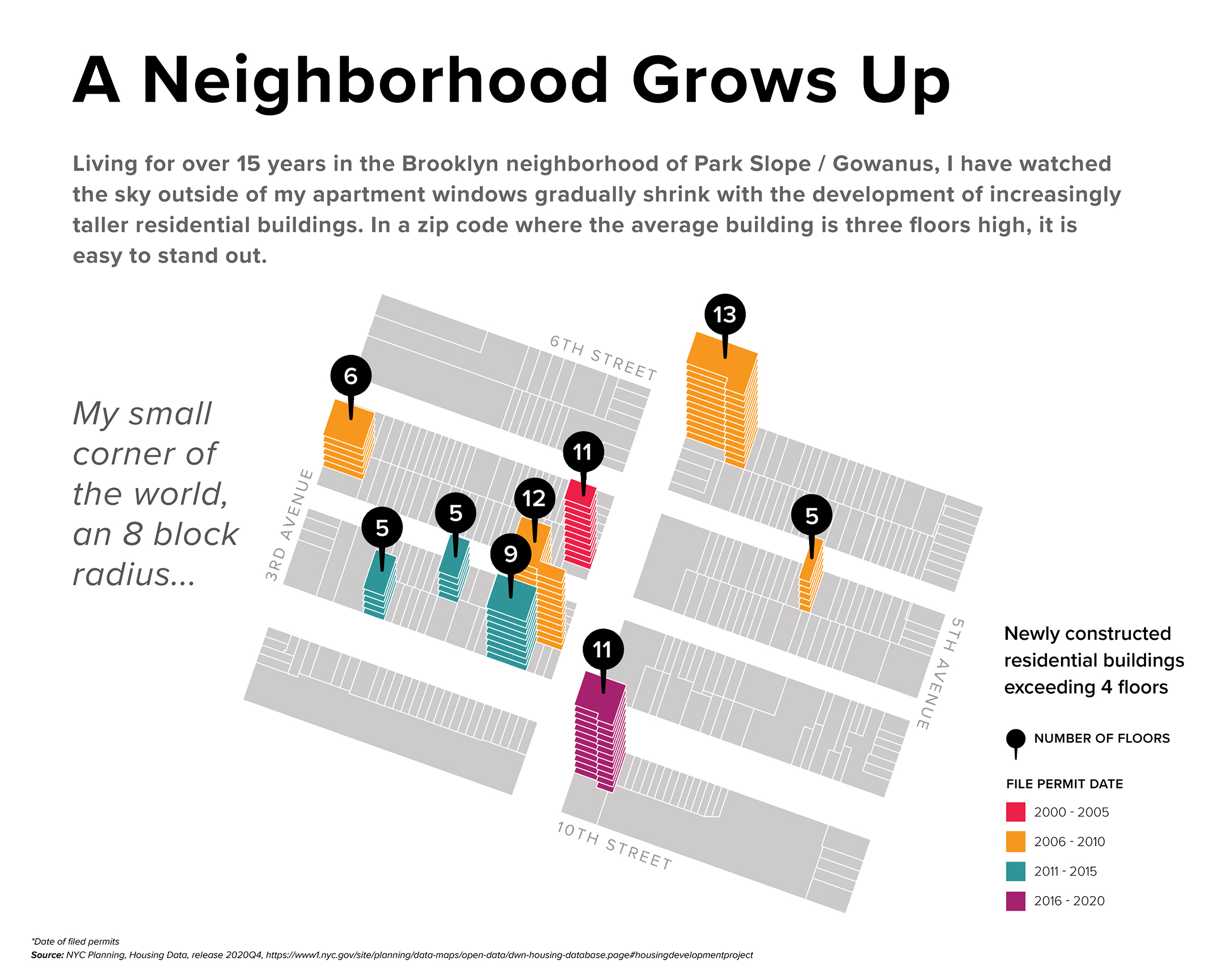
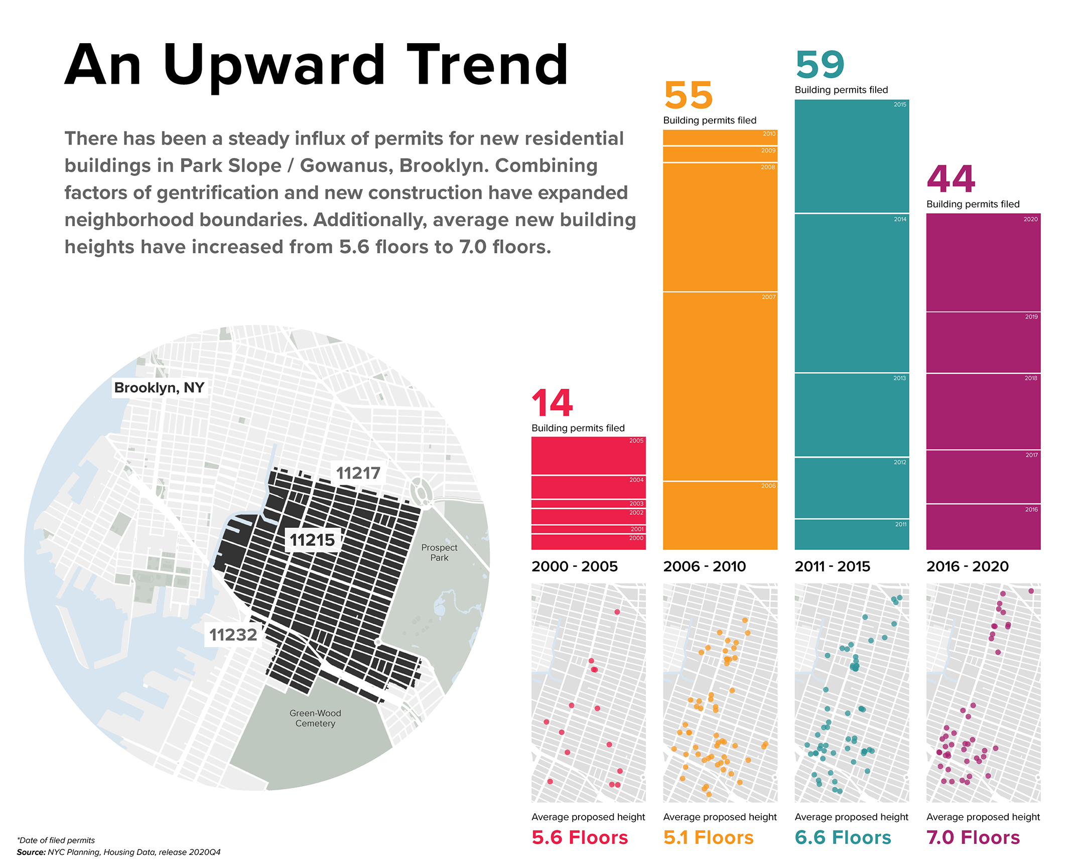
An exploration of vertical growth in Gowanus, Brooklyn. This project examines the rise of new residential development in my neighborhood, mapping where and when buildings have increased in height and density.
Using spatial analysis and visualization, I traced patterns of construction and redevelopment to better understand how the built environment is evolving - and what that growth reveals about change at the neighborhood scale.
Use side arrows to scroll through project
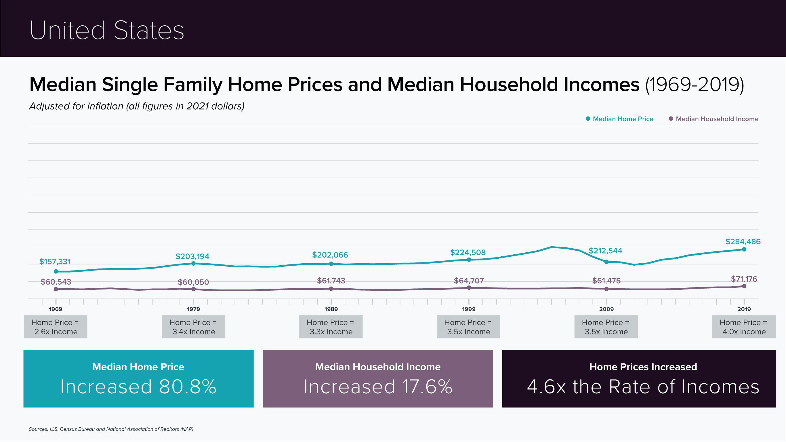
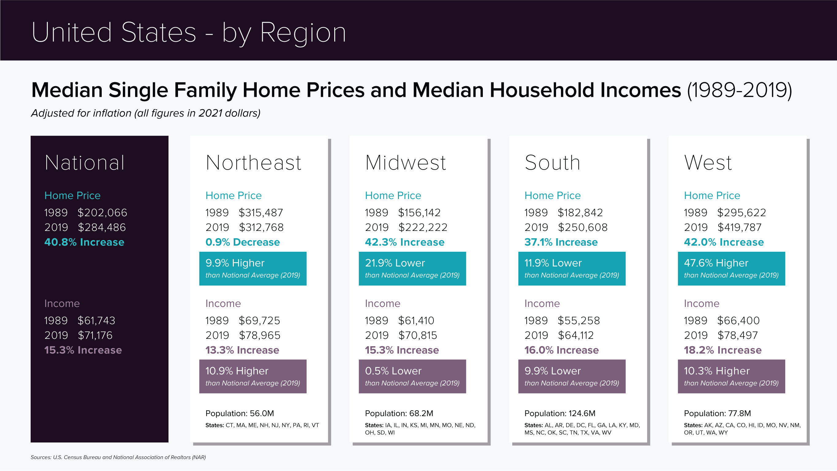
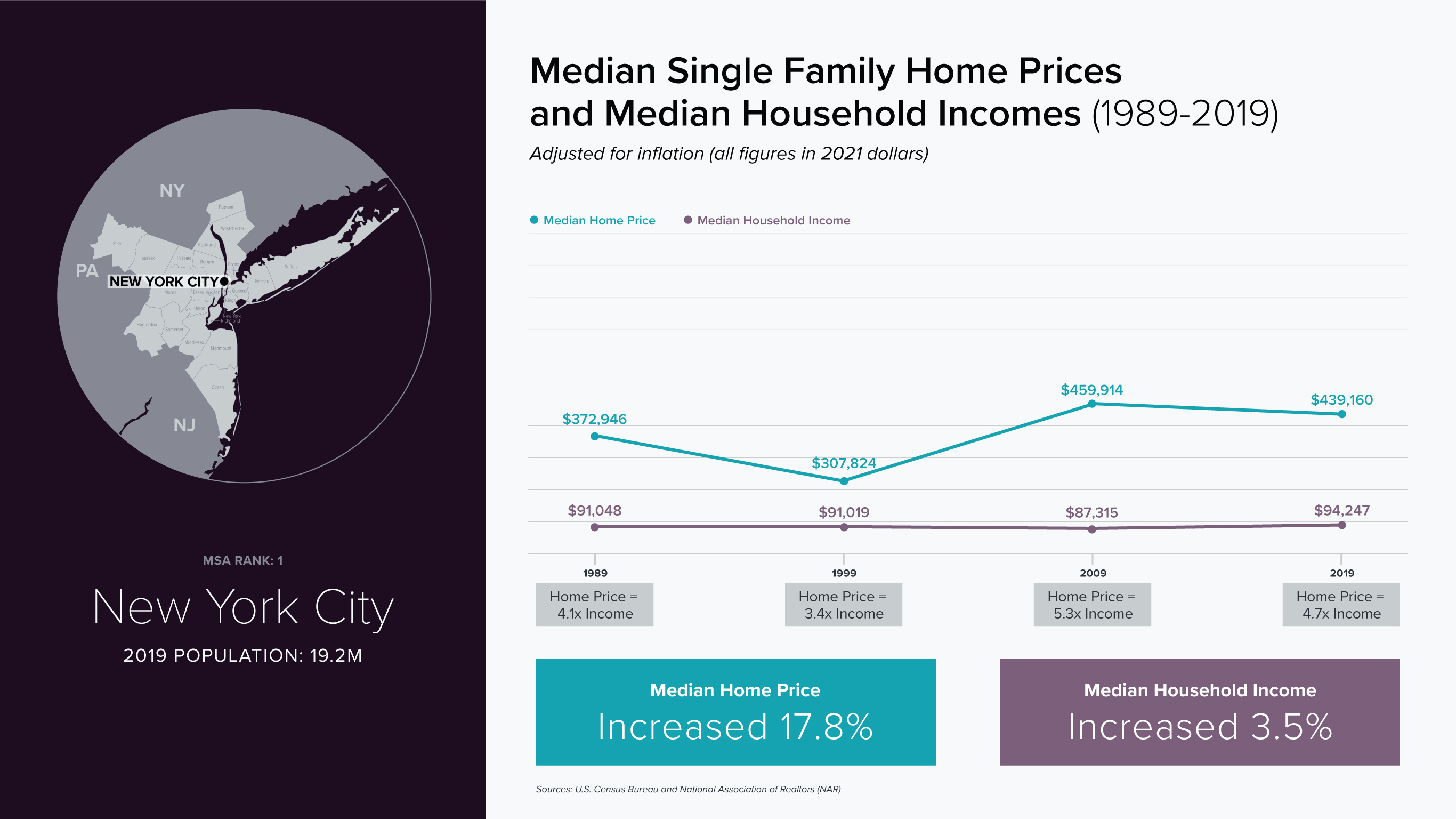
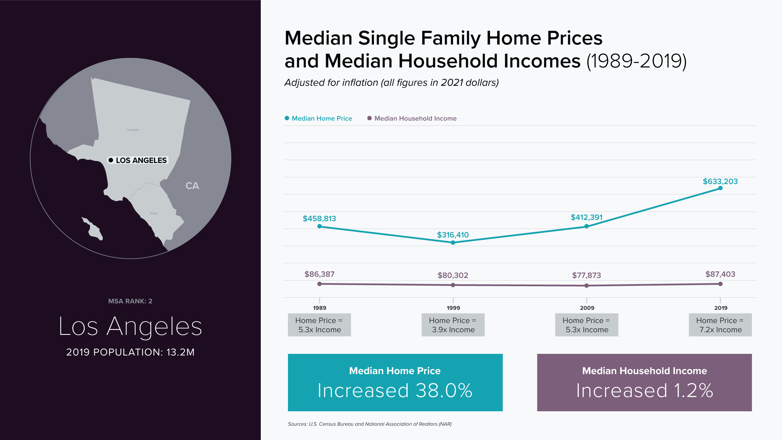
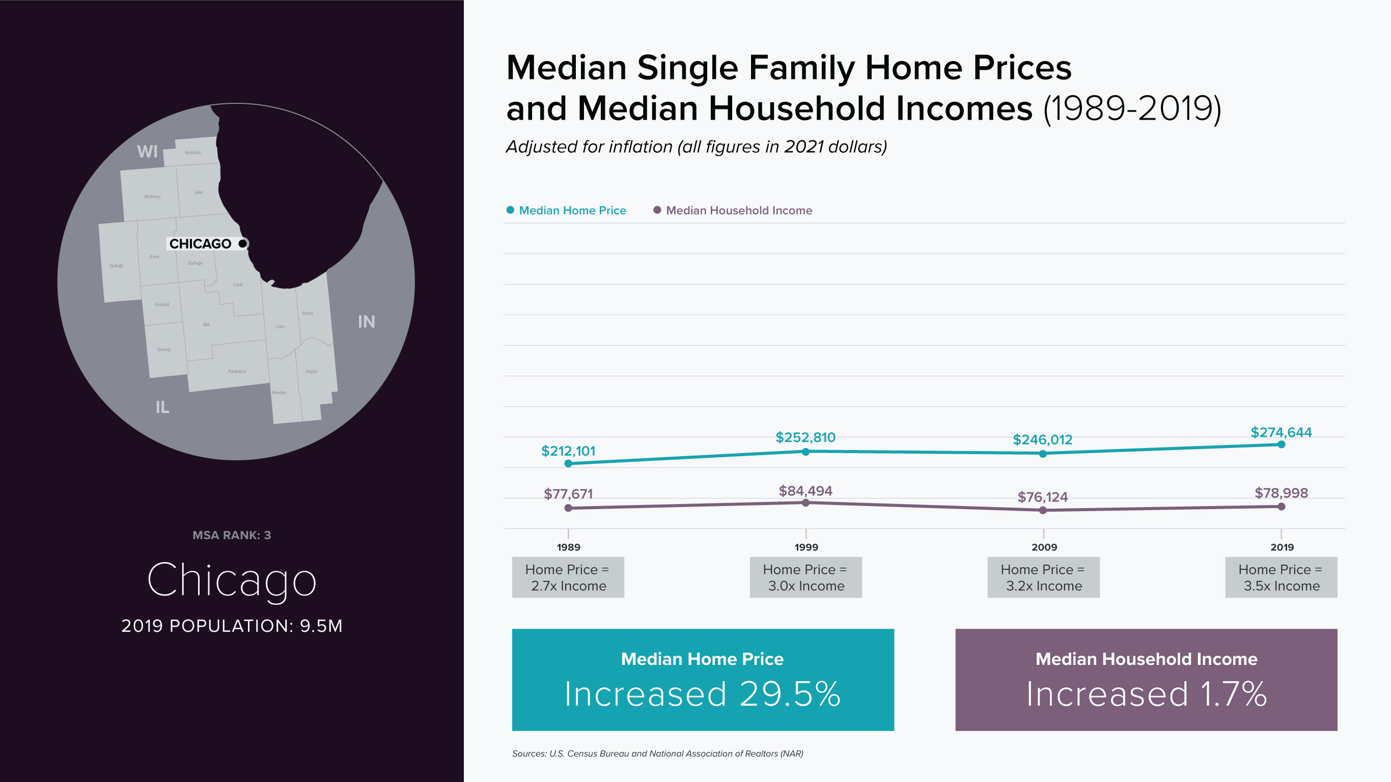
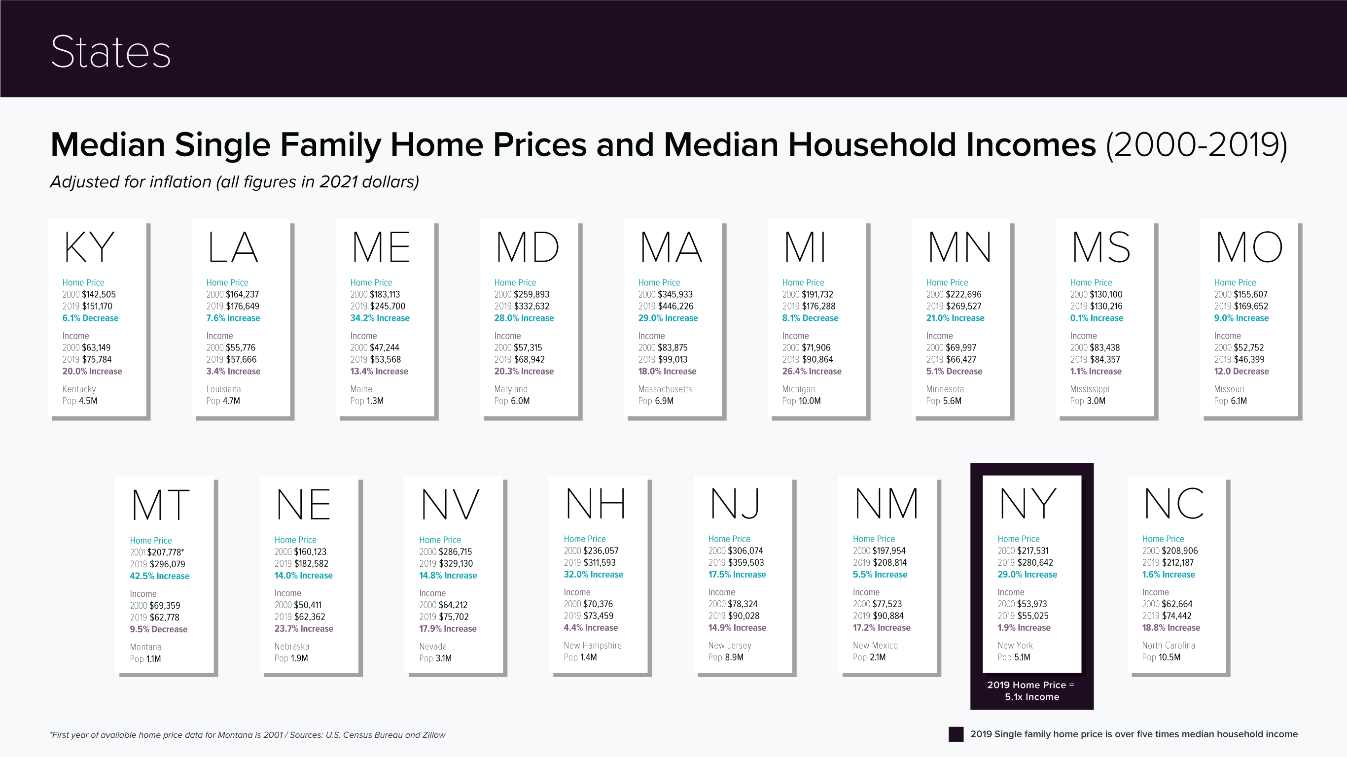
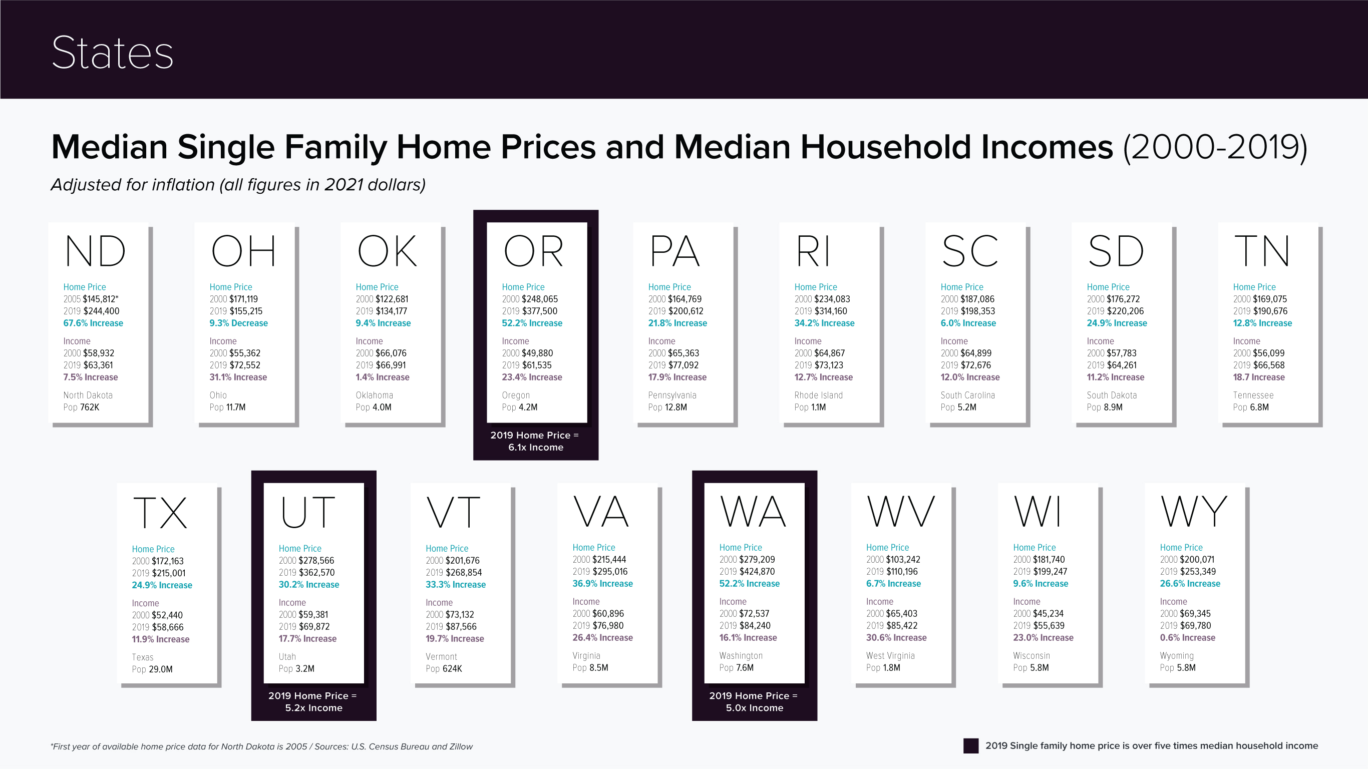
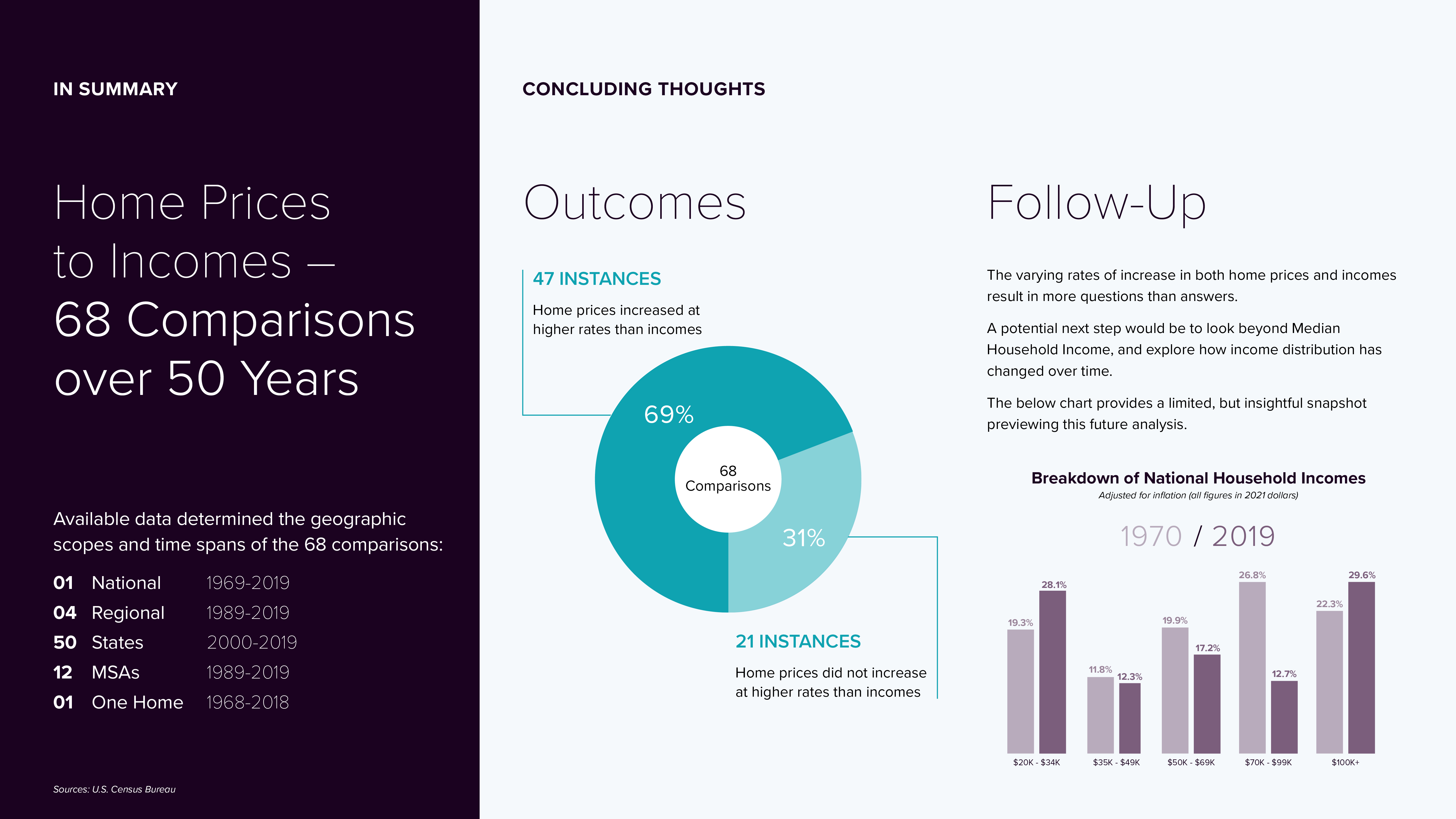
RESEARCH QUESTION
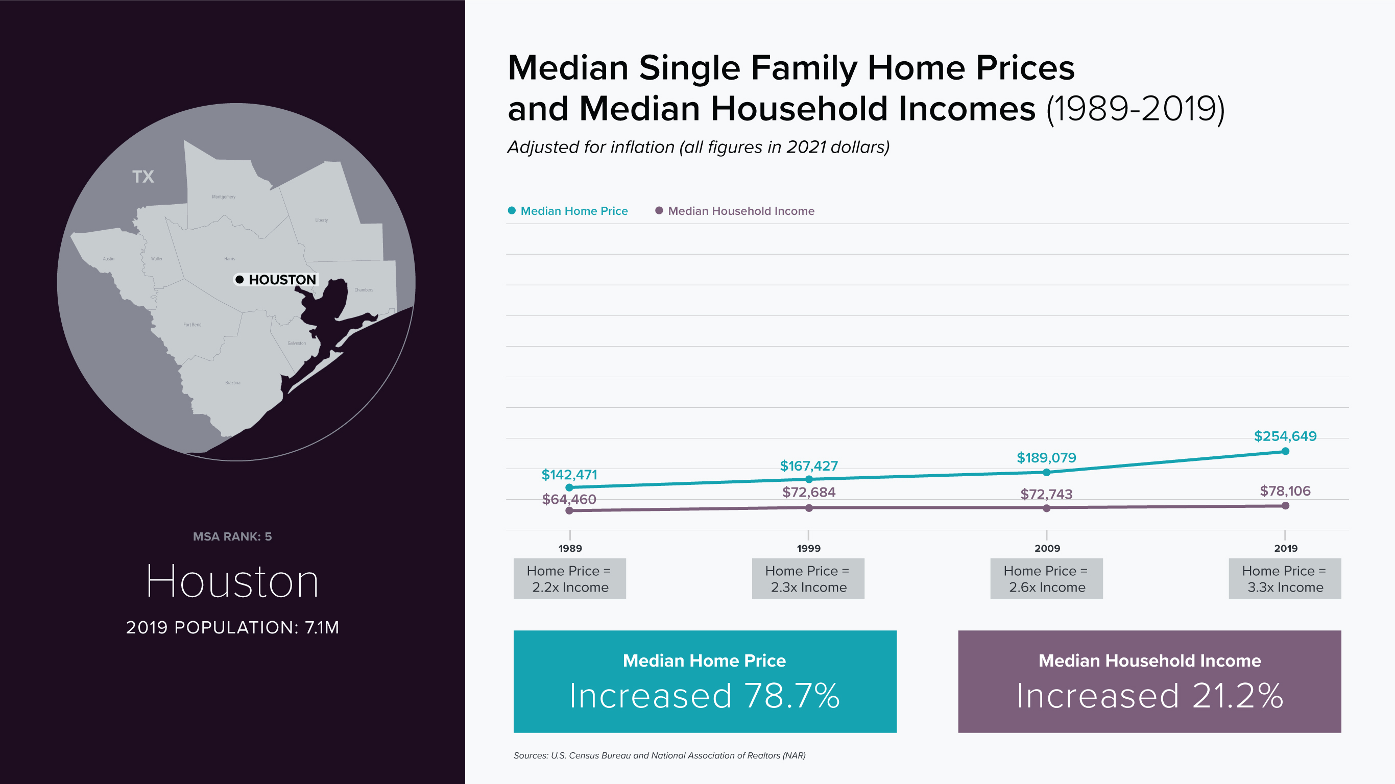
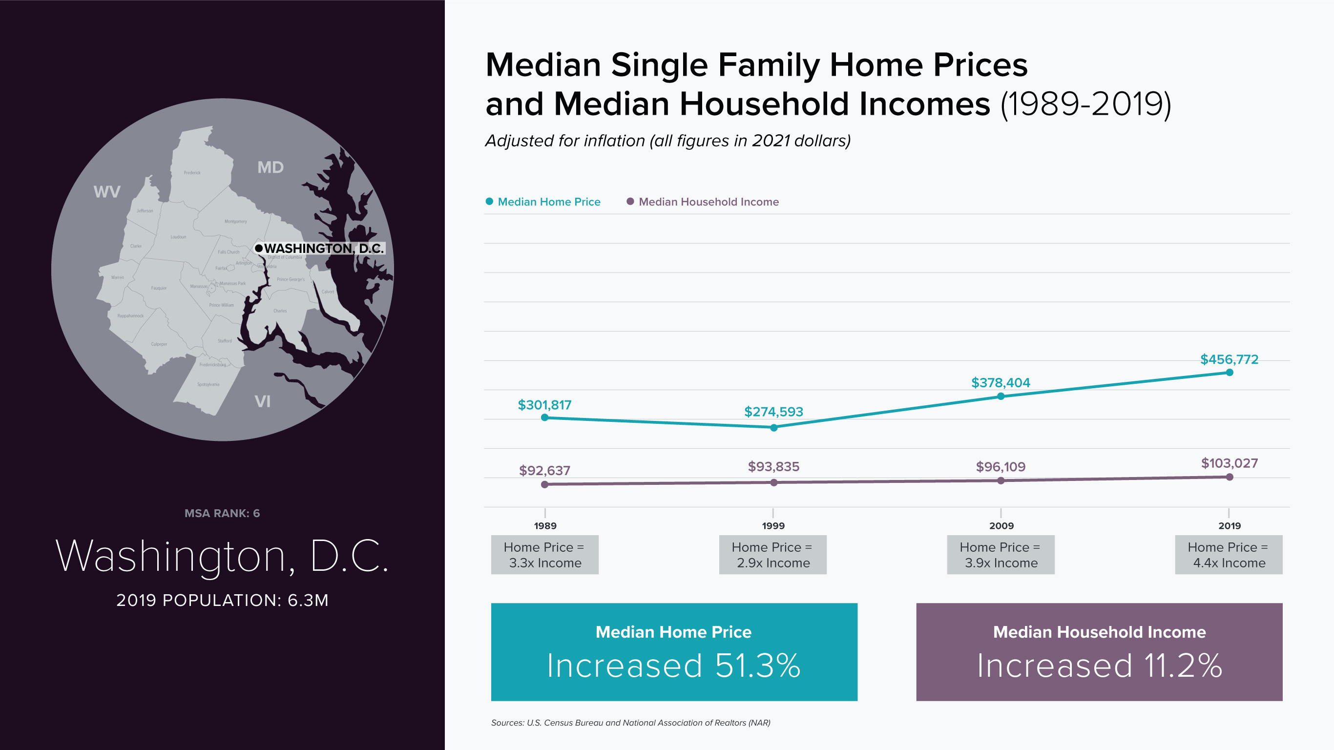
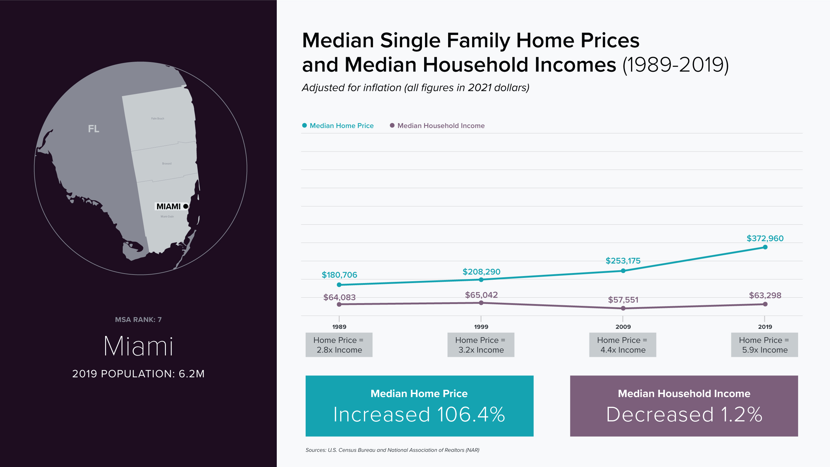
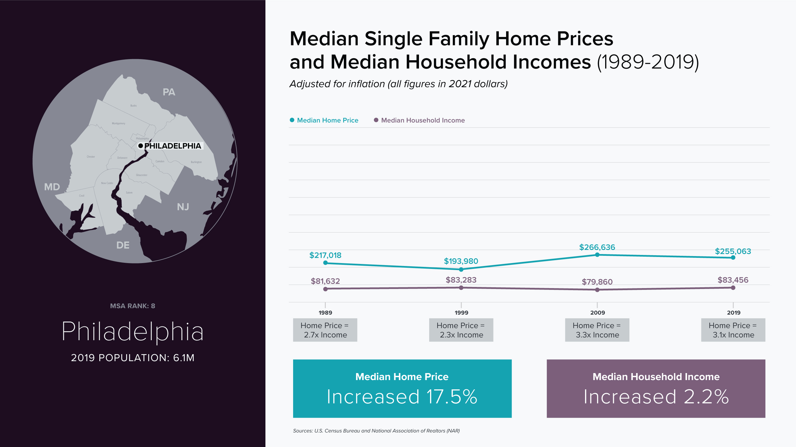
How have U.S. home prices changed relative to household incomes? The question appears
straightforward, but the relationship between earnings and homeownership is layered with
structural, geographic, and social complexity.
DATA DEFINITIONS AND LIMITATIONS
Single-Family Home Prices
Sale prices reflect single-family homes only, excluding multi-family properties,
condominiums, and co-ops. This limitation significantly reduces available data in dense urban
areas, where alternative housing types are more common.
Household Income
Income data does not account for household size. A single individual earning $50,000 faces
fundamentally different financial realities than a household of four supported by the same
income.
Gender & Race
Income figures are aggregated across all genders and races. As a result, the analysis does
not capture well-documented disparities shaped by both gender and race.
Metropolitan Statistical Areas (MSAs)
Metropolitan Statistical Areas (MSAs), as defined by the U.S. Office of Management and
Budget, include a central city and surrounding communities that are socially and economically
integrated. MSAs are ranked by population size and provide a consistent regional framework for
comparison.
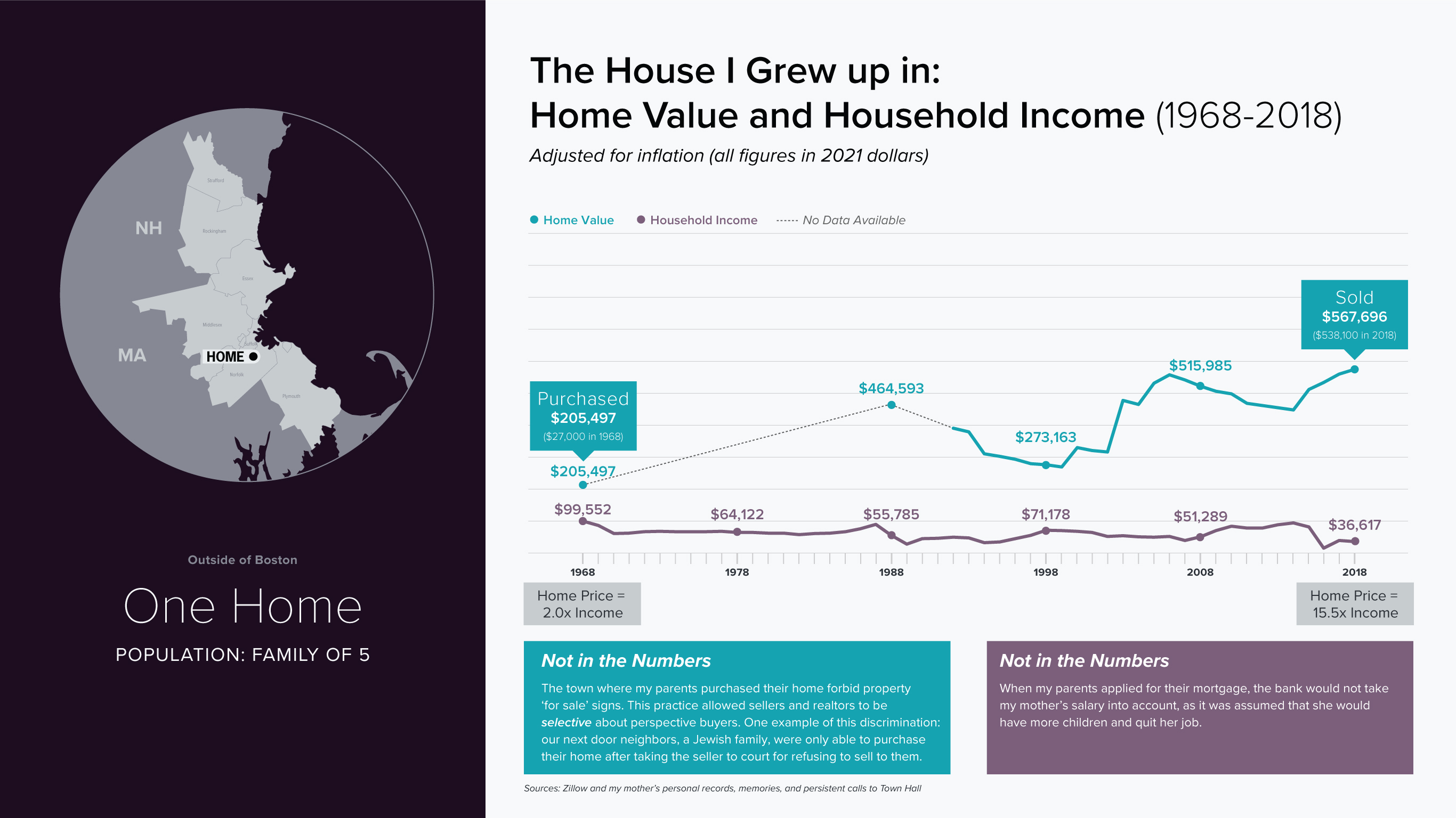
IT'S PERSONAL
The story of homeownership in America cannot be fully conveyed through a line graph alone.
To introduce a more human dimension, I incorporated personal data from the home I grew up
in—situating national trends within lived experience.
Use side arrows to scroll through project
CURIOSITY
Over the last century, the average human lifespan has nearly doubled. But are we
psychologically prepared for longer futures? If we could meaningfully connect with our future
selves, might we make better decisions in the present?
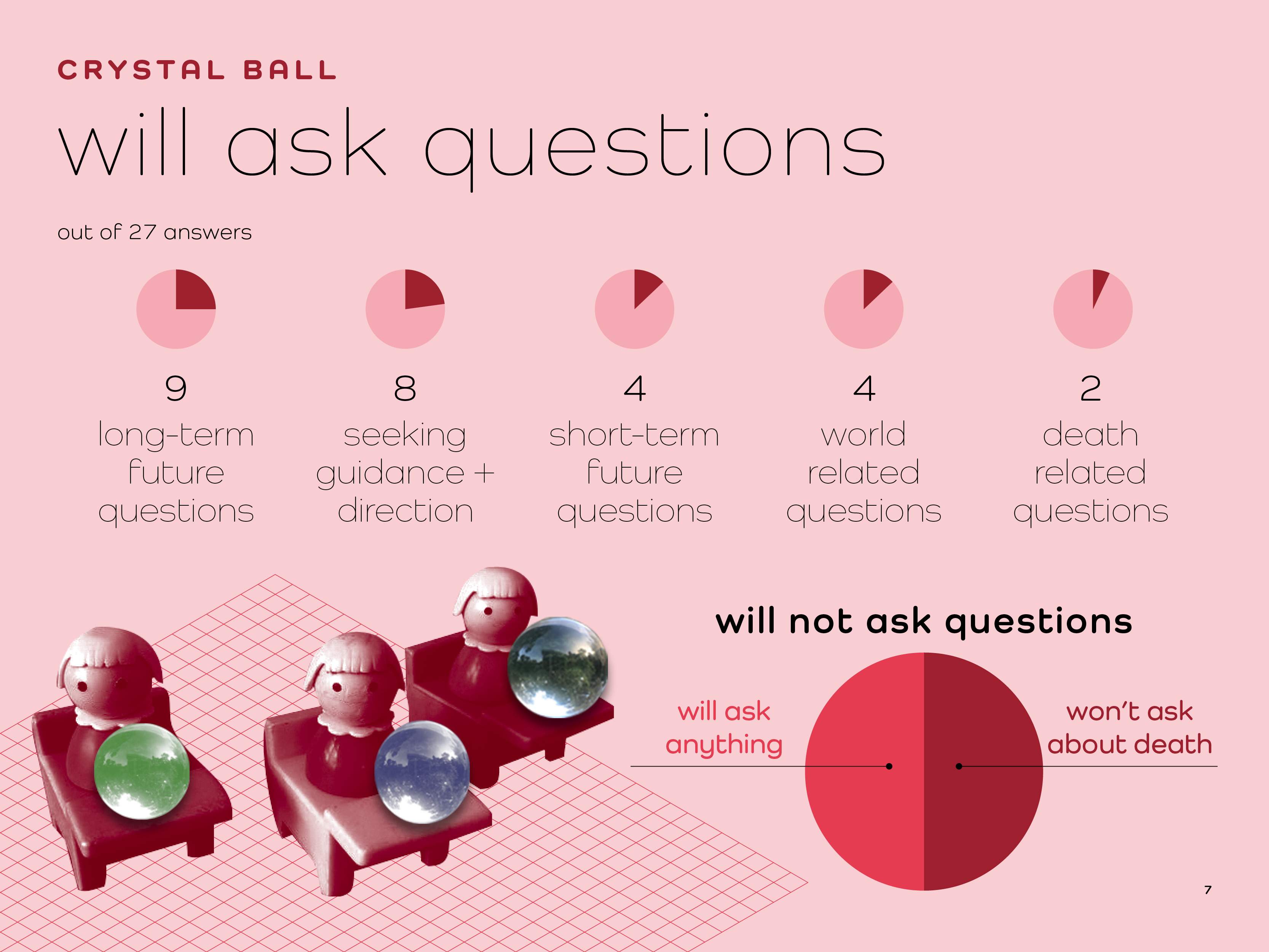
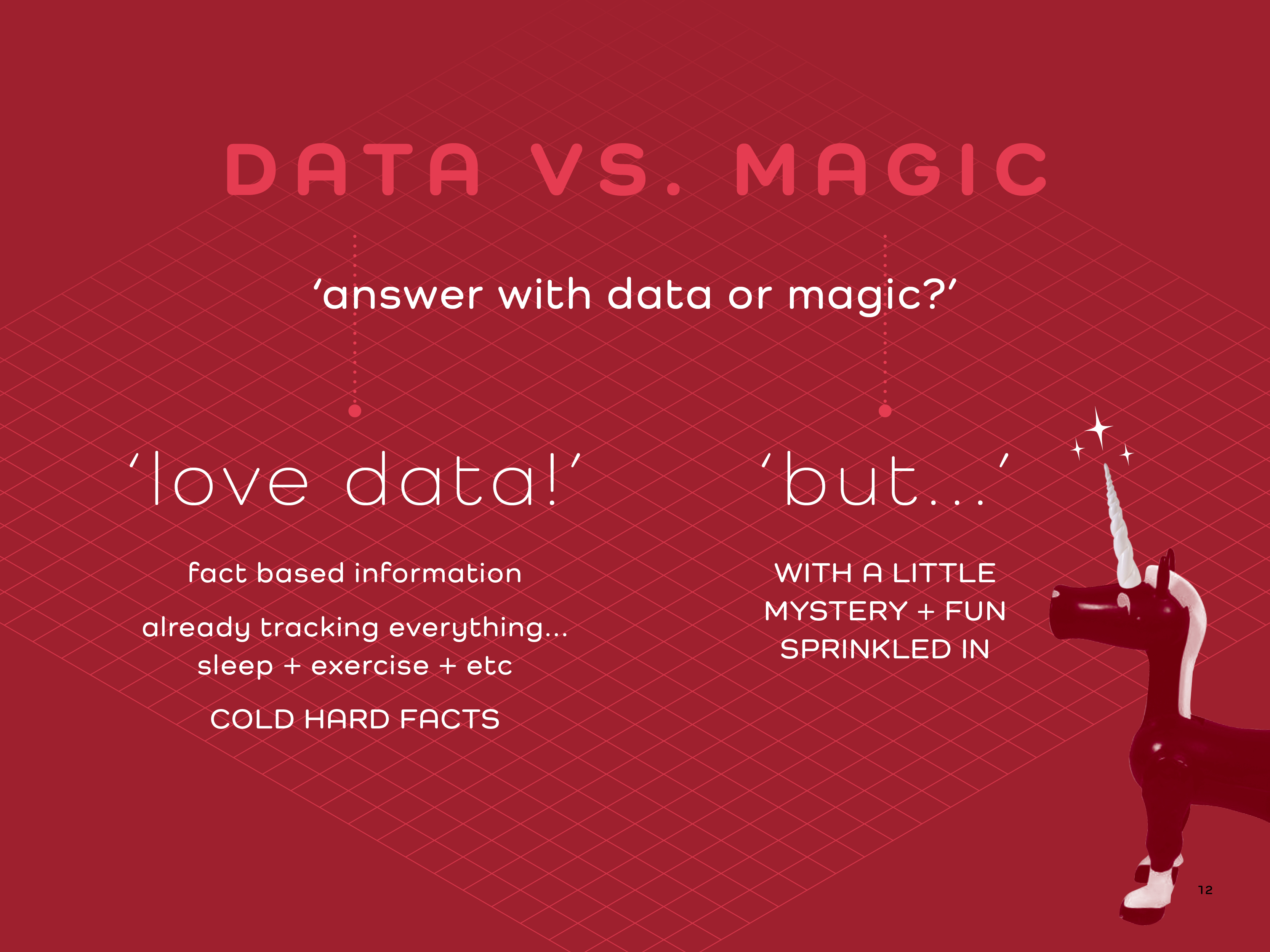
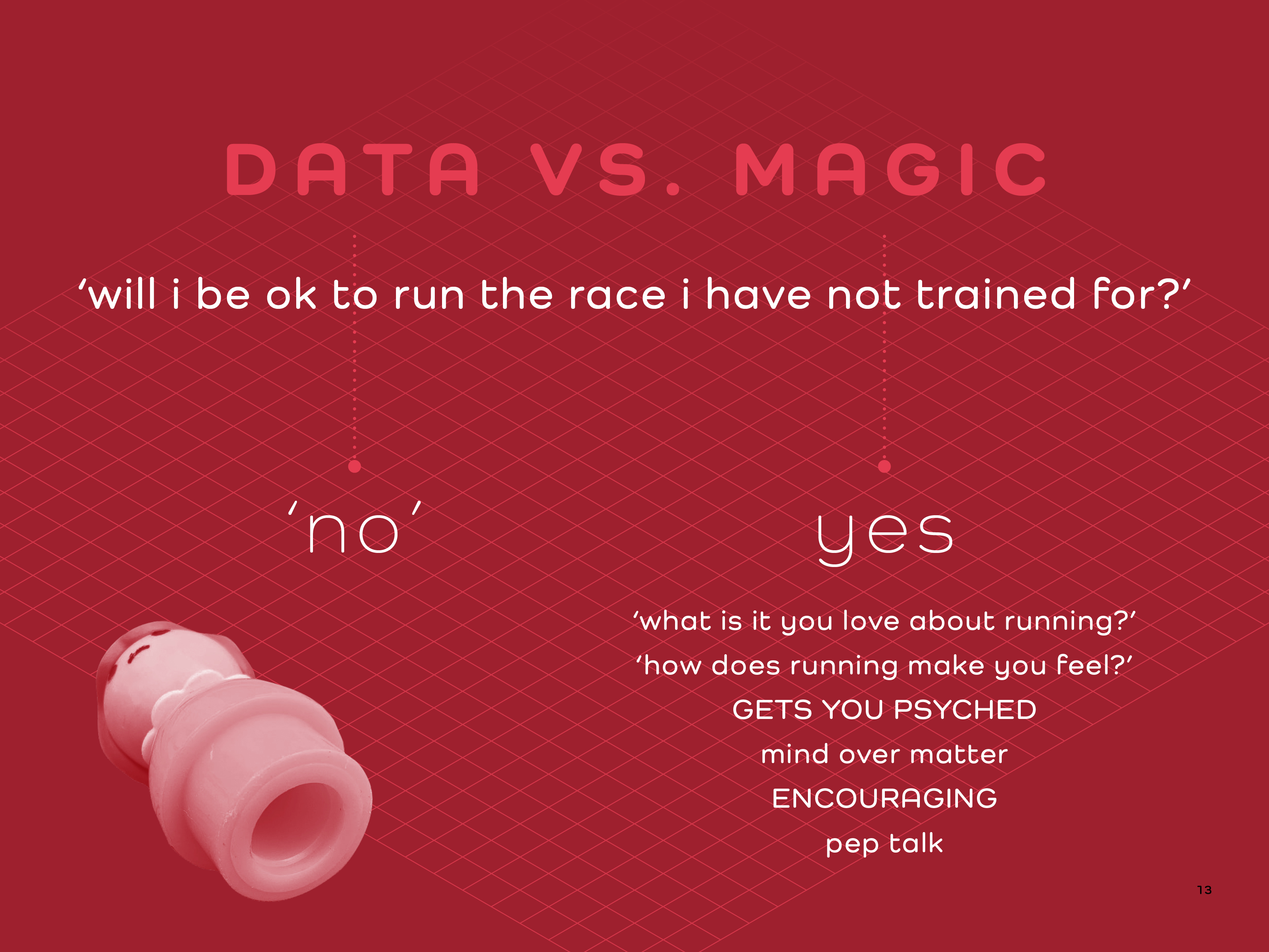
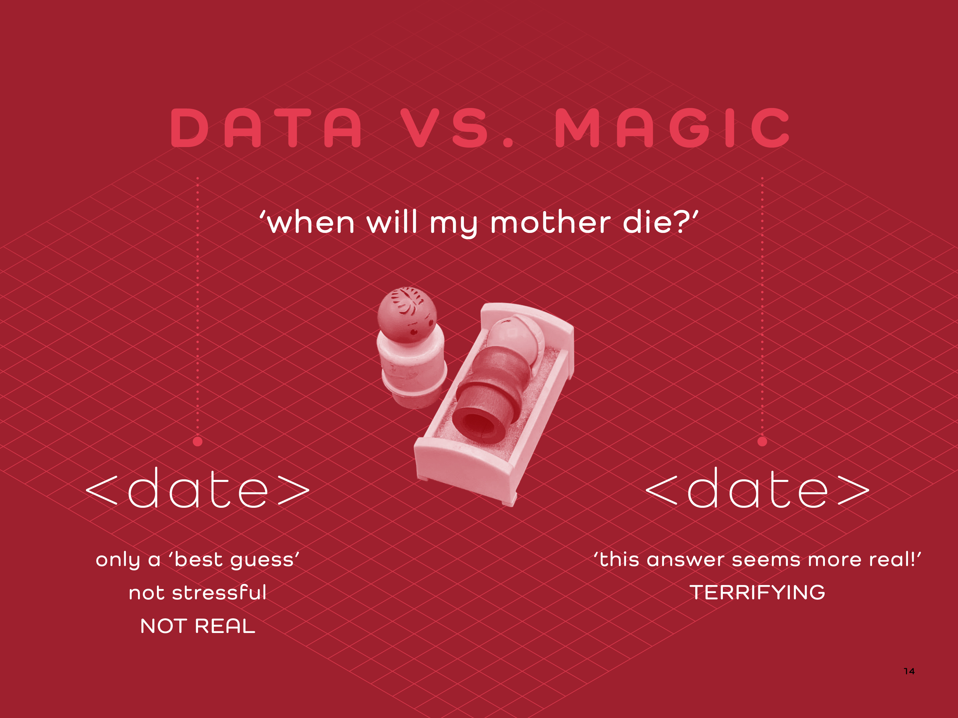
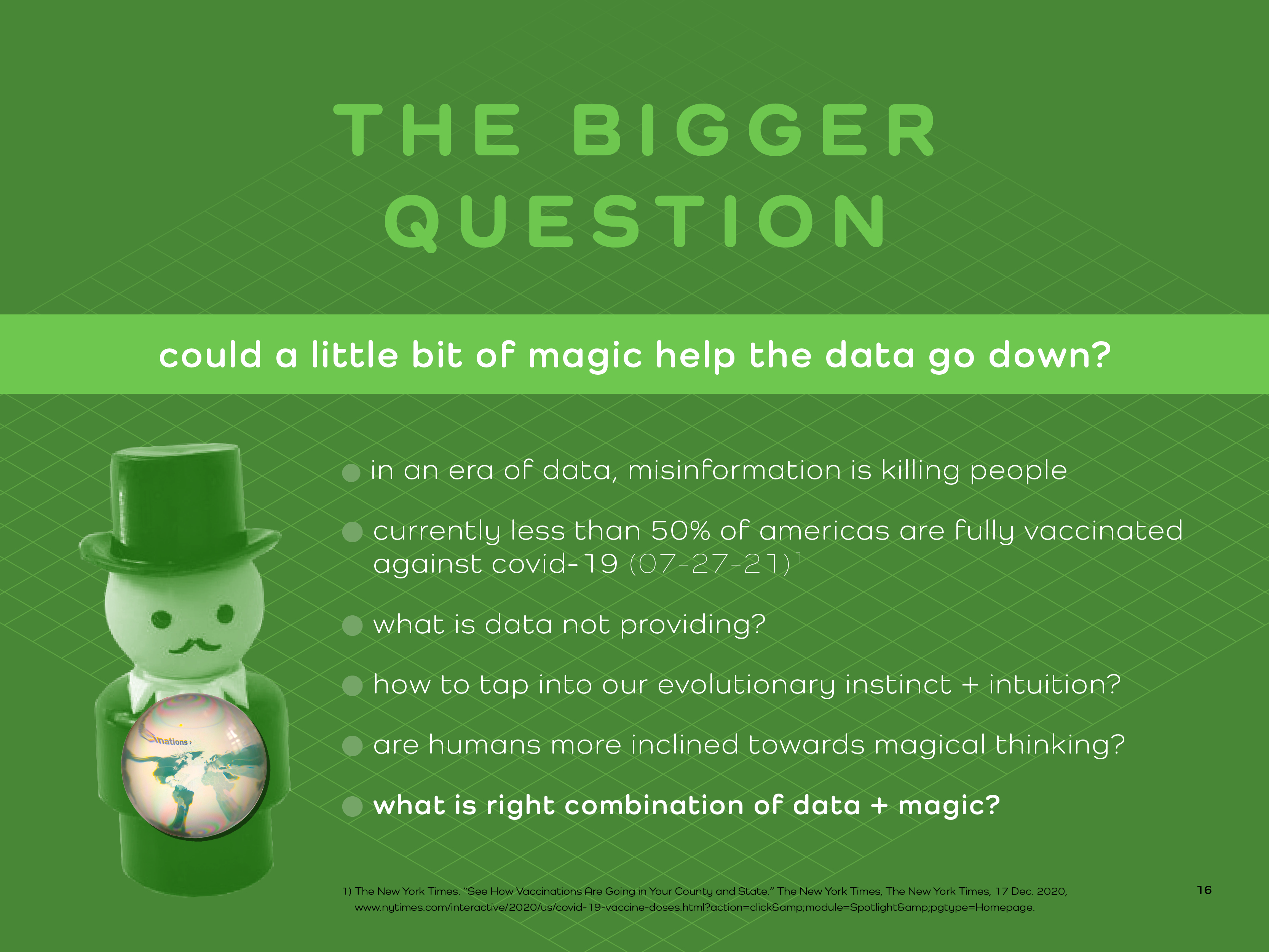
This project explores one culturally enduring method of engaging with the future: visiting a psychic. What began as a playful inquiry evolved into a deeper investigation of uncertainty, agency, and what people actually want to know about what lies ahead. I discovered that the questions people avoid may be as revealing as the ones they choose to ask.
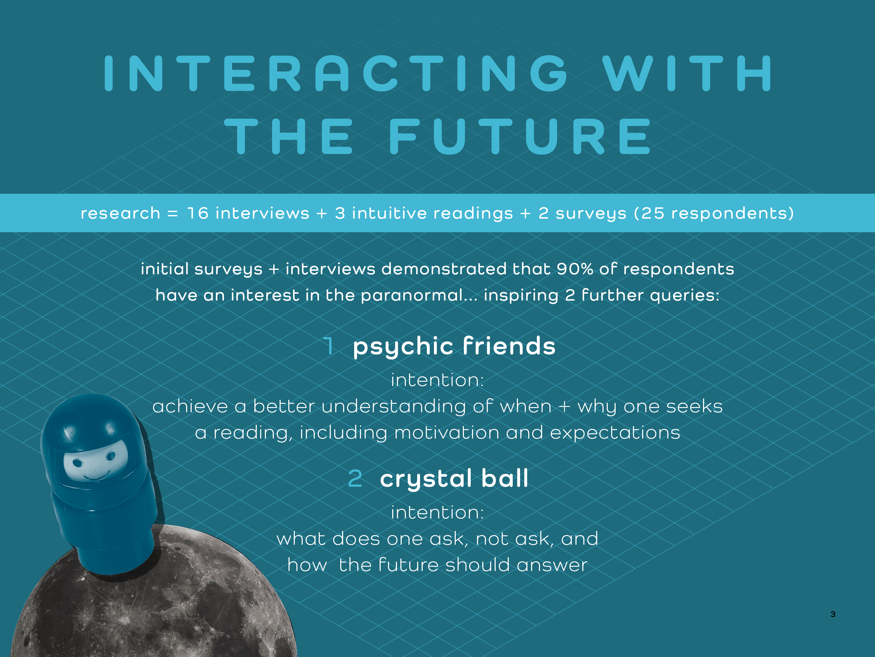
APPROACH & METHODS
I conducted a range of UX research methods to examine participants' beliefs, expectations,
and emotional responses to future-oriented experiences.
• Online surveys to surface initial attitudes and curiosities
• In-depth interviews to explore personal narratives
• Live sessions with an intuitive card reader, followed by a group Zoom discussion
• Participatory artifact research: I mailed “crystal balls” (glass spheres) to nine
participants and conducted interviews while they physically interacted with them
The tactile experience proved especially revealing. Holding a tangible object—even a simple
glass sphere—made the speculative exercise feel real, prompting more thoughtful and decisive
responses.
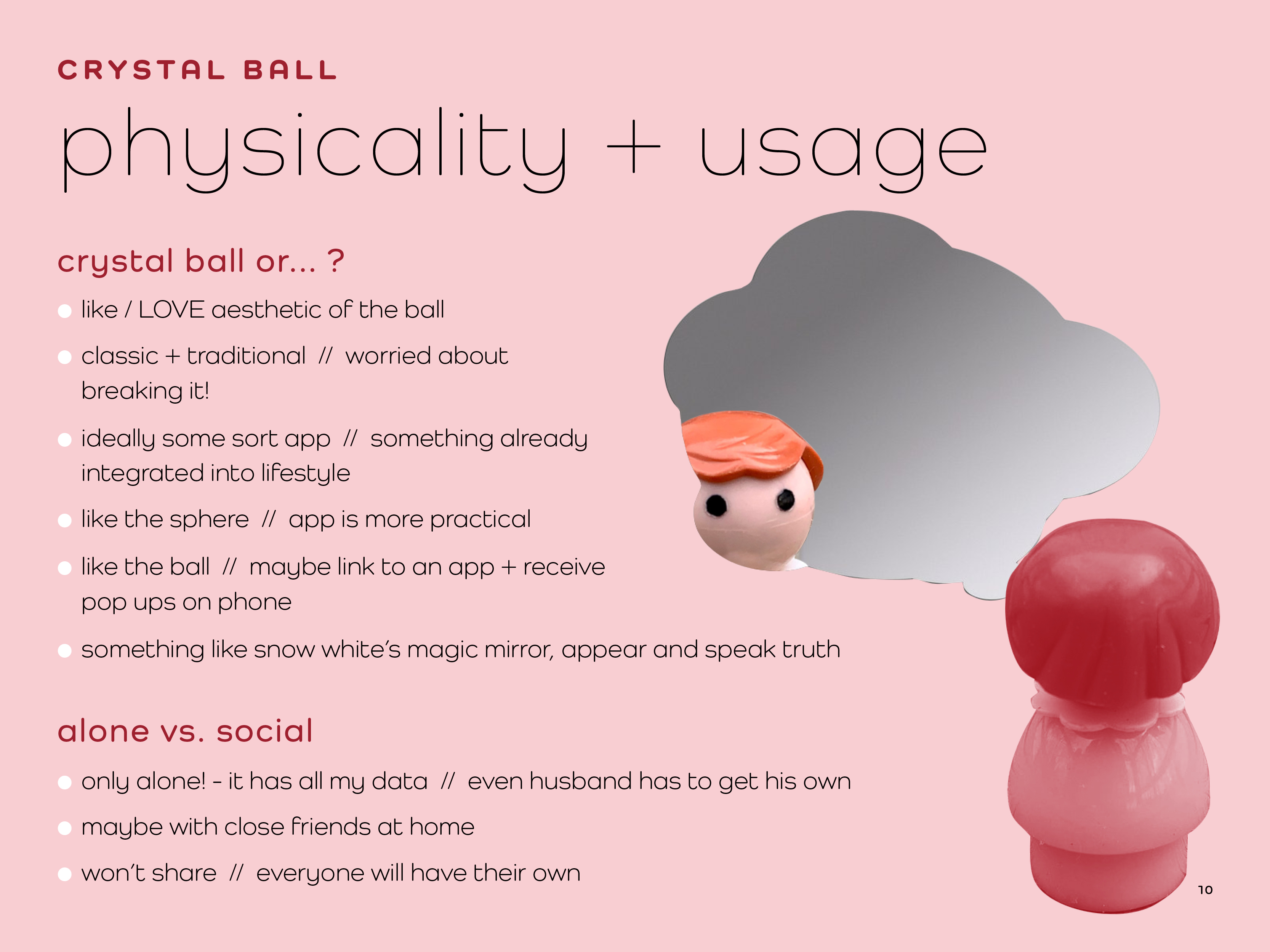
VISUAL PRESENTATION
Although many conversations skewed hopeful and aspirational, the act of looking into the
future can easily drift into darker territory. To counterbalance this, I intentionally developed
a visual language that conveyed playfulness and possibility. Drawing inspiration from figures I
loved in childhood allowed me to access a lighter, more imaginative aesthetic—distinct from the
analytical tone of my data-focused work.
CONCLUDING THOUGHTS
Emerging technologies increasingly promise predictive insight—tools that resemble a modern
crystal ball powered by data rather than magic. Yet my research suggests that people may not
actually want complete foresight.
Perhaps this reveals a tension in how we present data: in striving for precision and authority, we risk overselling its omniscience. Even in the age of data, there remains a desire for ambiguity, imagination, and mystery.
Use side arrows to scroll through project